Musée Cantonal des Beaux-Arts by Barozzi Veiga
Lausanne, Switzerland

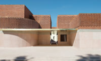
The 60-foot-high top-lit entrance hall provides an unexpected welcome after entering under a low, dark concrete canopy within the vertical ribs of the museum’s north-facing brick-clad exterior wall (shown).
Photo © Simon Menges

The 60-foot-high top-lit entrance hall (shown) provides an unexpected welcome after entering under a low, dark concrete canopy within the vertical ribs of the museum’s north-facing brick-clad exterior wall.
Photo © Simon Menges

The pristine galleries feature carefully controlled LED lighting.
Photo © Simon Menges

They are arranged as an enfilade of spaces, particularly on the second level, with no distractions from viewing the art.
Photo © Matthieu Gafsou

They are arranged as an enfilade of spaces, particularly on the second level, with no distractions from viewing the art.
Photo © Etienne Malapert

Upper-level galleries are accessed by elevator or vertiginous stairs.
Photo © Simon Menges

The lake- and railway-facing facade is almost entirely blind, and incorporates the existing locomotive shed nave.
Photo © Simon Menges

A 47 1/2-foot-tall Giuseppe Penone sculpture occupies the entrance hall.
Photo © Etienne Malapert

Image courtesy Barozzi Veiga

Image courtesy Barozzi Veiga

Image courtesy Barozzi Veiga

Photo © Simon Menges

Image courtesy Barozzi Veiga


Architects & Firms
“We chose David Chipperfield as vice president of the jury because we wanted a functional museum rather than a cream tart of a building,” explains Bernard Fibicher, director of the Musée Cantonal des Beaux- Arts (MCBA) in Lausanne, Switzerland. He’s referring to the 2010–11 architectural competition for the 134,000-square-foot, $85 million edifice, which opened in October next to the city’s main railroad station. With Barcelona-based Barozzi Veiga—a 2014 Record Vanguard that will soon be reworking the Art Institute of Chicago—the jury found exactly what they were looking for: an “anti-Bilbao” brick-clad box that makes optimal, undisturbed contemplation of artworks its principal business.
Additional Content:
Jump to credits & specifications
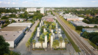
Lausanne, capital of the Canton of Vaud, is an odd city, since it occupies a spectacular site overlooking Lake Geneva but turns its back on the water. “It’s a sort of modesty on the part of the Vaudois,” muses Fibicher. “Anything too beautiful is viewed as suspect. It’s one of those Protestant reflexes.” And, indeed, when a 2008 referendum was held to validate building the MCBA on a waterside plot, the locals rejected the plan, because, it afterward transpired, they felt the lake was sacrosanct. Fibicher now recognizes that the referendum did the museum a favor: its new site is not only far closer to the city center but also very handy for national and international visitors arriving by train from Geneva, Zürich, France, and beyond. Located right next to the rails, the 5.6-acre lot was home to locomotive-maintenance sheds, one of which, completed in 1911, was considered of regional architectural interest. Competition candidates were encouraged to preserve and reuse it but were given the option of demolition. Since the site was too big for the MCBA alone, they were also asked to come up with an urban plan that would allow the later addition of two other museums—in other words, to design a sort of mini museum quarter.
While all the other candidates struggled to squeeze the requisite floor area into the preserved shed, Barozzi Veiga took a much more drastic track. “First, it would have been very difficult and expensive to bring the shed up to Swiss museum standards,” says Fabrizio Barozzi. “Second, we realized that, if we kept this huge old building, it would be impossible to create a new urban narrative for the project. So we took the radical decision to demolish almost all of it in order to create a museum plaza connecting to the station esplanade.” But they did retain one end of the shed’s transverse nave, which, as the linchpin of the MCBA, anchors their scheme in the site’s historic palimpsest.
On arrival, visitors are confronted by a blank lateral wall of pale gray bricks (a cladding vocabulary similar to that used by Herzog & de Meuron at the Tate Modern’s Switch House or Christ & Gantenbein at the Kunstmuseum Basel) before entering the long, narrow plaza. It is bound on its southern side by the MCBA—which serves to protect the space from the clatter of trains—and on its northern flank by an embankment viaduct. At the far end there is currently a construction site—that of the forthcoming Aires Mateus building that will house the two other museums. While the thinking behind this plaza (which Fibicher likens to the courtyard at Florence’s Uffizi) is eminently logical, a disadvantage became evident during my visit: because of the MCBA’s 72-foot height and the plaza’s narrowness, the space remained in total shadow the whole day through, despite the bright fall sunshine.
Like Lausanne itself, the MCBA turns its back on the lake, not because the architects wanted it that way but because two practical imperatives ensured that the lake-facing facade is almost entirely blind: stopping direct sunlight entering the galleries, and the slight but nonetheless real danger posed by freight trains carrying explosive chemicals. Approaching the northerly entrance facade, visitors could be forgiven for thinking it too was blind since it is cadenced, like a freight container, with vertical ribs—brick fins that animate its enormous, 477-foot length and hide its fenestration when viewed obliquely. Entry to this austerely subtle box is low-key—a dark concrete canopy with a very small door—in a classic architectural trick that “unprepares” you for what lies over the threshold: a spectacular 60-foot-high top-lit entrance atrium, which integrates the locomotive-shed nave at its rear. Now covered with a concrete barrel vault over its arched window, and fitted with steps leading up to plunging views over tracks and lake, the nave takes on all the grandeur of the Baths of Caracalla, a frequent reference for 19th-century railroad stations.
Slicing the museum in two, the entrance hall distributes visitors into the ground-floor enfilade of shop, restaurant, auditorium, and street-level gallery as well as the two upper levels of main galleries, which are reached either by elevator or vertiginous stairs. All the final-floor galleries are lit by north-facing sawtooth factory skylights, while many of those on the lower floors have windows overlooking the plaza; filters and blinds allow daylight to be very carefully controlled, so that any kind of art can be exhibited anywhere, in line with the architects’ goal of maximum flexibility. Handsomely proportioned, the galleries are also flawlessly detailed: shadow joints, picture walls in wood to avoid plaster dust when drilling into them, very discreet and carefully controlled LED lighting, wiring hidden in the walls in such a way that there are no visible outlets, but power lines for video works can be brought in when needed. In other words, an “anti-Centre Pompidou,” to use Fibicher’s expression, where the building will never distract from the art since all the technical stuff has been entirely dissimulated to provide quiet, calm, optimal viewing conditions. In pushing this parti pris to its logical and consummate extreme, Barozzi and Veiga have chimed—coincidentally, they say—with the aesthetic tenets of Swiss Protestantism: while obvious ostentation is entirely eschewed, the sensitive, subtle, immaculate realization incessantly whispers wealth.
CreditsArchitect: Barozzi Veiga — Fabrizio Barozzi, Alberto Veiga, principals; Pieter Janssens, project lead
Associate Architect: Fruehauf Henry & Viladoms
Engineering: Ingeni (structural); Chammartin & Spicher, SRG Engineering, BA Consulting (services)
Consultants: Matí (lighting); X-made (facade); Pragma Partenaires (project management); Bogner.Knoll (museum consultant)
Size: 134,000 square feet
Cost: $85 million (gross); $65 million (construction)
Completion date: October 2019 |
SpecificationsExterior cladding Carl Hansen & Søn, Gubi, Hay, BassamFellows, Tacchini, Menu, La Cividina, Lammhults, Moroso, Senab, Sarkop, e15
Roofing, Skylights, Metal doors and windows, Glass Sottas
Sliding doors Viglino, Hörmann Schweiz
Elevators EMCH Ascenseurs
Acoustical ceilings Design Composite
Building automation system Netboss
Lighting Rentex, Zumtobel, Monolicht, Luce-ms, Regent, Ribag, Moos, Erco |


