CF Toronto Eaton Centre Bridge Twists Across Busy Thoroughfare
WilkinsonEyre and Speirs + Major

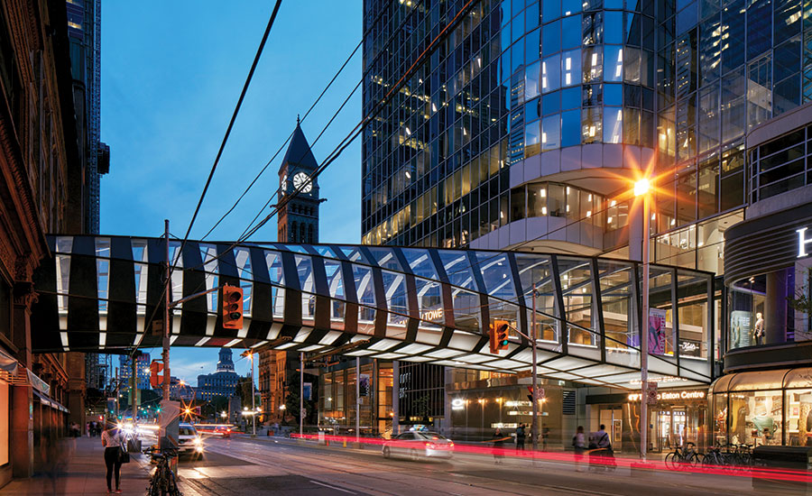
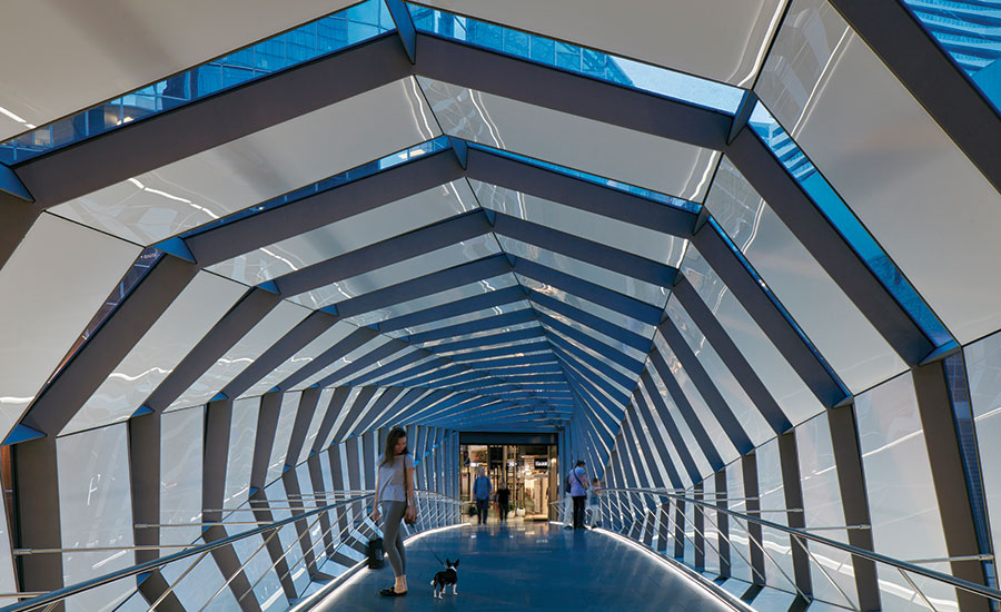
LEDs in the twisting 115-foot-long structure gently illuminate the street (shown) and guide occupants from the century-old Hudson’s Bay Company building to the 1970s CF Toronto Eaton Centre.
Photo © James Brittain

LEDs in the twisting 115-foot-long structure gently illuminate the street and guide occupants (shown) from the century-old Hudson’s Bay Company building to the 1970s CF Toronto Eaton Centre.
Photo © James Brittain


Twisting its way from the Victorian-era Hudson’s Bay Company building to the 1970s CF Toronto Eaton Centre, a new pedestrian bridge spans both the years and the city’s Queen Street with a graceful thrust. The dynamic crossing not only unites the two shopping destinations, both owned and operated by developer Cadillac Fairview, but also celebrates the recent revitalization of this popular urban mall and office complex.
Additional Content:
Jump to credits & specifications
The 115-foot-long bridge replaces a serviceable 50-year-old connection that did little to improve street life or user experience. Designed by London-based WilkinsonEyre, with lighting by Speirs + Major (S + M), the torqued steel structure—a modular assembly fabricated off-site, then erected in place with minimal disruption to this busy commercial hub—speaks to the existing architecture with its alternating ribs of glass and textured, bronze-clad steel. As the bridge emerges from the arched opening of the stone and terracotta Hudson’s Bay Company, its metal ribs are curved and broad, with thin strips of glazing between them, reflecting the older building’s solidity. As the bridge approaches the newer Eaton Centre, the geometry shifts: the metal ribs become slender and rectilinear, and the glass broadens, creating a transparent approach to the glazed tower.
While the bridge’s interior is largely sunlit during the day, S + M devised a powerful yet unobtrusive after-dark identity with a minimum of light sources. The idea for the exterior, says lighting designer Keith Bradshaw, “was to create a luminous soffit” that would improve the ambience for shoppers and passersby on the sidewalk underneath. Working closely with the architects, manufacturers, and local lighting engineer Mulvey & Banani, the lighting designers wrapped the underside of the structure with increasingly large sections of backlit frosted glass, illuminating the thoroughfare below with a subtle glow, which intensifies as it nears the Eaton Centre. Inside the passage, each side of the stone-clad walkway is edged with a continuous run of LEDs concealed by a bar-shaped acrylic diffuser, a system developed to bounce light off the interior’s milky, reflective glass surfaces.
The overall plan is deceptively simple, notes Bradshaw, with a crisp, white 4000-Kelvin color temperature consistent throughout, and no color or programmed sequences. The result of such restraint: a functional link between two buildings.
CreditsArchitect: WilkinsonEyre 33 Bowling Green Lane London EC1R 0BJ United Kingdom +44 (0)20 7608 7900
Architect of record: Zeidler 315 Queen Street West, Suite 200 Toronto, ON M5V 2X2 Canada +1 416 596 8300
Lighting Design: Speirs + Major
Lighting Delivery: Mulvey & Banani Lighting Inc.
Structural Engineer: Read Jones
Photographer: James Brittain |
SpecificationsRecessed into extruded trench detail Nelson & Garrett Custom Fixture with LED-Linear VarioLED Flex Hydra HD15 W850 White
Walkway Kicker Lighting LED-Linear VarioLED Flex SKYLLA White W835 TV IP67
Removeable Underside Deck Lighting Nelson & Garrett Custom Fixture with LED-Linear VarioLED Flex Hydra HD10-W850-IP67 |


