Hunters Point Library by Steven Holl Architects Opens in New York
Queens, New York

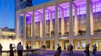
With its waterfront site looking out over the East River, the building has stunning views of the Manhattan skyline.
Photo © Paul Warchol

The library stands out against the backdrop of high rise apartments in Queens.
Photo © Paul Warchol

The whimsical, swooping glass openings contrast with the severity of the silver-painted concrete form.
Photo © Paul Warchol

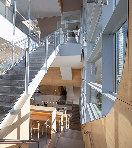
The design stops at nothing to lure visitors upward, through the soaring atrium.
Photo © Paul Warchol

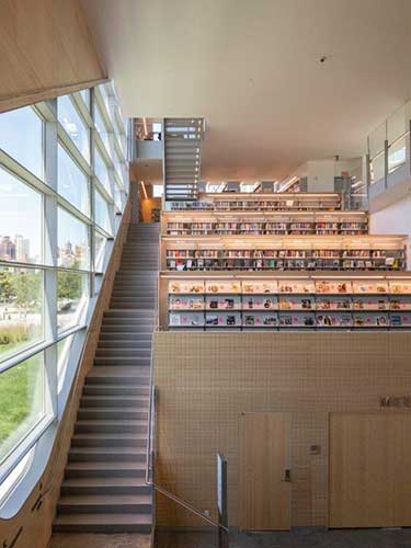
A set of terraced study benches ascend from the main entry up to the adult collection.
Photo courtesy Steven Holl Architects

Abundant glazing floods the children’s area with daylight and allows panoramic Manhattan views.
Photo courtesy Steven Holl Architects

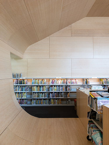
Bamboo clads much of the interior, lending a visual and acoustic warmth.
Photo courtesy Steven Holl Architects


Architects & Firms
The enigmatic calligraphic window openings etched across the Hunters Point Library command attention, drawing the eye from Manhattan across New York City’s East River to a waterfront site in the borough of Queens. Dwarfed by bland residential towers that march in heedless lockstep along the riverfront, this diminutive, 82-foot-high structure, designed by Steven Holl Architects (SHA), “represents civic life for the whole community,” says senior partner Chris McVoy.
With this project, Steven Holl ran with the idea that architecture could sculpt the experience of bringing together a community in a free-of-charge, 22,000-square-foot “third place,”—reflecting the belief popularized by urban sociologist Ray Oldenburg that people need a place to socialize that is neither home nor the ubiquitous privatized realm. In making explicit the library as "social condenser,” as Holl puts it, the architect was responding to a mandate from Queens Public Library (one of three New York City library systems) to showcase the broadening of its programming and community services—a common goal in libraries today, but one that often is incidental architecturally.
The whimsy of the large, swooping glass openings—in contrast to the severity of the building’s form: a silver-painted concrete box, which poses confidently on its tree-dotted lawn—hints at the wondrous experience Holl, McVoy, and senior associate Olaf Schmidt have created inside. At the entry and service-desk space, visitors will likely need to pause to orient themselves within the Swiss-watch intricacy of the design. A labyrinthine, full-height atrium unfurls directly overhead, flanked on either side by areas for adults, teens, and children. The upper four levels (slightly offset in height from one side to the other) cantilever into the atrium, edged with glass balustrades.
The library's signature element is a set of terraced study benches, backed by stacks, that ascend from the main entry to the bi-level adult collection. These seats will no doubt be coveted for their potential to inspire and distract, since they open to the spectacular panoramas across the East River to the Manhattan skyline through the massive freeform window wall (with glass panels as long as 14 feet). Tucked beneath the terraced benches is a large, stepped-ceiling community room that accommodates lectures, performances, and special events.
The design stops at nothing to lure visitors upward—a challenge faced by multi-level libraries. Open stairs zigzag, sometimes parallel to the sills of the water-facing window wall, sometimes diagonally across the expanses of glass, which silhouette people moving in front of the view.
That vertical circulation is echoed inside the land-facing wall by ramps that horizontally link the spaces on either side of the atrium, slicing through shafts of light entering the atrium from expanses of glass on that side of the building. (The ramps also enable full accessibility.) Someday, someone may choreograph a dance inspired by this circulation, but, for now, visitors will perform a kind of impromptu ballet as they move through the library.
Collections, reading areas, and gathering spaces open to the atrium as cantilevered trays of space, so that the visitor encounters the array of group-learning experiences as well as the collection’s offerings as they move along the stairs and ramps amid the luminous daylight that floods into the atrium. Acoustical dampening is built into the wood paneling that clads much of the interior. Rather than achieving the utter silence of yore, the intention is to allow a background hubbub. The children’s area is cocooned—and acoustically separated—by a sensuously rounded bamboo-faced volume that bulges into the atrium.
To minimize columns and allow large uninterrupted spaces, Silman Structural Engineers framed the interior floors in steel, carrying the loads of the many cantilevered floor edges back to hefty steel beams that cross the narrow dimension of the building. These beams slot into recesses formed into the exterior concrete bearing walls, which have special reinforcing, enabling them to carry loads around the looping glass openings. In an area that has been vulnerable to flooding, the site’s gentle upward slope from the waterfront places the ground floor above the 100-year flood plain.
Today’s opening culminates a years-long, $40-million journey, initiated by local advocates who had long championed a new library for the rapidly growing neighborhood. SHA was selected in 2010 by the City’s capital-project agency, the Department of Design and Construction (DDC); the firm participated in the agency’s Design Excellence program, which emulates the Federal GSA program, with the goal of bringing the highest quality to public architecture. (Full disclosure: the author worked for the DDC but did not have any connection to the library project.)
The contractor reportedly struggled with many special conditions in Holl’s design, and there were other hold-ups, including the specialty fabrication of the glass and window-wall system in Spain and Germany, with further delays from a dock-workers’ strike. Escalating costs and the slipping schedule at Hunters Point were highly publicized, with some reports citing Design Excellence as an enabler of unnecessarily elaborate architecture.
There was plenty of blame to go around. A 2017 report by the Center for an Urban Future, “Slow Build,” documents longstanding management problems at DDC, a messy multi-agency approvals process, and City contracting procurement that favors low bidders even when they may not be fully qualified. Construction did not begin until 2015—a full five years after SHA was hired—and was accompanied by a flurry of change orders, requests that are common in low-bid public projects. The Queens Library also made changes late in the project, according to DDC, which continue, in one case prompted by a debate over whether railings on a rooftop outdoor reading terrace, one of the special features of the design, are high enough even though they meet code requirements. Pursuant to a DDC “Strategic Blueprint for Construction Excellence,” the agency has begun overhauling procedures to improve cost controls and reduce delays that have afflicted many of its projects.
If the public embraces the magical journey of spatial suspension, ever-changing light, and irresistible views, does that make the cost (at close to $2,000 per square foot) and delays worth it? Some have dismissed these things as inevitable with public projects. But given the high needs, the painstaking work of reforming sclerotic procedures must be done, though even streamlined procedures will challenge architects to design sensitively to many public agendas and tight budgets.
Holl’s design shows how a public place can be created with transcendent allure, which is as important today as it was in the early 20th century, when Carnegie-funded libraries rose as beacons of opportunity in cities across the country. If it draws more users—especially those who are intimidated because they lack reading or language skills—the value of the library’s design will be incalculable.


