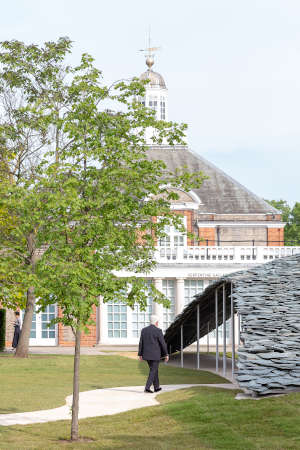
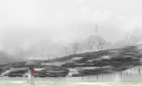
Billowing over the green of London’s Kensington Gardens like a jagged stone sail, Junya Ishigami’s Serpentine Gallery Pavilion shows that after 19 editions, the annual program has not lost its capacity to stimulate and surprise. The thin canopy rises from three corners, heaped with thick flakes of loose-laid slate, its frayed hems almost brushing the grass in some places and soaring to 15 feet in others.
Its enigmatic character evokes an abundance of allusions, from ancient stone barrows to the ruffled feathers of “a big black bird in the rainy sky over London,” as Ishigami suggests, and reflects the Japanese architect’s longstanding preoccupation with the intimate interplay between man-made and natural environments. “I wanted to design this structure as something between architecture and landscape,” he says, “to make a stone garden in front of the gallery building, or a piece of scenery continuous with its own slate roof.”
A “random” composition of differently sized stones helps to create the impression of a natural feature, but also recalls examples of vernacular architecture, lending the structure a kind of universal context, suggests Ishigami. “In these ancient techniques we can find a similarity between roofs in different parts of the world, including Europe and Asia,” he notes. “This building will eventually be sold and move to another site. The relationship to this place is important, but I can’t forget about what will happen elsewhere.”
Another recurring feature of Ishigami’s work is lightness; indeed, he first began discussions with the Serpentine curators at the 2010 Venice Biennale, where the then 34-year-old won the Golden Lion for a structure of gossamer-thin filaments that was demolished by a stray cat. But here, he explains, “I wanted to make a new relationship between lightness and heaviness; the building looks very heavy from the park entrance, but from the other side and from inside it looks very light.”
Photo © Norbert Tukaj
Overhead, 61 tons of stone are held aloft by 106 white steel posts, each slender enough to wrap a hand around, arrayed at roughly two-yard intervals. Such a forest of columns might be expected to compromise the 3,767-square-foot pavilion’s usefulness as a space for events, but oddly it doesn’t. Slim enough not to obscure sightlines, they read as “furniture” within the cave-like building, suggests Ishigami.
Slates lie on a grid of steel mesh, to which some are tied with wire loops, while others are held in place by the weight of stone on top. To preserve the slenderness of the roof, the steelwork deals only with vertical load; lateral stability is provided by anchors at each corner.
By embodying apparent opposites—light and heavy, crude and delicate—the pavilion vividly accentuates architecture’s essential ingredients: structure, space, material. Another apparent contradiction had to be overcome in the making of it. Ishigami’s concept demanded the appearance of simplicity, but “our engineers tell me that in their entire careers they have seldom built a more complex structure,” says commissioner Hans Ulrich Obrist. Ishigami also felt the pressure of delivery: “This half-year has been the hardest time in my life,” he says.
Some of this stress may have arisen from a controversy during the design phase over his studio’s use of unpaid interns. Another crisis occurred on the eve of opening, when the Serpentine Gallery’s CEO resigned in connection with outside business interests. Commentators have begun to ask whether a Goldman Sachs–sponsored pavilion associated with glamorous summer parties is out of step with changing times. It is right to question the awkward relationship of the art world to money, but Junya Ishigami's poetic mineral tent demonstrates the ongoing vitality of the pavilion program. London would be poorer without it.
Photo © Norbert Tukaj