A Library by Skolnick Architecture + Design Partnership Features Colorful Wayfinding
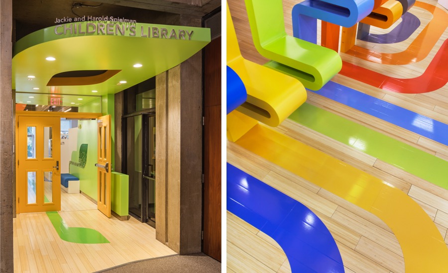
Reading areas are zoned for age groups by colorful, painted-on wayfinding stripes.
Photo © John Wallen
As the number of books available in digital and audio formats keeps rising, brick-and-mortar libraries have had to adapt and evolve into much more than lending facilities and repositories to stay relevant. “Libraries are the new town squares,” says Lee Skolnick, founding principal of Skolnick Architecture + Design Partnership. “They must be multifunctional, welcoming, provide space for people to gather, and incorporate an ever-increasing set of analog and digital content delivery platforms.” The architect used these guidelines when designing the new Jackie and Harold Spielman Children’s Library and inserting it into a gutted space within the existing Port Washington Public Library on Long Island in New York.

To give the new facility a distinct character while simultaneously suggesting designated areas for groups and activities, the design team conceived a color-coded theme that both alludes to the Tree of Knowledge and acts as a wayfinding system. Hovering above the centrally located librarian’s desk, this system starts as a canopy with different-color “leaves” that morph into sinuous limbs that branch out. These enameled-steel bands then descend toward the floor, forming display shelves that double as seats.
The vibrant paths resume in the form of 3M-film graphics on the bamboo flooring, navigating to various zones with corresponding color schemes. Dark blue leads to the early childhood area and is emphasized through blue wall graphics and leaf-shaped rugs of inlaid resilient flooring by Langhorn Flooring Concepts. Tangerine-tinted Benjamin Moore paint covers a wall in the quiet-study room. And a yellow path directs visitors toward the story-reading corner and parents’ lounge with coordinating sunshine-hued cushions, curtains, and wall graphics.
Selecting the materials and finishes was a challenge: “We were intent on having the colored branches and leaves be continuous. We needed different materials for floors, walls, canopies, freestanding structures, etc. but they had to match perfectly in terms of color and finish to achieve this seamless continuity,” says Skolnick. Thus, “wall paint, wall graphics, floor graphics, and enamel were selected and approved together. Any change to one meant a change to the others.”

Reading areas are zoned for age groups by colorful, painted-on wayfinding stripes.
Photo © John Wallen
Specifying lighting and furnishings was more straightforward. The architects chose a variety to accommodate the different types and ages of guests frequenting the children’s library, which range from toddlers and tweens to parents and caregivers. Ambient lighting by Architectural Lighting Works mingles with USAI downlights. Decorative pendants by Tech Lighting and Eureka add just the right touch of contemporary style. Parents get to sit on classic Bertoia chairs from Knoll while older kids can lounge on stone-shaped floor cushions by Iglooplay.

In the children’s reading room, leaves painted on the walls echo the canopies.
Photo © Ola Wilk
Every element and hue works in concert to create timeless environments that support the library’s diverse groups and activities, from story time and toddler yoga to intergenerational chess and video-game design workshops. To sum things up, says Skolnick, the palette “appeals to all ages. Not too kids-y, trendy, or overly sophisticated.”
This story was featured in Material World, Architectural Record’s products-focused newsletter. Subscribe today!


