Greene Ranch by Anacapa Architecture
Santa Barbara, California

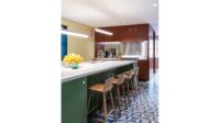
A sliding glass wall on one side of the house spans 36 feet, connecting the kitchen to the outdoors.
Photo © Erin Feinblatt

Custom appliance doors of ipé conceal the refrigerator-freezer and pantry, and tie in with the facade.
Photo © Erin Feinblatt

The guest bath features the same subway tile and brass fittings as the kitchen.The house’s east facing wall frames a view of its matched kitchen.
Photo © Erin Feinblatt

A skylit corridor leads to the master suite.
Photo © Erin Feinblatt

In the master bath, walnut and brass fittings punctuate the gray-tiled walls and concrete floor.
Photo © Erin Feinblatt

Image courtesy Anacapa Architecture


Architects & Firms
When the owner of an unremarkable 1,100-square-foot 1950s ranch house commissioned Anacapa Architecture to replace it with a new 2,450-square-foot dwelling with an open plan, she described the kinds of materials and finishes she wanted indoors. Principal Dan Weber used these strong palette choices as a jumping-off point for his architecture and interiors. This is especially evident in the kitchen and bathrooms, which are key to his design.
Additional Content:
Jump to credits & specifications
Besides doubling the house’s footprint, Weber and his team balanced the slatted ipé panels and white stucco of the exterior by using the same wood in the kitchen’s clean, white environment. From the street, the combined living/dining/kitchen area is visible through a large window, neatly framed by the house’s cladding. Used for its durability as well as its visual appeal, the street-facing ipé wall turns a corner inside the entry vestibule and reappears as striking millwork to conceal the bottom-mount, built-in refrigerator-freezer in the kitchen. The white custom cabinetry in the rest of the space offers plenty of storage to keep it clutter-free. The pristine palette underscores the link between the stucco and the white-painted millwork, the bianco bello marble-top island and white-tile backsplash.
In the evening, one can switch on a series of downlights and a dramatic brass chandelier that hovers above the island. “The owner had a very clear vision for the design: she wanted a bright, minimalist space,” says Weber. “The island is the central gathering place for rich social interaction that revolves around meal preparation.” It holds the sink, dishwasher, storage, and concealed trash bins. The client selected the marble for the countertop.
Weber carried the elegant palette into a nearby guest bath, suspending pendant versions of the kitchen chandelier above a walnut vanity complemented by brass faucets, hardware, and a mirror edged in the same metallic finish.
The open plan of the kitchen-living wing extends to the master suite. Here, a full-height wall forms the bed’s headboard, but the room is devoid of doors at either side. These two thresholds lead into the master bath, which features polished-concrete floors with radiant heating and large-format gray tiles. The fixtures in this room include a tub; an open shower shielded by a single glass panel on one side; an enclosed toilet; and a custom double vanity fabricated by the same cabinet- maker who worked on the kitchen. While the vanity was constructed with walnut, the same brass fittings and luminaires punctuate the calm gray space. Timber slats lining the shower floor and a custom bench are composed of the recurring ipé that ties the indoor and outdoor spaces of the house together in many details.
The minimalist design and carefully curated palette work in concert to present a visually serene and uncluttered home, from every nook to the main attraction that is the kitchen.
CreditsArchitect: Anacapa — Dan Weber, principal architect; Geoff April, Jose Sanchez, design team
Structural engineering: Ashley & Vance Engineering
General contractor: Beach Front Construction |
SpecificationsCustom cabinetry Lotus Cabinetry
Hardware Buster & Punch; Colonial Bronze
Sliding glass doors Western Window Systems
Lighting & mirrors RH Modern
Fittings Kohler |


