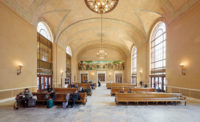
The Oregon Pioneer Savings Landmark Building in downtown Portland seems an unlikely home for Expensify. The online expense-management service was created 10 years ago by CEO David Barrett, who describes its mission as “making expense reports that don’t suck.” The company was founded in San Francisco (and now has offices in London and Melbourne), but it outgrew its original space. Portland, with its laid-back ambience and cheaper real estate, was an attractive alternative for another West Coast office. The stately neoclassical monument, designed by Boston-based Coolidge and Shattuck, was the first building Barrett saw. It has graced a corner site since 1916, with a pedimented Doric colonnade distinguishing its marble-clad front facade and a richly decorated skylit atrium dominating its interior.
Additional Content:
Jump to credits & specifications
“It was the perfect blank canvas,” Barrett recalls, “with a classy core that we could build on to create a unique space for our team to grow and our culture to thrive.”
ZGF’s principal in charge, Alan Gerencer, and his team, Gabriella Caldwell and Franco Rosete, shared Barrett’s enthusiasm for the venerable landmark. The client asked them to remain true to its original aesthetic while adapting it to his company’s offbeat working model. “Expensify hires people who thrive in a fast-paced, collaborative environment with lots of personal freedom,” Barrett explained. “We have only two rules: get shit done, and don’t ruin it for everyone else.” Here, Gerencer realized, was an opportunity to balance respect for history with edgy design.
Barrett’s brief was simple. He needed flexible spaces where his employees—currently 50 but potentially up to 150, whose average age is 31—could be comfortable, whether their work required collaboration or heads-down focus. Eschewing assigned workstations, he wanted a mix of open spaces and meeting rooms in which employees could choose to work depending on their mood or the task at hand.
The four-story, 34,000-square-foot building—of which Expensify currently occupies 17,350 square feet—came with challenges. It was leased rather than bought, limiting the scope of work. The 57-foot-high atrium did not translate obviously into usable square footage. And the total timeline from initial interview to opening day was only 10 months. Both Expensify and ZGF saw these problems as opportunities to be creative.
The bank’s spatial hierarchy led to a vertical distribution of program. On the ground floor, a grand stair—surrounded by space slated to be a café—leads up to Expensify’s quarters, which occupy the atrium and the surrounding second and third floors. The fourth floor, accessed by elevator from a secondary entrance, can be subleased to a tenant.
The atrium is a marvel of classical proportions and details, including 18-foot-tall windows screened by X-patterned bronze grilles, entablatures highlighted by gilt friezes and medallions, and colossal Ionic columns. Behind these, on one side, is a communal workspace with a 22-foot ceiling, vertically gridded windows and a 41-foot-long walnut table. On the other side is a casual open kitchen and café with cabinetry of spalted maple. On a mezzanine above, a boardroom, richly paneled in a mix of oak, stained navy blue, and walnut, and accented with brass inlays, overlooks the atrium’s sun-filled, multistory volume. Comfortable seating, in an eclectic range of styles, is everywhere, even in old bank vaults. The third floor contains another open work area and a “village” of oak pavilions for private phone calls. These are part of a strategy to create varying levels of auditory privacy. Acoustical panels are discreetly distributed throughout, dampening noise but still allowing for an energetic buzz.
ZGF capitalized on the atrium’s height by adding a monumental stair of blackened steel and oak with small conference rooms, clad in glass and panels of aluminum printed to look like brass, at its cantilevered landings. Conceived as a treehouse—a conceit reinforced by a suspended chaise that hangs like a swing—this bold sculptural intervention began with an evocative sketch by Rosete, drawn in response to Barrett’s request for “something special” to connect the various levels. “It evolved,” says Rosete, “as a place to meet, hang, perch, and connect.”
Thoughtful rigor underlies the intersection of old and new. “Our approach was not to mimic but to adapt and embellish, drawing from original elements but using contemporary details,” Gerencer explains. For example, patterns of oak leaves and acorns on the historic bank vault doors led to the selection of oak for flooring and millwork. The boardroom paneling pattern and the gabled pavilion tops refer to the classical X motifs in balustrades and grilles. The juxtaposition of gold leaf and dark bronze inspired a metalwork palette of brass and blackened steel. And vertical window proportions informed the glazing of the “treehouse” conference rooms. All of this was executed with a high level of craft. “No detail was overlooked,” says Caldwell.
Expensify’s new surroundings are suitably sophisticated for a successful financial-services firm but retain the casual character of the company’s startup culture. The kombucha-sipping young staff—and their dogs—seem very much at home in ZGF’s mash-up of subtle reference and bold intervention. “I love that we maintained the history and aesthetic of the bank but also made it our own,” says one business-development manager. “The space inspires so much creativity,” adds Barrett, with obvious pride. “We’ve been able to host everything from open events for the Portland community to employee yoga classes and wine tastings. It never gets old.”
CreditsArchitect: [ZGF, 1223 SW Washington St. Suite 200 Portland, Oregon 97205, 503-224-3860, www.zgf.com]
Personnel in architect's firm who should receive special credit: [Alan Gerencer, Franco Rosete, Gabriella Caldwell, Kirsten Justice, Jeanne Jameson, Chardonnay Cintron, Jan Willemse]
Architect of record: [ZGF, 1223 SW Washington St. Suite 200 Portland, Oregon 97205, 503-224-3860, www.zgf.com]
Interior designer: [ZGF
Engineers: Structural: KPFF MEP: Glumac
Consultants: Broker: Melvin Mark Companies” “Code Consultant: Code Unlimited LLC
General contractor: Swinteron Builders
Photographer: Garrett Rowland |
SpecificationsDoors Special doors: EZYJamb Upswinging doors, other:
Interior Finishes Acoustical ceilings: Armstrong Suspension grid: Armstrong Demountable partitions: n/a Cabinetwork and custom woodwork: Artek, Inc., Legend Custom Woodworking, Inc.Hansett Stainless Inc. Paints and stains: IdeaPaint, Miller Paint Wall coverings: tri-kes Paneling: Custom Millwork Plastic laminate: Formica, Arborite Solid surfacing: Pental Floor and wall tile: United Resilient flooring: Shaw Contract Carpet: Milliken, Masland, Shaw Special interior finishes unique to this project: Aluminum Brass Panels: Pure+FreeForm Wood flooring: Kahrs Acoustic Panels: FSorb
Furnishings Chairs: Restoration Hardware Room & Board BuzziSpace Naughtone Herman Miller Schoolhouse Electric Source Grand Rapids Chair Company Rejuvenation CB2 Level4 Tables: BuzziSpace Custom Tables: Mallet Bernhardt Schoolhouse Electric Restoration Hardware CabDeco Upholstery: HBF Momentum Maharam Camira Lighting Interior ambient lighting: Schoolhouse Electric Tom Dixon Lighting BuzziSpace Cerno Group Luceplan Nemo Roll & Hill |


