NYU Langone Health by Ennead and NBBJ
New York City

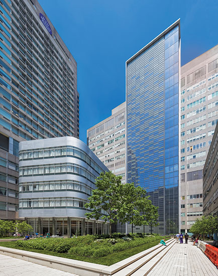
NYU Langone Health, as seen from Brooklyn, across the East River (from left to right): the Science Building (2018), Smilow Research Center (2006), Skirball (1989), Energy Building (low in foreground; 2016), Tisch Hospital (1963), and Kimmel Pavilion (2018).
Photo © Jeff Goldberg/Esto

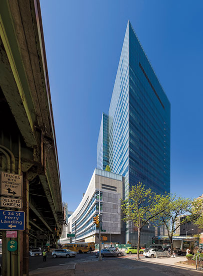
The energy building, next to the Kimmel Pavilion, is slightly curved along the highway and the East River.
Photo © Jeff Goldberg/Esto

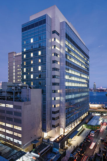
The new 21-story tower offers individual patient rooms with sweeping views.
Photo © Jeff Goldberg/Esto

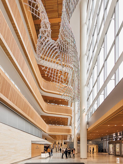
The lobby of the Kimmel Pavilion is dramatized by a sculpture created by Alyson Shotz.
Photo © Jeff Goldberg/Esto

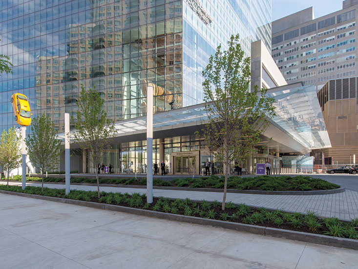
Hassenfeld Children's Hospital, part of the Kimmel Pavilion, has its entrance signaled by Spot, a sculpture by Donald Lipski showing a giant Dalmatian balancing a yellow cab.
Photo © Aislinn Weidele/Ennead Architects

On the southern edge of the campus is the new 16-story Science Building devoted to education and research.
Photo © Rene Perez

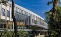
A brise-soleil and fritted glass louvers animate the south-facing facade.
Photo © Aislinn Weidele/Ennead Architects

The labs receive light filtered through the brise-soleil and fritted-glass louvers.
Photo © Aislinn Weidele/Ennead Architects

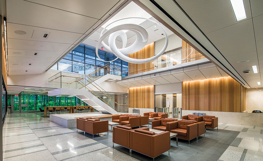
The lobby, punctuated by Mariko Mori’s mobile, opens onto Alumni Courtyard.
Photo © Elliot Goldstein

Joanna Pertz Landscape Architecture designed the Alumni Courtyard, placed to the north of the Science Building.
Photo © Derek McClung/Turner Construction

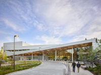
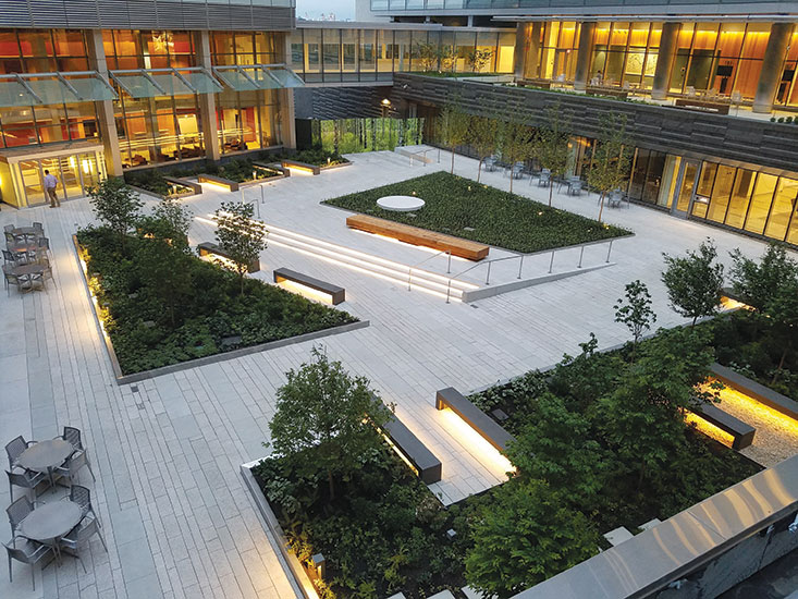
The Fleck Courtyard, designed by Joanna Pertz Landscape Architecture, is separated from the main Tisch Courtyard by a glazed passageway.
Photo © Rene Perez

Tisch Courtyard, also designed by Joanna Pertz Landscape Architecture, extends in front of Ennead’s new elevator tower, next to the Skirball Institute of Bionuclear Medicine.
Photo © Jeff Goldberg/Esto

The Energy Building, a dense 6-story structure, raises mechanicals above the floodplain.
Image courtesy Ennead Architects & NBBJ

Image courtesy Ennead Architects & NBBJ

Image courtesy Ennead Architects & NBBJ

Image courtesy Ennead Architects & NBBJ

Image courtesy Ennead Architects & NBBJ


In 1949, when Skidmore, Owings and Merrill designed a campus for New York University’s medical center in Manhattan, the compound was a clean-edged Modernist composition, a rectilinear, sculptural ensemble on lawns overlooking the East River. But in subsequent decades, the center—now called NYU Langone Health Main Campus—added buildings and piecemeal interventions that diminished the clarity of the scheme on its 9.4-acre site.
Additional Content:
Jump to credits & specifications
Like other urban medical school–hospital campuses, this superblock—bound by 30th and 34th Street, First Avenue, and the FDR Drive–had acquired an almost ad hoc massing. Inside, awkward adjacencies and spatial allocations undercut functionality as well as patient and staff experience.
In 2008, Robert I. Grossman, the medical school dean and CEO of NYU Langone Health, launched ambitious plans to transform the complex into a fully integrated “world-class” patient-care, education, and research center. The process began with a master plan by Ennead and NBBJ. Ten years and one devastating hurricane later, much of that vision has finally come to fruition.
In calibrating what to add, subtract, or modify, the architects analyzed the tight existing site and its context, identifying structures that had outlived their value and could be demolished. It was essential to reconfigure the public circulation for rational, intuitive wayfinding—bringing continuity punctuated by leafy courtyards—and orienting views out. Another key goal was to honor SOM’s scheme, with the planar Tisch Hospital tower and its podium of interlocking buildings. As NYU Langone senior vice president Vicki Match Suna says, “We consider ourselves stewards of the original campus.”
The 2008 master plan, implemented in phases while the medical center remained in operation, added three new buildings and organized the campus programmatically into zones: acute patient care, ambulatory medicine, and research/education. Ennead’s 71,000-square-foot Energy Building was completed in 2016, and its 365,000-square-foot Science Building in January. Last month, NYU opened the 830,000-square-foot Kimmel Pavilion, a state-of-the-art hospital tower by Ennead and NBBJ, which includes Hassenfeld Children’s Hospital. But in October 2012, as the Energy Building began construction, Hurricane Sandy struck, causing extreme flooding and even backup generator failure. Without functioning elevators, patients had to be evacuated down many flights of stairs and, for the first time in the institution’s history, it closed (for months). NYU Langone ultimately recovered, with the aid of a $1.45 billion FEMA grant.
While the planned buildings were designed for resiliency, says Ennead partner Thomas Wong, “this was a chance to correct the entire campus.” And that, adds Match Suna, “was the silver lining.”
Bypassing phased updates, FEMA’s funding enabled NYU to address the urgency of its existing conditions comprehensively. The recovery included installing robust perimeter flood barriers, gates, and seals, and permanently elevating critical infrastructure—mechanical, electrical, and IT systems—above the floodplain. Vulnerable low-lying elements, such as the main cafeteria, were also relocated. And Ennead addressed the severe inadequacy of the existing 18-story Tisch Hospital’s elevators by adding a four-car bank alongside the original building, expanding each floor’s lobby and lounge area, dramatically improving foot traffic.
For belt-and-suspenders resiliency, NYU developed strategically redundant systems, particularly with Ennead’s riverfront Energy Building, finished in 2015. Inside this low structure—echoing SOM’s play of horizontal massing—is a highly sustainable cogeneration plant, along with multiple self-reliant backup resources. With waste heat from the electricity-generating turbine converted into steam that powers its climate control year round, the campus is on track for LEED Platinum certification.
A top NYU priority was to make the medical center outstandingly comfortable, safe, functional, and appealing for patients, as well as visitors, doctors, and staff. That’s especially evident in the 21-story Kimmel Pavilion, the city’s first hospital building with all single-occupancy rooms. But before it could rise, at the campus’s north end, daunting challenges needed resolution. Two Amtrak tunnels cross under that land, about 60 feet down, and no new loads could rest on them; also, the site’s eastern side is unstable riverfront landfill. The solution was a bridgelike structure, spanning the Amtrak zone with 30-foot-deep trusses (through Kimmel’s 6th-floor mechanical plenum), from which operating rooms hang, and on which 11 patient floors rest. Pilings through the landfill go down 100 feet into bedrock, and the building’s footprint, a parallelogram, follows the tunnels’ skew.
Kimmel has two main entrances: on First Avenue and 34th Street for adult patients and a dedicated one on 34th Street for the children’s hospital within the same building. Place-making sculptures mark both portals: a 38-foot-tall Dalmatian balancing a taxicab on its nose fronts Hassenfeld, and a monumental, light-bouncing, skeletal mobile animates Kimmel’s six-story atrium lobby amid overlooking balconies and huge, cityscape-framing windows.
Upstairs, the 374 beds comply with the single-occupancy-only requirement for new hospital construction and renovations, mandated in 35 states (in New York as of 2010). Its advocates cite greater infection control, privacy, and the healing benefits of quiet space and loved ones’ staying with patients. Solo rooms also optimize bed availability, since room-share-limiting issues like gender or contagions no longer apply. Tisch will be converted in phases to all single-occupancy too. But its real integration with Kimmel occurs in their joint podium, where the expanded emergency room extends into both buildings, and operating room procedure floors connect. “Tisch and Kimmel,” says Wong, “will perform as one hospital with two bed towers.”
The medical center plans to add many of Tisch’s operating rooms to Kimmel’s 30 new ones. But, given health-care trends toward more outpatient procedures and shorter hospital stays, the combined post-renovation bed count is not likely to increase significantly from Tisch’s current tally of 565.
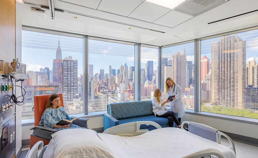
Kimmel’s rooms are stunningly appointed, each with sweeping views, a fold-out sofa for visitors, and a 75-inch flat-screen monitor, enabling patients to order meals, adjust climate control, learn about their health conditions, conduct live video conversations, and watch movies. The nearly floor-to-ceiling windows, with fritted low-E glass, are triple glazed to cancel noise.
In many ways, NYU has chosen to exceed minimum requirements, despite the expense. Its innovative infection-control measures include translucent sliding-glass doors to patient rooms instead of bacteria-harboring privacy curtains. And parallel routes separate onstage from offstage traffic, removing patients from distracting back-of-house activity. To alleviate stress for staff, patients, and visitors, says NBBJ partner in charge Joan Saba, “the whole place was designed so you’re never more than one turn away from daylight”—even the corridors outside Kimmel’s ORs have panoramic river views.
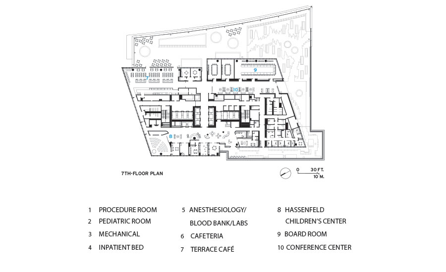
Patients and staff can also step outdoors. The seventh floor, which includes cafeteria and conference areas, has landscaped terraces designed by Hargreaves Associates—one just for kids. (Hassenfeld also has whimsical New York–themed play areas.)
But before Kimmel existed, Ennead introduced, in its Science Building, a language of interior forms and materials that would unify the broader complex while giving each place a distinctive character. In 1993, the Polshek Partnership (a precursor to Ennead) completed the multiuse Skirball building, which organized the campus with a main entrance and reception lobby, along First Avenue. But the medical school still lacked a clear physical identity, or even its own front door.
Now that’s changed with the new 16-story Science Building, a gateway, at the campus’s south end, to its academic-research areas. Like Kimmel’s luminous multistory lobby, with dynamic artworks, wood accents, and surrounding overlooks, the Science Building, entered from 30th Street, is soaring and daylit, with a central, pendant sculpture amid second-floor balconies, and a ground floor café opening out to the landscaped Alumni Courtyard.
Around the leafy quad, Ennead’s new building connects with existing research structures. Along with the communal spaces, the science tower’s open laboratory floors upstairs, designed for flexibility to accommodate emerging technologies, encourage collaboration. To allow the research areas prime south-facing river views, the architects devised a brise-soleil, with fritted-glass louvers that cut glare and heat gain.
From upper floors, views now take in terraces and courtyards, as well as a newly planted roof on a low 1952 SOM building. When lab consolidations and relocations are complete, the tortuous ductwork along courtyard walls will disappear, enhancing the experience.
This thoughtful and extremely challenging campus transformation (of undisclosed cost), is not about wild, reinvent-the-wheel architectural form. It’s more about well-considered consistency, compatible language, attunement to users, fluid circulation, and rethinking existing conditions to tie it all together. Without being derivative, Ennead has extended the original design’s perpendicular play of mid-rises versus towers. But, apart from Kimmel—which gains some lightness from its sleek, glass curtain wall skin—the massing density can feel imposing from First Avenue. Yet within the complex, many scales, along with diverse places of respite and activity, reveal themselves. When asked whether NYU Langone’s metamorphosis is almost done, Match Suna replied: “Yes and no. We’ve accomplished a real transformation, but the nature of a medical center—which this design recognizes, anticipates, and accommodates—is that it’s always evolving.”
CreditsArchitect: Ennead Architects — Duncan Hazard, partner in charge; Todd Schliemann, FAIA, Thomas Wong, design partners; David Tepper, management principal; Elizabeth Arnaiz, Lois Mate, Marissa Sweig-Trigger, project managers
Associate architect: NBBJ — Joan Saba, FAIA, Jay Siebenmorgen, Bryan Langlands, Sarah Markovitz, Kristen Clay, Catherine Alberte, lead designers
Engineers: Langan (civil); Jaros Baum & Bolles (m/e/p/fp); Leslie E. Robertson Associates (structural for Kimmel, Energy Building, emergency department); Severud Associates (Science Building)
Consultant: Heintges Consulting Architects & Engineers (curtain wall); Jacobs Consultancy (lab planning); Two Twelve Associates (graphics); Hargreaves Associates, Joanna Pertz Landscape Architecture (landscape); Atelier Ten (lighting design, sustainability) Lee H. Skolnick Architecture + Design Partnership (ThematicInterior Design for Hassenfeld Center) |
SpecificationsGlass curtain wall Viracon
Metal panels Centria, Pohl, Kingspan,
Metal roofing and other Overly Custom Metal Systems and Overly Panels, Hanover Pavers, Zinco Green Roofing
Patient room doors Assa Abloy
Closers Dorma
Acoustical ceilings Armstrong, Decoustics, Lindner, ACG
Acoustical fabric wall panels Decoustics with Carnegie Fabrics
Solid surfacing Wilsonart, Corian, 3Form, LG Hausys, Krystalcast, Caesarstone
Paints and stains Benjamin Moore, Sherwin-Williams, Tnemec, Corotech, PPG
Glazing assembly TGP
Lighting USAI Lighting, B-K Lighting, Bega
Elevators Thyssenkrupp
Toilets American Standard |

