Salesforce Tower by Pelli Clarke Pelli
San Francisco

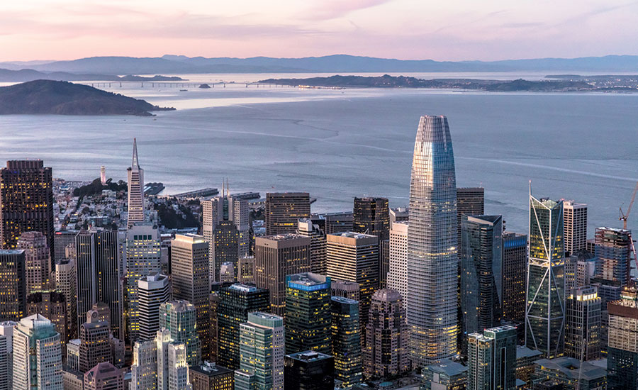
The Salesforce Tower surpasses the height of the city’s next-tallest building, the Transamerica Pyramid by more than 200 feet.
Photo © Jason O'Rear

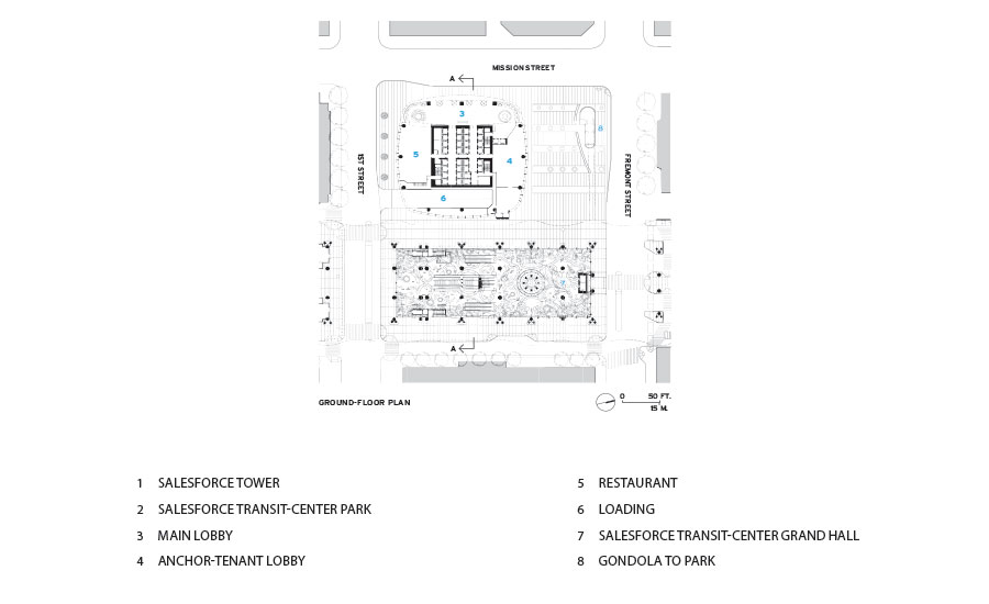
The tower was conceived together with a transit hub topped by a 5.4-acre public park.
Photo © Tim Griffith

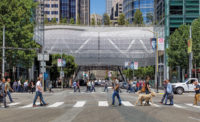
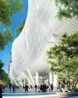
The four-block-long transit station’s bus deck bridges over several streets and is enclosed in a lace-like skin.
Photo © Jason O'Rear

Above street level, the building’s aluminum sunshade grid, which sits proud of the skin, adds texture and depth.
Photo courtesy Pelli Clarke Pelli Architects

At the ground, the highly transparent facade, supported by a system of horizontal trusses and cable nets, puts the marble-and-chrome lobby on display.
Photo © Jason O'Rear

At the ground, the highly transparent facade, supported by a system of horizontal trusses and cable nets, puts the marble-and-chrome lobby on display.
Photo © Vittoria Zupicich

The office floors for Salesforce employees are non-hierarchical, without private offices. Spaces for informal collaboration include a loungelike area with sofas and upholstered chairs.
Photo courtesy Salesforce

The scrim at the tower’s pinnacle becomes a canvas at night for an LED installation by artist Jim Campbell.
Photo © Tim Griffith

Image courtesy Pelli Clarke Pelli Architects

Image courtesy Pelli Clarke Pelli Architects

Image courtesy Pelli Clarke Pelli Architects


Architects & Firms
The Salesforce Tower has been an undeniable presence on San Francisco’s skyline for some time—since long before the spring of 2017, when it topped out. But now, with the completion of the 61-story, 1,070-foot-tall skyscraper earlier this year, the Pelli Clarke Pelli Architects–designed project has officially earned the titles of the city’s tallest structure and the tallest office building west of the Mississippi.
Additional Content:
Jump to credits & specifications
Of course, critics have decried the Salesforce Tower as the inappropriate Manhattanization of San Francisco. But though it is big (it encloses 1.4 million square feet) and is highly visible, it doesn’t loom. Square in plan, with rounded corners, the top third of the obelisk softly tapers. And while it might seem at first glance to be just another glass-clad tower that could have been built anywhere, it has features that make it a fitting symbol of this rapidly changing city and its startup economy, including a 150-foot-tall perforated-metal screen at the pinnacle: by day it helps the building’s top dissolve into the sky and conceals unsightly mechanical equipment, but at night, the scrim transforms into a giant canvas for an installation by local LED artist Jim Campbell.
Surpassing San Francisco’s former record holder, the 1972 Transamerica Pyramid, by more than 200 feet, the Salesforce Tower is nearly impossible to miss from almost any spot in San Francisco and beyond. But, at one point, it was not clear if the project—whose gestation period ended up being more than 10 years—would even get off the ground. In 2007, the developer Hines and architects Pelli Clarke Pelli won a competition with their proposal for the skyscraper and an adjacent transit hub, with a 5.4-acre public park on top designed by PWP Landscape Architecture. The two buildings, then known as the Transbay Tower and the Transbay Terminal, were conceived as the centerpieces of a much larger redevelopment zone at the edge of the city’s financial district, made possible in part by the demolition of an elevated freeway damaged in the 1989 Loma Prieta earthquake.
But the Great Recession that hit in late 2008 put the brakes on the tower’s construction. Ground wasn’t broken until 2013, after Boston Properties became the lead developer, assuming a 95 percent stake in the project. Later, the cloud-computing company Salesforce would acquire the naming rights for the skyscraper, with a lease for what would eventually total 900,000 square feet, including the two top floors. Subsequently, the company would also put its name on the transit center and the rooftop park, which are slated to open next month.
In the post-crash economic climate, the design team naturally faced pressure to be exceedingly practical. However, Fred Clarke, senior principal at Pelli Clarke Pelli, claims that no design sacrifices were made. He points to refinements like the rounded-glass corners, which consist of curved insulated glass panels rather than being assembled from faceted flat panes. And he calls out the exterior aluminum sunshades. The gridded system sits proud of the glass skin, adding texture and depth. Its white epoxy coating contains mica to make the most of the quality of light that is particular to San Francisco.
Still, there were some challenging developer demands, including a directive that there be no elements that would interfere with the tower’s dramatic views or that would hinder office layouts. For the structural engineer, Magnusson Klemencic Associates, this meant that the building could not rely on the typical seismic systems generally found in skyscrapers in earthquake-prone San Francisco. “There could be no perimeter braces, no outrigger trusses, no belt trusses,” says Ron Klemencic, chairman and CEO of the Seattle-based firm. Instead, the lateral system is confined to the 85-foot-square reinforced-concrete core with walls that are 4 feet thick at the base. Perimeter columns take only the gravity loads. There are three of these per face, placed about 40 feet apart, and none at the all-important curved corners or within the interior of the 25,000-square-foot floor plates. But even without a readily apparent seismic system, the tower is designed to sway 25 percent less in a quake than a more conventional one, says Klemencic.
This “quiet” but robust superstructure sits on a mat foundation with piles that extend more than 300 feet to bedrock. The team made the decision to go that deep at the outset of the project, when the sinking and listing of nearby Millennium Tower was known in construction circles, but before it had been widely publicized. The condominium building’s piles only go down about 70 feet, to the Colma clay layer.
But arguably more notable than the depth of the Salesforce Tower foundations, or the seemingly straightforward configuration of its superstructure, is the process used to engineer them—a methodology known as performance-based seismic design (PBSD). Under this alternative to code-prescribed techniques, designers and owners can develop an enhanced level of earthquake performance and devise a scheme tailored to that outcome.
Because PBSD depends on sophisticated computer-modeling techniques, engineers are able to “interrogate and analyze” the structure to determine the response of the building to ground motion and then “fine-tune and allocate strength where it is needed,” says Klemencic. Salesforce Tower provides an enhanced level of protection, beyond what is mandated by code for buildings with more than 5,000 occupants.
This advanced engineering will only be tested in an extreme event, of course. But other building systems will have an effect on occupants’ day-to-day well-being. Clarke touts the energy-conserving air-conditioning system. It takes advantage of outdoor air and San Francisco’s mild climate to provide “free cooling” when conditions are right. In conjunction with raised floor distribution, the system should improve indoor air quality and thermal comfort. It is one of many features that have helped the tower’s core and shell garner a LEED Platinum certification.
The Salesforce offices are also on track to earn their own Platinum rating. Mark Cavagnero Associates (MCA), working with Interior Architects, has designed the Salesforce floors, creating a non-hierarchical environment intended to encourage teamwork. The scheme includes “neighborhoods,” each comprising three floors connected with a communicating stair. Instead of private offices, the workplace has unassigned, open desks. In addition to conference rooms enclosed almost entirely in glass, there are spaces for less formal collaboration and socializing, including a kitchenette and a loungelike area with sofas and upholstered chairs. These more relaxed spaces occupy the prime part of each floor plate—the side that overlooks the park atop the transit center. “Marc wanted the best views and best light to be shared,” says MCA’s founding partner, Mark Cavagnero, referring to Salesforce CEO Marc Benioff.
Benioff’s workplace-as-community philosophy extends to the building’s top floor, which has dramatic views of the Golden Gate Bridge, Coit Tower, and the piers along the Embarcadero. There Cavagnero is creating a gathering and event space with a large kitchen and a café, rather than executive offices, as one might expect. The facility is envisioned as a “living room” of which customers, employees, their families, and even the public could take advantage.
This floor is still under construction, so it is too soon to know just how accessible this space will be to non-Salesforce employees. But in many respects, the tower is already proving a success. Its leasing is virtually complete—with tenants that include coworking giant WeWork, consulting firm Accenture, and real-estate brokerage CBRE—but its impact is even further-reaching. The tower has refocused the energy of downtown with a sophisticated new skyline topper emblematic of the future.
Back to the the Tall Buildings
CreditsArchitect: Pelli Clarke Pelli Architects 1056 Chapel Street New Haven, CT 06510 203-777-2515 www.pcparch.com
Personnel in architect's firm who should receive special credit: Cesar Pelli, FAIA, RIBA, JIA Fred Clarke, FAIA, RIBA, JIA Edward Dionne, AIA Chris Herring, RA IIeana Dumitriu
Architect of record: Kendall-Heaton Associates 3050 Post Oak Blvd Suite 1000 Houston, TX 77056 713-877-1192 kendall-heaton.com
Personnel in architect's firm who should receive special credit: Rollie Childers, AIA Daniel Dupuis, AIA Brandon Beal, AIA James Simone, AIA Leigh Rogers, AIA Josh Mullin Veronica Escobar Luis Baena David Davis
Artist: Jim Campbell Studio
Engineers Structural: Magnusson Klemencic Associates MEP: WSP Group Civil: BKF Engineers Geotechnical: Arup
Consultants: Curtainwall Consultant: Morrison Hershfield Security / Code Consultant: Jensen Hughes, AV/Telecommuncations: WSP Acoustics: Cerami & Associates LEED/Environmental Consultant: Environmental Building Solutions: Stok Vertical Transportation Consultant: Persohn/Hahn Associates Fire Life Safety: WSP Group Lighting Designer: Horton Lees Brogden Lighting Design Landscape Architect: Peter Walker & Partners, Landscape Architect of Record: RHAA Graphics and Wayfinding Consultant: Debra Nichols Design Transportation/Parking Consultant: HWA Parking Building Management and Controls: HMA Commissioning: Comand Commisioning Aerial Tram Consultant: Engineering Specialties Group Façade Access Consulatant: C.S. Caulkins Co., Inc. Lighting: HLB Lighting Design Inc. Traffic Consultant: Fehr & Peers
General contractor: Clark Hathaway Dinwiddie Joint Venture
Photographer: Vittoria Zupicich, Tim Griffin, Jason O’Rear |
SpecificationsExterior Cladding Metal/glass curtain wall: Benson Industries Flat Glass: Tecnoglass/ Guardian AG-50 Curved Glass: Sunglass / Guardian AG-50
Roofing Built-up roofing: Siplast SBS – modified bitumen membrane
Doors Revolving Door Entrances: Boon Edam Crystal TQ Entrances: Ellison Balance Doors Entrances: Dawson Doors
Hardware Locksets: Sargent 8200 Closers: Norton 210 Series Exit devices: Sargent 80 Pulls: Sargent 80 Series ET Lever F Security devices: Alvarado SU5000 Turnstiles Other special hardware:
Interior Finishes Lobby Walls: Marble, Calacatta Jule from Campolonghi Lobby Floors: Limestone, Vera Gold from Campolonghi Lobby Wall Accents: Stainless Steel, from SWS Lobby Accent Lighting: Lightplane, from Forms & Surfaces Acoustical ceilings: Armstrong Optima Suspension grid: Armstrong Silhouette XL Special surfacing: Acoustical Plaster by BASWAphon Floor and wall tile: Casalgrande Padana: Granitoker-Metalwood Resilient flooring: Armstrong Excelon, GTI Uni by Gerflor Carpet: Classic Tile by Shaw Raised flooring: Concore CC150 by Tate
Lighting Interior ambient lighting: Lithonia, LaMar Lighting, Luna Downlights: Birchwood, Gotham, Exterior: MTR Column by Selux; Ritorno Round Symmetrical by Selux, Lumenpulse, Boca Flasher, Lucifer, Elliptipar, USAI, AION LED, Finelite, AXIS,
Conveyance Elevators: Schindler Group
Plumbing [putting each product on a separate line, enter in this way: "Product: Manufacturer Name"] K-4325 WC: Kohler K-4904 Urinal: Kohler K-2214 Sink: Kohler
Energy Energy management or building automation system: Syserco |


