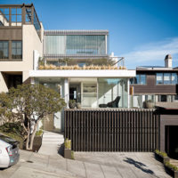
Float Station by Jensen Architects
California

A transparent addition allows passersby to view the goings-on inside.
Photo © Cesar Rubio

The double-height glazing, along with a circular skylight, brings abundant dayllight into the reception area and guest lounge.
Photo © Cesar Rubio

The double-height glazing, along with a circular skylight, brings abundant dayllight into the reception area and guest lounge.
Photo © Cesar Rubio

Private treatment rooms feature ceiling cove lighting and illuminated tubs. Walls and ceilings are coated in white epoxy to resist the corrosive effects of salt water. Wood and white quartz rocks for shower floors add a natural element.
Photo © Cesar Rubio

Station’s luminous, open reception area welcomes visitors.
Photo © Cesar Rubio


Architects & Firms
Flotation therapy, in which one lies suspended in a sensory-deprivation tank, became popular in the 1970s as a way to reach another level of consciousness. Recently, the minimalistic design approach of San Francisco–based Jensen Architects is aiding its revival as a way to de-stress and deal with chronic pain. Located in the Silicon Valley town of Campbell, California, Float Station offers light-filled transparent spaces offset by hefty concrete, stone, and wood, and also meets rigorous programmatic requirements.
Additional Content:
Jump to credits & specifications
To help clients transition from their harried lives, Float Station co-owner Ryan Ariko wanted to create an environment that would draw them in gradually. He also didn’t want the space to feel like a spa, with dim lighting, because, he says, “The experience is very different and enlivening.”
For the 2,400-square-foot project, the architects reimagined an existing one-story commercial building, removing everything but the roof and concrete-masonry unit walls on either side. First they added a double-height, double-glazed reception area in full view of the street. According to firm principal Mark Jensen, the program “is ultimately quite intimate, so it may seem counterintuitive, but we wanted to be transparent about what was going on in here.”
Jensen and his team then created a new masonry facade for the remaining structure on its south side. Clad with concrete veneer that looks board-formed, this textured wall transects the glass volume, providing an outdoor surface that displays an illuminated sign and that, once indoors, partitions off the entrance, where clients are prompted to sit and remove their shoes before checking in. Just beyond this area is the guest lounge, where an adjoining corridor leads to the five acoustically insulated, 150-square-foot float rooms, each dominated by a fiberglass flotation pod enclosing a shallow pool of buoying, heated salt water.
To avoid spa clichés, the design team chose materials that were substantial and gave a sense of permanence, such as the concrete veneer and an enormous marble-clad coffee table. Against a backdrop of white drywall, this quiet materiality keeps the space from feeling clinical, as does the strategic use of light.
In addition to abundant daylight in the open public area, resulting from the glazed addition, and circular skylights in the lounge and corridor, the design team inserted a band of color-changing LED cove lighting that continues into the private float rooms. Creating an illusion that the ceiling is floating within walls that continue beyond the ceiling plane, this device acts as an architectural foil for any fears of potential claustrophobia. The coves also conceal air supply and return vents in the float rooms.
In the reception area, the cove lighting is programmed to correspond to the hour, changing its hues like daylight in order to support the body’s circadian rhythms. The coves in the float rooms provide a gentle white light that Ariko plans to dim and brighten automatically in order to control the float experience without disrupting the client’s meditative state. After entering, they can operate the lights inside the tanks.
The architects were able to integrate the functionality in such a seamless way that the luminous spaces here seem fluid and uncomplicated. However, says Jensen, “a wonky, geeky interest in technology was important, because there’s a lot of back-end stuff to make this all work.”
CreditsArchitect: Jensen Architects—Mark Jensen, principal
Engineers: Coffman Engineering (structural, m/e/p); Acoustic Arts and Engineering (acoustical); Nterra Group (civil)
General contractor: Duerson Construction |
SpecificationsCurtain wall Arcadia
Concrete veneer 2Stone
Lighting Ketra (cove, LED smart lamps, controls); Halo (recessed downlights); Edge (pendant); B-K, Cooper (exterior); ETC (controls) |


