Library at A.J. Condit Elementary School by VLK Architects
Houston

To link the spirit of the old school to the new building, VLK Architects salvaged its 1928 brick archway, and made that a feature wall next to the entrance.
Photo © Chad M. Davis

To link the spirit of the old school to the new building, VLK Architects salvaged its 1928 brick archway, and made that a feature wall next to the entrance.
Photo © Chad M. Davis

The hall outside second-floor classrooms and labs, on the landing overlooking the central “learning commons,” doubles as a breakout space.
Photo © Chad M. Davis

A first-floor teaching theater extends the library’s new function as a media hub.
Photo © Chad M. Davis

Curvy shelves can be arranged to form reading nooks.
Photo © Chad M. Davis


Architects & Firms
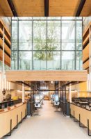
The new campus built by VLK Architects to house the 100-year-old A.J. Condit Elementary School in the Houston suburb of Bellaire, is a working model of a new era in learning. Outside, a major shift from the previous rundown brick-clad box that was razed to make way for the new project is a replacement—comprised of three elbow-shaped volumes that curve toward each other—that holds 24, K-5 classrooms only on outer walls, instead of on either side of narrow straight corridors. And each classroom’s new interior wall is made of glass to connect it to the vaulted two-story space; second-story classrooms open onto a curvy landing with balconies overlooking the commons below.
The additional open space to accommodate the growing student population was a must. Beyond that, VLK’s program of an attractive centralized “learning commons” with all classrooms connecting to it, gave the school district a tool for addressing what it describes as an advancement in education methodology.
That’s because the commons, with its spaces for informal gathering and solo learning, is also Condit’s library—still stocked with books but reimagined without walls as a free-flowing media hub with various points of entry where students can use a computer and conduct self-checkouts according to the honor system, just outside the classroom door on every level.
“The learning commons changes the way the library is used. By weaving and threading the classrooms through the commons, learners and educators have access to the resources but in a collaborative and open way,” says VLK project designer Richard Hunt.
Hunt says the new library concept has been talked about in professional school design circles, but he had not seen the idea built before his team took on the challenge—and especially not among public schools.
The open book shelves can be arranged in a radius shape, to make use of dry-erase boards and seating built into their curved sides. The shelving and other soft seating options are on casters, so that students can “redefine their spaces,” Hunt explains.
To encourage students to move from classrooms to areas of independent learning, an element of fun was also key. “There’s a tree-house aspect to the space, because of the overlook down to the first floor. We were also allowed to bring in a different materials’ palette,” Hunt says of the rugs and playhouse-style seating shapes. At first glance, visitors notice the blue- and green-painted signage and soffits. To add interest to a rectangular, white two-story volume that holds two of the schools’ science labs and extends up into the vaulted space like a column, VLK applied a graphic of the school’s name in blue. The color scheme continues in the color-block pathways, which break up wall-to-wall carpeting on the ground floor.
While the floor plan is inviting for teachers and students (Hunt says the principal tests new hires by asking them how they’d incorporate the space into their lessons), noise-control was a consideration. Ironically, the layout which raised the noise question also helps to mitigate it, says Chad Davis, VLK senior associate: “The shape is much like an auditorium. The curves of the balconies are actually part of the acoustic management. You have great acoustics when you have a dynamic space.” Acoustic tiles shaped like lily pads suspended from the ceiling also help. But Hunt says committing to this building meant faculty placed a higher priority on active learning. “They understand that this is about open discussion between the kids, not something that’s library quiet.”


