Rijnstraat 8 by OMA
The Hague

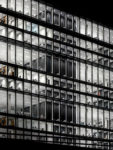
Apart from the vertical concrete cores, the 460-foot-long structure is now fully glazed.
Photo © Delfino Sisto Legnani and Marco Cappelletti

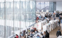
Approximately 6,000 civil servants work in the new ministry building.
Photo © Nick Guttrige

The atria, now glazed on all sides, bring daylight deep into the interiors.
Photo © Delfino Sisto Legnani and Marco Cappelletti

New staircases make a bold graphic statement.
Photo © Nick Guttrige

Before: The building’s exterior changed significantly.
Image courtesy OMA

After: The building’s exterior changed significantly.
Image courtesy OMA

The OMA-designed interiors were enriched with found works of art from the archives.
Photo © Delfino Sisto Legnani and Marco Cappelletti

Yellow escalators add a pop of color.
Photo © Nick Guttrige

Nature is brought inside the office.
Photo © Nick Guttrige

LED lighting is used throughout the entire building.
Photo © Delfino Sisto Legnani and Marco Cappelletti

Photo © Nick Guttrige

Image courtesy OMA

Image courtesy OMA

Image courtesy OMA

Image courtesy OMA




Architects & Firms
The small nation of The Netherlands has taken on an outsize role in international affairs, as a founding member of the European Union and as headquarters of the International Criminal Court, which is based in The Hague, also the seat of Dutch government. But this growth in bureaucracy could not be accommodated in the medieval structures that housed the small Dutch executive and legislative branches, and a new administration hub grew near the city’s central railway station. OMA—which is known for its international work but is based in nearby Rotterdam—has converted a building, completed only in 1992, which was a keystone for this development, paring back a brilliantly conceived but cluttered structure and creating a platform for a more flexible bureaucracy.
Originally home to the Ministry of Housing, Spatial Planning and the Environment (VROM), the building was a 1 million-squarefoot hulking affirmation of the expansive ambitions of the new Netherlands. Designed by the Dutch architect Jan Hoogstad, the VROM was built around five monumental prefabricated concrete cores, each 16 stories and 194 feet high—taking cues from the only other nearby building, Herman Hertzberger’s Ministry of Social Welfare and Employment (1990), a complex divided into separate cruciform buildings to match the more diminutive urban scale of the historic city. (Tellingly, Hertzberger himself is currently converting that out-of-date complex into housing.)
Additional Content:
Jump to credits & specifications
In the original VROM, circulation wrapped around each of the cores, which also supported a huge concrete girder off which hung the floors down to the fourth story, allowing a tram and a public passageway beneath the northern section of the building. The VROM was both a gateway to The Hague from the railway station and a bridge over one of its main pedestrian and public-transport routes. It was an emphatic civic statement and, with its glazed atria, a declaration of responsibility to the public. Yet the VROM turned out to be almost instantly obsolete. The Dutch public purse began to shrink and the size of government along with it. The building had been designed without much thought for open-plan working—the offices were small and enclosed— and, despite the vast atria on the eastern side of the building, only select offices had views onto them. There were few central meeting points, an important omission if the building was to become more flexible and adapt to hosting different ministries in the future. So, in November 2012, three firms were invited to compete to renovate the building, and 18 months later—with the design taken to more advanced stages—OMA was announced as the winner.
What the architects have done is to reinvent one of the key buildings in the evolution of the Dutch state in a stunning fashion. Undertaken with the full cooperation of Hoogstad, the renovation reveals the noblest intentions of the original. Now named after its address, Rijnstraat 8 is designed to house, for now, the Ministry of Infrastructure and Water Management, the upper ranks of immigration services, and some elements of the Ministry of Foreign Affairs. The floor area has shrunk slightly, but the building has gained a far greater level of flexibility and a real transparency, rather than a metaphorical one.
An appreciation of the programmatic approach we have come to expect from OMA—prioritizing the user experience over the construction of the building—is only partially useful in understanding the ingenuity at work at Rijnstraat 8. Indeed, OMA has lavished the same consideration on a 25-year-old structure as it has on such centuries-old ones as the Prada Foundation in Milan and the Fondaco dei Tedeschi in Venice. Ellen van Loon, the OMA partner in charge, explains how they revealed the engineering of the original building. “The steel structure was covered with fire-rated board, so all this amazing construction was hidden. We took the board off all the structures and painted them instead. The full structure is legible now.”
A new circulation spine was added along the entire eastern side of the building, which runs along the back of the atria. Previously, only the long corridors on this side were open to the exterior, but now, with full glazing on the interior office space, light from the atria reaches deep into the floor plates. Staircases running across the glazed back wall of the atria connect floors, as do elevators at the cores. This extra circulation is suspended from a new steel truss that sits across the top of the cores. It makes a bold, almost graphic mark at the back of the bright, glazed space. By removing two entire floors, new double-height floors have been created for meeting spaces. Further floor space has been surrendered to the passageway underneath the building, which is now double the original size. The southernmost core has been largely replaced with a diffused system of columns, between 15 inches and 2 feet in diameter, creating a more conventional structure, with offices on the perimeter of the building. Here the atrium has been removed, the ground floor extended out into that space, and glazing wrapped around the three facades.
The interiors have been done inexpensively but with verve and wit. Structure and circulation provide most of the moments of visual interest. It is cheering to see the yellow escalators from the OMA-designed Seattle Central Library repeated throughout this building. The marble-like carpet tiles on the ministerial levels are a blast. New structural components have been painted black, giving the building visual depth. An especially enchanting moment has been created on the top floor, where the intersection of old and new structures creates the bones of a roof pavilion: an ideal space for parties and events.
Dutch architects are often at their most engaging when they work at large scale, grappling with how to make it humane. Ironically, unlike the larger nations in Europe, and despite its colonial past, The Netherlands had never built gargantuan public buildings to administer its empire and thus lacked the infrastructure for the era of bigger government. In revisiting the VROM, OMA has reinvented an important structure in which the ambitions of the Dutch state—to be accountable and effective—are expressed in a profoundly modern way.
CreditsArchitect: OMA — Ellen van Loon, partner in charge; Bart Nicolaas, Anita Ernodi, Alex de Jong, Kees van Casteren, team
Engineers Arup (structural)
Consultants Level Acoustics (acoustics); DGMR (fire safety)
Client: Rijksvastgoedbedrijf, The Hague |
SpecificationsGlazing Saint-Gobain
Solar Panels Oranjedak
Freestanding Furniture Plan@office
Fixed Furniture Van Assem; Intos
Lighting Etap (LEDs); Breda; Maas & Hagoort |


