Preservationists Protest Changes to the AT&T Building

Philip Johnson on Time cover January 8, 1979.
Photo © Time
Thirty-odd years ago, if you had announced a plan to rip apart the base of Philip Johnson and John Burgee’s AT&T tower in New York, you would have had a line of architects stretching down Madison Avenue hoping for the chance to swing a sledgehammer blow against America’s most controversial (and hated) new building.
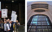
How times change. In November, architects and preservationists gathered in front of the Chippendale-capped building to protest a plan by Snøhetta architects that would do just that. Produced for a development team led by the Olayan Group, Snøhetta’s scheme would replace the pink granite front facade at the lower levels with a diaphanous glass curtain wall. The building’s Postmodern monumentality would be replaced by the kind of transparency made fashionable by Apple stores everywhere.
That proposed design would also summarily undermine the building’s architectonic integrity, which is predicated upon the solidity of its base. What would become of the lobby interiors is unclear, but the facade-ectomy would completely transform their coherence. The entire endeavor has the whiff of marketing rather than architecture, an attempt to generate excitement for a building that has been vacant since its last owner, the Sony Corporation, departed in 2016.
Such draconian steps are unacceptable because, loved or loathed, the tower’s significance both as a work of architecture and a defining piece of New York’s built history is indisputable.
That sense is widely shared. Upon the release of the proposal, outrage spread rapidly on social media, generating the hashtag meme #saveATT, before moving into the streets. “Hands off my Johnson,” read one memorable placard at the demonstration in front of the building. (Manning the barricades was no less an eminence than Robert A.M. Stern, his presence recalling a time decades earlier when Johnson, his mentor, had taken to the streets to protest the demolition of McKim, Mead & White’s Pennsylvania Station.) What was once America’s most notorious new building is now a bona fide Postmodern icon.
It may become an official one, as well. The tower, now simply 550 Madison Avenue, is just barely old enough for landmark designation, and preservationists hastily moved forward on their applications in response to Snøhetta’s proposed alterations. It is now grinding its way through the bureaucratic machinery of New York’s Landmarks Preservation Commission.
The building was a polarizing Postmodern landmark well before it opened, in 1984. Five years earlier, Johnson had appeared glowering on the cover of Time magazine with a slablike model of the building cradled in his hands as if it were a tablet delivered from the heights of Mt. Sinai. “Johnson did not create the way of thinking that his building reflects,” the critic Robert Hughes wrote in the accompanying story, “but he helped bring it about, and now he has given it a degree of public validity that cannot help affecting other corporate clients.”
While it did boost the Postmodern movement, Johnson’s “way of thinking” was never quite clear. Was the whole thing one of his winkwink, nudge-nudge jokes, as the highboy top suggested? Or was he serious, as the monumental base, with its gloomy arcades, would have one believe? It was hard to tell, and Johnson, who liked to keep people guessing, played it both ways, depending on who asked.
That attitude did not sit well with critics. In the Times, Ada Louise Huxtable described the AT&T as a “monumental demonstration of quixotic aesthetic intelligence rather than of art.” Writing in The Village Voice, Michael Sorkin was even less generous: “The so-called ‘post-modern’ styling in which AT&T has been tarted up is simply a graceless attempt to disguise what is really the same old building by cloaking it in this week’s drag, and by trying to hide behind the reputations of the blameless dead.”
At least technically, Sorkin was not quite accurate, and therein lies the root of the current predicament. AT&T is in fact not the same old skyscraper but a bespoke tower, tailored to the desires of what was then America’s preeminent corporation. Though it rises to the height of a 60-story building, it is in fact only 36—the product of luxuriously tall floors and of its arcaded base, which reaches up six stories to an elevator “sky lobby” with a mural by the artist Dorothea Rockburne. (The fate of the painting is uncertain in the Snøhetta renovation.)
The corporation that the tower was tailored for never got to live in it, and its various successors have struggled with its eccentricities. By the time it was finished, At&T was a shell of its former self, having been forced by federal courts to give up its monopoly on all telephone service in the U.S. Less than a decade later, the corporation sold the building to Sony, which commissioned Gwathmey Siegel to enclose Johnson’s monumental ground-floor arcade and transform it into retail space.
That was an ill-conceived decision, and one that Snøhetta must grapple with today as it tries to turn the building into a functional contemporary office tower. To the firm’s credit, it has proposed an expansion of the public arcade behind the building, to be accomplished by the demolition of a freestanding annex structure, conceived as a museum, that has never been successful. Better access to those expanded pubic spaces would be welcome.
“We’re trying to take in constructive criticism,” says Snøhetta partner Craig Dykers, who has promised adjustments to the plan. “We’re trying to make a positive way forward.”
But moving forward should not entail erasing the past, however complex and contradictory that might be.


