La Massana Fine Arts School by Carme Pinós
Barcelona

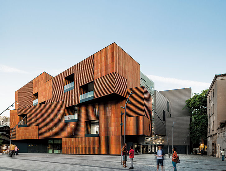
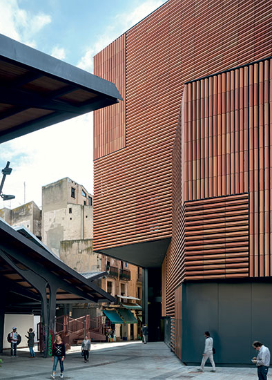
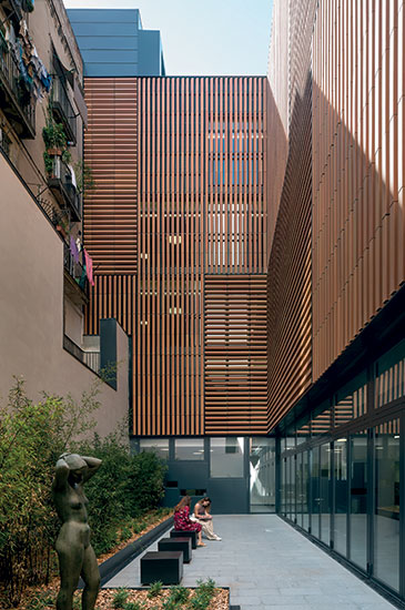
The dynamic massing is lightened by cantilevers and the louvered ceramic cladding, which shields the interiors from a crowded plaza. Balconies mark view corridors through the building; a corner entrance on the right is indicated by subdued gray ceramic cladding on a narrow side street.
Photo © Iñigo Bujedo Aguirre

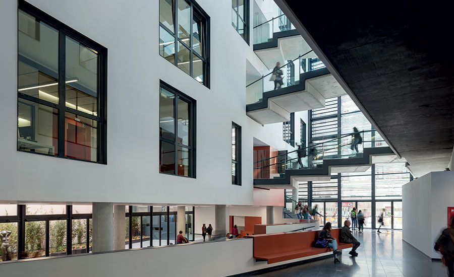
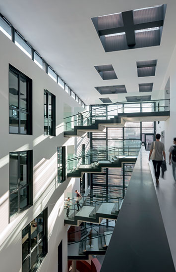
Studio and classroom wings surround a central atrium crisscrossed by bridges and lined with windows like a street.
Photo © Duccio Malagamba

A sunken student lounge overlooks a light court with classroom corridors around it.
Photo © Duccio Malagamba

Photo © Duccio Malagamba

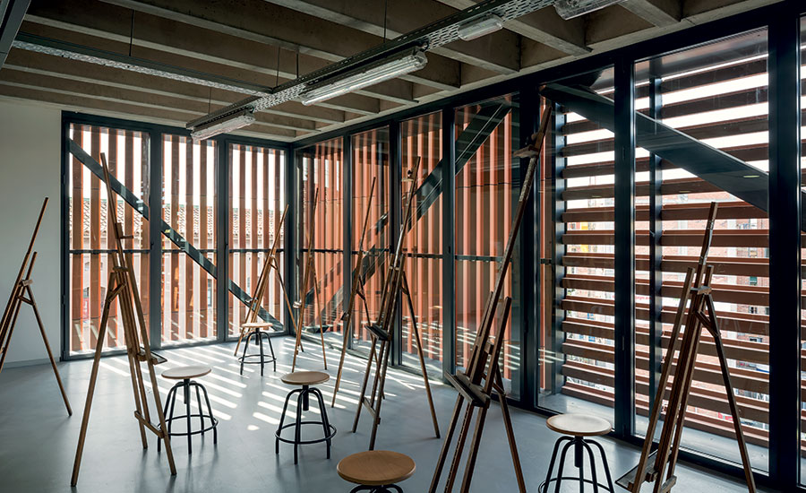
A painting studio has windows behind the ceramic louvers of the main facade.
Photo © Duccio Malagamba

Photo © Duccio Malagamba

Image courtesy Carme Pinós

Image courtesy Carme Pinós

Image courtesy Carme Pinós

Image courtesy Carme Pinós

Image courtesy Carme Pinós


Architects & Firms
When commissioned to design a new home for La Massana Fine Arts School in Barcelona, located behind the city’s famous Boqueria Market, architect Carme Pinós faced a double challenge—wrestling with both the density of the city’s Medieval Raval quarter and with the masses of tourists who flood the plaza that the building faces. Affiliated with the University of Barcelona, Massana is a hybrid, offering university degrees in the visual arts and design, vocational degrees in the applied arts, and an extensive high school program for local students.
Pinós’s response was to turn the school inward around a skylit interior “street” or atrium. This solution was inspired, she says, by the building that was the school’s quarters since its founding in 1929, at the nearby Medieval Santa Creu Hospital, where it was walled off from the street and organized around a leafy courtyard, one of those surprising spaces hidden inside many blocks of the city’s Gothic Quarter. But unlike the outdated facilities in the former hospital, Pinós’s design also engages the mobbed spaces outside in a guarded way, with gestures such as a glazed exhibit area for student work on the ground floor, and large balcony windows scattered across the otherwise opaque facade. With its red ceramic cladding and dynamic massing, the building is a striking presence on the plaza.
Additional Content:
Jump to credits & specifications
Together with the school, Pinós redesigned the square itself, known as the Plaza de la Gardunya, as well as a new rear facade for the Boqueria Market and a row of multifamily housing—both public and market-rate—still under construction opposite the school. This operation of “urban suture,” as she calls it, is the result of a city competition she won in 2006 for the school site and plaza. Much of the site had been cleared in the 1960s for an office tower that was never built. Pinós designed underground parking and loading docks for the market under the square, with entry and exit ramps discreetly incorporated into the new buildings, and included a grouping of trees and benches at the plaza’s center. She also resolved the exposed ends of the market’s shed roofs with overlapping peaks, to create a more human scale on the plaza and a more protective, though open, enclosure.
Pinós’s compositional technique typically involves syncopated openings, overlapping angles, large cantilevers, and fragmented, dynamic massing. For the school, she used these strategies to lighten the impact of the 120,000-square-foot building on the neighborhood, tailoring it to the narrow streets on three sides. At the corner entrance, for example, she pulled the school back from the street line to create a small, secondary plaza, and covered the entry itself with a dramatic cantilevered volume, the one gesture counterbalancing the other. The windows on this side of the building feature folding louvered shutters, for a domestic touch, and the ceramic cladding is a quiet gray color, in contrast to the terra-cotta hue of the main facade.
Despite the complexity of her design, Pinós used a simple scheme in which two L-shaped volumes interlock around an atrium. Lining the plaza and the side street to the east, the reddish volume is finished with a ventilated skin of ceramic louvers, crafted by the noted local ceramist Toni Cumella. It contains art studios and workshops, with large windows hidden behind the ceramic screening. Taking pride of place is the top-floor painting studio in the corner, with northern light, a 20-foot ceiling, and a mezzanine.
The gray ceramic volume folds into the block behind the workshops to form the back wall of the atrium and contains classrooms, which overlook the central space. Corridors on the opposite side face a rear light well that the building shares with the existing apartment buildings on the block.
The atrium is an architectural tour-deforce at the heart of the building. Sky bridges at various levels, staggered in position and rippling upward in groups of steps from the classroom wing to the workshops, crisscross it–spanning a 5-foot rise in grade from the back of the site to the plaza, which Pinós has carried up through every floor. The long sides of the atrium are solid, to reinforce its character as an interior street, with punctured openings for the classroom windows and along the corridors of the workshop wing, while the ground floor is completely open. Overlooking the plaza on one side is the exhibit space; 5 feet below it, the student lounge, with lockers and work tables designed by Pinós, has a more protected position under the classrooms, with windows facing the light court.
The atrium receives direct sunlight throughout the day from different sides. Up on the sky bridges, view corridors pierce through the entire building, ending at the large balconies on the main facade, an idea that Pinós says was inspired by the building cuttings of artist Gordon Matta-Clark. The sky bridges add a Piranesian complexity to the otherwise straightforward circulation, enriching the experience of the students’ constant movement through the building.
In the 1980s, the Raval neighborhood was a degraded, crime-ridden place that seemed beyond recovery. But years of heavy municipal investment, including Richard Meier’s MACBA Museum of Art in 1995, have proved almost too successful. The struggle now is to maintain a balance between the demands of mass tourism—cheap food, trinkets, lodging, and amusements—and the role of the district as a living part of a vibrant city.
With Carme Pinós’s La Massana Fine Arts School and Plaza de la Gardunya, Barcelona has taken a stand to accommodate both sides of this difficult equation. Her powerful, though hardly solemn, design for the school claims its place on the square, clearly establishing the complex terms of this interaction.
CreditsArchitect: Carme Pinós — Carme Pinós, principal; Samuel Arriola, project manager; Elsa Martí, Roberto Carlos García, Holger Hennefarth, Blanca Perote, Ana Isabel Rodriguez, Inés Senghour, Francisco Olivas, design team
Engineers: BOMA, Masala Consultors (structural); Indus (facilities, acoustical, budget)
General contractor: UTE Massana
Client: Consorci d’Educació de Barcelona |
SpecificationsCeramic cladding Ceramica Cumella
Windows Technal, Schüco, Jansen
Furnishings Estudio Carme Pinós (fixed furniture); Ergomobel, Mobles 114 (chairs); FAMO (tables); Sellex (shelving units); Figueras (auditorium seats) |

