Crest Apartments by Michael Maltzan Architecture
Van Nuys, California

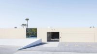
Crest’s deep, narrow parcel extends from a busy commercial strip to a single-family residential neighborhood. Along the street, a stair tower rises alongside the volume housing the glass-enclosed lobby at grade.
Photo © Iwan Baan
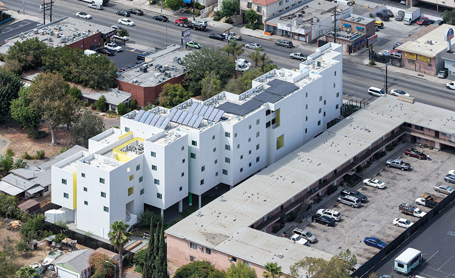
The rooftops incorporate outdoor terraces, as well as PV and solar-thermal panels.
Photo © Iwan Baan

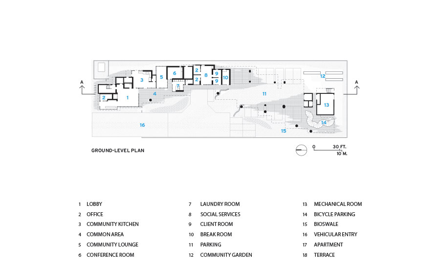
The massing—an arcing set of volumes—modulates the scale while defining varied outdoor spaces.
Photo © Iwan Baan

The lobby connects visually and spatially with the site’s landscape.
Photo © Iwan Baan

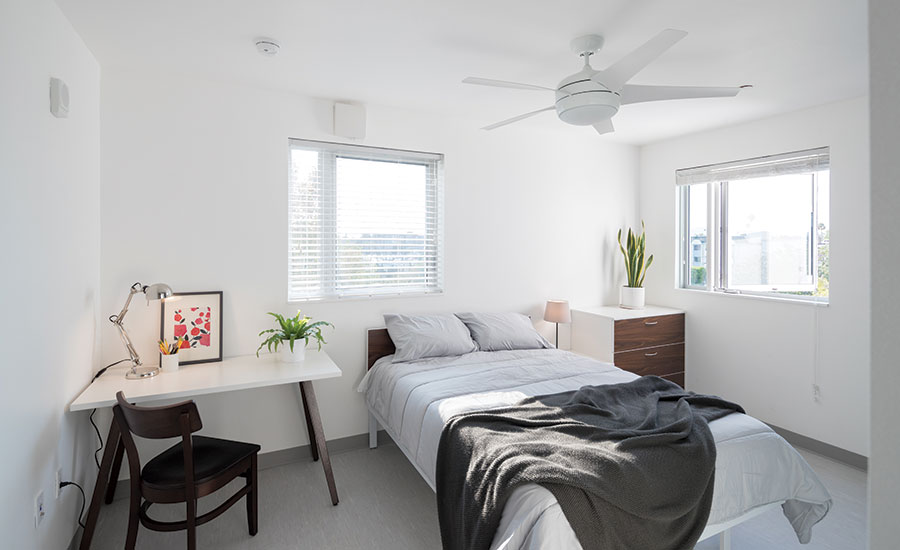
The 64 studio apartments are daylight-filled and airy.
Photo © Iwan Baan

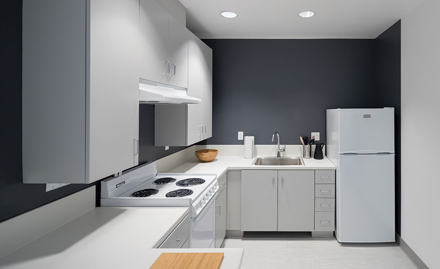
The apartments all have full kitchens—a key amenity for achieving stable lifestyles, as earlier SRHT projects have revealed.
Photo © Iwan Baan

Throughout the building, occasional shots of color reflect off surrounding white stucco walls, generating atmospheric effects, as in a stairwell or exterior light well.
Photo © Iwan Baan

Throughout the building, occasional shots of color reflect off surrounding white stucco walls, generating atmospheric effects, as in a stairwell or exterior light well.
Photo © Iwan Baan

Image courtesy Michael Maltzan Architecture

Image courtesy Michael Maltzan Architecture

Image courtesy Michael Maltzan Architecture

Image courtesy Michael Maltzan Architecture


Architects & Firms
As Crest Apartments in Van Nuys, California, neared completion, this glowing-white, crisp-lined building— with its gently arcing cluster of volumes—began to attract inquiries from market-rate renters. But, as those aspiring tenants soon learned, this was actually permanent supportive housing for formerly homeless men and women. Crest’s owner-developer, the Skid Row Housing Trust (SRHT), has always considered innovative, high-quality design fundamental to its philosophy and goal of creating places of pride for both its residents and their neighbors. “Yet, interestingly enough, this had one of the tightest budgets of the four residential projects we’ve done for the Trust,” says architect Michael Maltzan. “Clearly, we had to be inventive with modest means, but I also think people were responding to an underlying familiarity—to a familiar approach reinterpreted.”
In transformative ways, Crest took design cues from “dingbats”—the TIGHT SITE Crest’s deep, narrow parcel extends from a busy commercial strip to a single-family residential neighborhood. Along the street, a stair tower rises alongside the volume housing the glass-enclosed lobby at grade. The rooftops incorporate outdoor terraces, as well as PV and solar-thermal panels. much-derided low-rise apartment buildings common in Van Nuys and the surrounding San Fernando Valley. Across this sprawling suburban area northwest of downtown Los Angeles, dingbats follow a classic formula: boxy, cheap-looking, and raised on columns to accommodate parking. Like those low-cost structures, Crest is modest in height (five stories), covered in stucco, and built (at least partially) on pilotis to free up the ground plane, but the similarities end there. Crest’s skin is smooth, luminous, and precisely detailed; its massing is complex and subtle; and instead of hovering above barren concrete paving, the 45,000-square-foot building allows landscaping to thrive beneath and around it.
Additional Content:
Jump to credits & specifications
“We learned from our other supportive housing for the Trust,” says Maltzan, “how important outdoor space is to a sense of community, and how essential community is to recovery.” But with those previous projects, all built since 2006—Rainbow, New Carver, and Star Apartments (RECORD, June 2015)—the designers had to eke out open-air opportunities within dense urban settings. By contrast, Crest had the advantage of being SRHT’s first project far from the downtown core, bordering on suburbia. Nonetheless, its roughly rectangular parcel was tight: nearly 300 feet deep with only 90 feet of street frontage, it had to fit in a code-mandated fire lane and firetruck turning radius.
Yet the constraints ultimately drove key design moves, including the arcing footprint to accommodate fire-rig maneuvers. And the emergency-lane conundrum inspired the architects to rethink a cost-saving convention, elevating the locally ubiquitous dingbat into an organic integration of landscape and building.
The resulting $23.6 million project (with $14.2 million in construction costs) is a modified bar configuration: a sculptural, curving cluster of blocky volumes that read together as a whole while mediating, in their varied heights, between the busy commercial strip fronting the site and the single-family residential neighborhood behind it. Freestanding within the lot, the bowed footprint generated diverse and protected outdoor congregating spaces, including one for barbecuing and another for community gardens. “Giving people options, letting them make decisions for themselves tends toward the best outcomes,” says SRHT CEO Mike Alvidrez.
Inside, Crest’s street-level amenities—its airy lobby, lounge, communal kitchen, laundry room, and supportiveservice offices—have a glassy transparency, connecting them to the outdoors. With native tall grasses and other drought-tolerant plantings, the grounds, by project landscape architect Tina Chee (then a senior designer with SWA) embrace the inherent beauty of vacant lots—what Maltzan calls “feral” or “survivor” landscapes. “It’s full of self-seeding and regenerative plantings that parallel Crest’s mission,” says Chee. Underfoot surfaces, even the fire route and parking spots, are pervious, universally accessible, and sprouting with vegetation. Bioswales, capturing site rainwater and runoff, are among the features that earned Crest LEED Platinum certification.
Upstairs, the wood-frame building, with concrete structure at grade, has 64 studio apartments, housing formerly homeless people with chronic health conditions (36 percent of the units are set aside for veterans). Maltzan says he’s always avoided “the bleak institutional trope of double-loaded corridors.” But Crest’s site restrictions left few alternatives. So his team rethought the condition, giving it wide passageways (that also serve as gathering spaces), punctuated by light wells, open-air terraces, and journey-enhancing bends in the path. Similarly resourceful are the many transformations of low-cost materials and components, including expressive arrays of simple, off-the-shelf fluorescent fixtures. And, amid Crest’s primarily white vertical surfaces, deftly placed planes of color generate atmospheric and spatial effects. Animated by sunlight, these insertions of yellow, green, or blue alter the reading and character of an entire passage, bouncing color against the white stucco walls and polished concrete floors. Extending the journey metaphor, the studio apartments (offering full kitchens, large bathrooms, and generous daylight) have U-configurations for spatial variety within a single room.
With such projects, however, “there’s often a question of how they’ll fit into the community,” says Alvidrez, underscoring SRHT’s commitment to being good neighbors. “We tend to encounter initial trepidation about formerly homeless residents.” All the more reason, he says, to deploy “great design to begin changing negative perceptions.” But even he was surprised that Crest won over not only locals, but adjoining neighborhood councils. “They were all at the grand opening,” he continues. “It really wowed them.”
Now in operation about one year, Crest looks bright, clean (even stylish), inviting tenant interaction while also providing for quieter, more solitary activity. The resident-tended planting beds are burgeoning with tomatoes, basil, cantaloupes, zucchini, and peppers, mostly grown from seeds salvaged from kitchen scraps. In a recent conversation, one enthusiastic gardener—noting the quality of the apartments and outdoor areas as well as Crest’s proximity to such conveniences as a supermarket and dedicated biking and walking path—gave the place high marks. “Man,” he mused, “someone really thought this out.”
CreditsArchitect: Michael Maltzan Architecture, Inc. 2801 Hyperion Avenue, Studio 107 Los Angeles, CA 90027 (323) 913-3098 www.mmaltzan.com
Personnel in architect's firm who should receive special credit: Michael Maltzan, FAIA, Design Principal; Tim Williams, Principal in Charge; Ed Tung, Job Captain; James Leng, Project Designer; Benjamin Ruswick, Hiroshi Tokumaru, Jessica Tracey, Joseph Saccomanno, Igor Kitsen
Architect of record: Michael Maltzan Architecture, Inc.
Interior designer: Michael Maltzan Architecture, Inc.; Office42
Engineers Structural Engineer: John Labib + Associates Civil Engineer: Breen Engineering M/ P Engineer: Khalifeh & Associates Electrical Engineer: OMB Electrical Engineers
Consultants Landscape Architect: SWA Group (Lead Landscape Designer Tina Chee) Acoustical Consultant: Newson Brown Acoustics Fire & Life Safety: Exponent Specifications: AWC West Survey: Adkan Engineers OSHA Consultant: Lynn Safety CASp consultant: Yung Kao Green Rater: Global Green HERS Rater: Alternative Energy Systems Construction Manager: Egan Simon Architecture
General contractor: Benchmark Contractors
Photographer: Iwan Baan, Michael Maltzan Architecture, Inc. |
SpecificationsStorefront glazing Structural System Manufacturer of any structural components unique to this project: "Smart Walls": CTF California TrusFrame (Pre-fab built-up wood-frame shear walls)
Exterior Cladding Moisture barrier: DuPont Tyvek Stuccowrap: DuPontCurtain wall: NA Other cladding unique to this project: LaHambra Integral Color Plaster
Roofing Built-up roofing: Low Slope Four-Ply Conventional Roofing System: Malarkey Roof Scuttle: Type F Roof Hatch - Bilco Elastomeric: 322 White Elastomeric Coating: TOPCOAT
Windows Metal frame: 670 Series Clear Anodized Aluminum Windows: Western Windows
Glazing Glass: Aluminum Framed Storefront Glazed System & Slide Doors: Arcadia
Doors Entrances See "storefront" product and manufacturer listed previously Metal doors: Texim, Inc. Wood doors: Haley: T.M. Cobb Sliding doors: Aluminum Framed Storefront Slide Doors: Arcadia Upswinging doors, other: Automated Driveway Entry Gate (custom welded wire w/ tube steel): Red's Iron ; Gate Motor Model LA500PKGU: LiftMaster
Hardware Locksets: Unit Entry: MIWA Lock Co., Ltd. Unit Interior Latchset: Schlage Closers: Falcon Exit devices: Falocn Pulls: Arcadia
Interior Finishes Cabinetwork and custom woodwork: Decore-active Specialties Thermofoil cabinet material; Paints and stains: Dunn-Edwards Exerior Flat Paint (Exterior Accent Walls); Dunn-Edwards Interior Flat Paint (interiors); X-Seal Multi-purpose Primer & Sealer Plastic laminate: Thermofoil Laminate: Formica Solid surfacing: Solid Surface: Basix Floor and wall tile: Eco-Body Natural Hue Ceramic Title (Bathrooms): DalTile Resilient flooring: VCT Exceleon Flooring: Armstrong
Furnishings Standard Horizontal Mailboxes: Salsbury Ring Bike Rack: Landscapeforms
Lighting Interior ambient lighting: Edge Linear Compact Fluorescent Lamp: Prudential Lighting Exterior: Heavy Duty Narrow Channel Lamp: Columbia Lighting (Exterior Soffit); BW5 Linear Flourescent: Bartco (Upper Level Corridors)
Conveyance Elevators/escalators: Schindler 330A Elevator Brushed Stainless Steel Walls & Handrails: Schindler
Plumbing Ultra Max II One Piece Toilet: Toto Undermount Bathroom Sink: Kohler Wall -Mounted Lavatory: Kohler Sinlge Control Lavatory Faucet: American Standard Kitchen Sink: American Standard High Arc Kitchen Faucet: Moen Florwell Service Sink: American Standard Service Sink Faucet: Delta Laundry Sink: American Standard Tub: Fibercare Shower System: American Standard
Energy Photovoltaic system: Optimus Series - Monocrystalline Solar Modules (OPT 60 Cell Modules): Suniva Solar Thermal Collectors and Solar Station: Heliodyne Add any additional building components or special equipment that made a significant contribution to this project: Mr. Slim: Mitsubishi (Heat Pump and Valence Unit High Efficiency Ductless Mechanical System)
|


