Interview with Thomas Phifer About Glenstone
The architect discusses the museum he designed for a stunning rural site—and how art, architecture, and nature are all essential elements of the visitor experience.

A rendering of the arrival experience.
Photo © Peter Guthrie, courtesy Glenstone

Photo © Jason Schmidt

Model of the site showing the structures embedded in the land.
Photo © Scott Frances

Models of two rooms at Glenstone, where natural light and darkness will both contribute to the ambience.
Photo © Scott Frances

Models of two rooms at Glenstone, where natural light and darkness will both contribute to the ambience.
Photo © Scott Frances


Glenstone, a museum for post-World War II art outside Washington, D.C., in rural Maryland, is a striking cultural facility, featuring eminent works of outdoor sculpture on a bucolic 200-acre site and exhibitions in a 2006 building designed by Gwathmey Siegel. Now a 170,000-square- foot expansion is under construction, designed by Thomas Phifer and Partners. The scheme, called the Pavilions, is a series of discrete one-room galleries, set around a central water courtyard, with eight of its rooms devoted to—and specifically designed for—the work of a single artist. Among the artists whose work will be on long-term view are Brice Marden, Cy Twombly, Charles Ray, and Michael Heizer (including an outdoor work, Compression Line). The setting of gently rolling hills, with the landscape designed by PWP Landscape Architecture, is an essential part of the visitor experience. Commissioned by collectors Emily Wei Rales and Mitchell Rales, the museum will be completed in 2018. Thomas Phifer spoke about the project with RECORD editor in chief Cathleen McGuigan.
Following are excerpts from their conversation.
Architectural Record: What were the guiding principles behind your design for this museum?
We had a very specific brief. There were 11 gallery rooms, some with changing exhibitions, though the exhibitions will change pretty infrequently.
Eight rooms are for permanent display, with each dedicated to the work of one artist. In the case of Charles Ray, it will be curated over time by him.
From the beginning, the clients talked about slowing down the experience so that you wouldn’t see the works of art in a crowded place. Instead you would see them in a space with natural light and in a room proportioned particularly for the artist. You would get lost in the work.
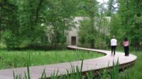
And there is the remarkable pastoral site. For the arrival, we wanted to create an atmosphere where you kind of leave the world behind. You park, you arrive at a wood building [the visitor center], and then you walk through the landscape. With every step, you try to remove as many distractions as you can.
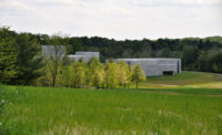
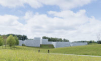
And each room is a pavilion embedded in the landscape. Back to the Land Thomas Phifer talks about Glenstone, the museum he has designed on a stunning rural site—and how art, architecture, and nature are all essential elements of the visitor experience.
Why did you create a cluster of separate structures, one for each gallery? You could have made an enfilade of rooms, where they were joined together.
By pulling the pavilions apart and making them a village of buildings, each could express its own special qualities. Because these rooms were so particular, each was for one artist, and, in most cases, one work, we worked with the artist when we could, to develop a particular proportion: the height, width, length of the room, and a certain quality of light. They began to become their own distinct places.
We also wanted these rooms to be almost of the land. There’s an inseparable quality between, first, what happens in the land; second, what happens with the works themselves; and, third, what happens with the architecture. Those three things were fundamental to the way we thought about the project.
The other fundamental thing we did was separate the bookstore and the café from the art experience. As you arrive, there’s a little bookstore; then in a separate building is the café with a beautiful view of the landscape and woods. The parking is kept away from all this.
What you describe sounds very Zen, the idea of clearing away everyday life, to get to something more pure. The architecture you describe sounds conceived as an architecture of experience, not as an object in the landscape.
That’s right. When we first started, we looked at Ryōan-ji Temple in Kyoto, with its rock garden.
Here, you will encounter the artworks, and then move to a water garden in the middle of the complex—a quiet interlude— before you move back into one of the rooms.
And at Ryōan-ji, the surrounding landscape is walled off. In our project, you take a stair down one level to the galleries and the courtyard. By going down into the earth—and by encircling the water garden with the rooms—we created this kind of special place of silence and calm.
You mention Ryōan-ji Temple’s walling off of the immediate surroundings. Glenstone has a strong feeling of enclosure by virtue of walls that appear thick—because they are beautiful board-formed poured-concrete blocks, 6 feet long and a foot thick and stacked like bricks. They have real substance.
We tried to find material that is not precious, something we felt was an honest expression of itself. The concrete blocks are a crafted material—they’re kind of handmade. They were poured over two years, and there are 25,000 of them. And they’re poured in different weather conditions. When it’s cold, they get a little darker, because the water is held in the concrete. In the summertime, when it’s really hot, they dehydrate and they get whiter. If it rains right after the block has been stripped, then they streak. The building surface looks like a tapestry.
One of the things so critical to your museum work is the issue of light. It’s a key architectural element at Glenstone. Can you talk about how you bring natural light into each room?
In conceiving this project, we talked a lot about nature and architecture. Nature is not just plants and trees—it’s daylight. It’s the movement of the sun. It’s ever-changing. It sounds so obvious, but we envision this place without any light bulbs on during the day, and galleries that will change according to the movements of the sun and clouds.
How did you manage that?
We put the building on the cardinal points—every one of the rooms is oriented north, south, east, west.
Obviously, we don’t let direct rays hit the works, but we won’t filter it much, so that if you’re in the room in the morning, you’re going to feel a particular side is a little bit brighter. If you go into that room throughout the day, that room acts as a kind of sundial in the way that light moves around.
The whole experience is fundamentally grounded in light, but it’s also grounded in shadow—that sense of shadow in the corner, that sense of moving into a room that’s slightly darkened. At Glenstone, it will be a feeling as if you’re moving through a passageway and encountering bright light and a little shade and a lot of shadow. That amazing book In Praise of Shadows [by Japanese writer Junichiro Tanizaki] speaks about this experience with light.
Going from shade and shadow into these rooms that will open up to the sky at the top—the whole experience tumbles around daylight.
The light is really important, but the shadow provides the poetry of the building. It makes a rich experience. In Ryōan-ji, as you move back into the building from the garden, the porch, and finally indoors, the light gets dimmer and dimmer. It’s all about shade and shadow and framing the image of the garden. We’ve tried to learn the lessons of those buildings that were made long ago.
A lot of museums have so many louvers or scrims on top that the light gets so filtered, filtered, filtered: you have one big wash of the same kind of light. But our daylight gets filtered just one time, through a translucent laylight, so you feel the sun’s movement.
Besides the careful siting, the proportions, and light, your buildings have such beautiful attention to detail—not that you want to be noticed but, here, because you wanted not to be noticed.
Yes, you want the architecture to dissolve and, the fewer distractions you can have with the way the building is detailed, the richer the experience is.
In developing the design, you worked extensively with real models, of both the site and the individual rooms.
Yes, we really used them as a tool. We did these models of the land and the buildings, and then we made models of all the rooms. And we constantly worked at these two scales, to make these rooms as simple and as elemental as possible. We sculpted this one site model over years, getting the right assemblage and placing the structures with the rise in the landform—just embedding them in the land.
Is that right? You placed the buildings within the existing curves of the topography?
That’s absolutely what it was. And so we kind of sculpted all these buildings and placed them in the land very carefully. We worked on the proportioning of all the buildings, and that changed over time. We’re in construction, but we’re putting the landscape back exactly the way that it was.
There is an aspect of this collection of forms—the pavilions— that feels ancient and timeless, burrowed into the land; and now this is how they sit in the land, as if they might be future ruins.
That’s right. We wanted to give the sense that these artworks were living in a place that had permanence.


