Taussig Cancer Center by William Rawn Associates and Stantec Architecture
Cleveland

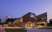
The front elevation of the Cleveland Clinic’s Taussig Cancer Center is cantilevered 32 feet, allowing for a covered airport-like dropoff to ease congestion. A lightwell, located on the grassy island within the driveway, brings daylight to the lower level.
Photo © Robert Benson

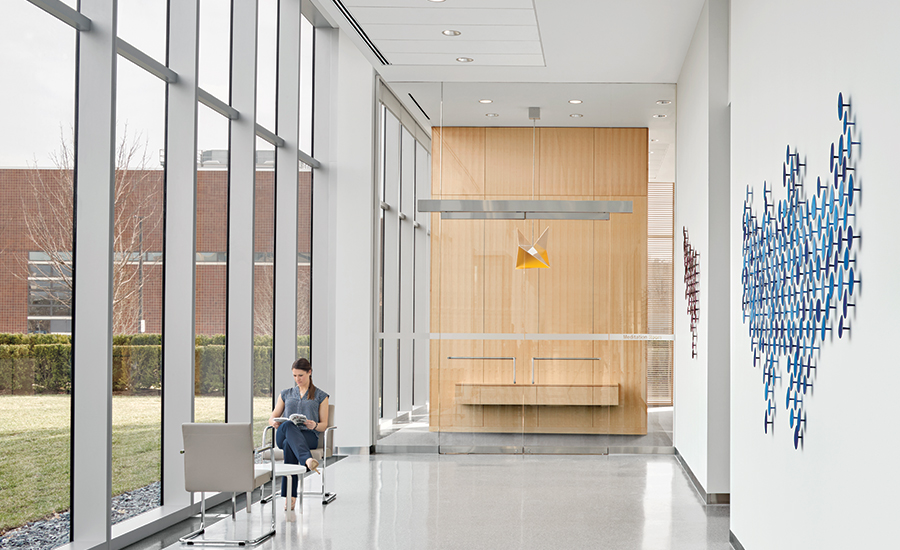
The expansive lobby greets visitors and offers access to a garden, as well as to patient-support services, a cafeteria, and the center’s meditation room (right, beyond the glass doors).
Photo © Robert Benson

The expansive lobby greets visitors and offers access to a garden, as well as to patient-support services, a cafeteria, and the center’s meditation room (right, beyond the glass doors).
Photo © Robert Benson

Clinical corridors are carpeted to reduce noise, while wood details and access to views convey a sense of calm.
Photo © Robert Benson

Daylit infusion rooms also have partially glazed walls.
Photo © Robert Benson

A lightwell illuminates the hallway in the basement, where treatment rooms have LED lighting that patients can control.
Photo © Robert Benson

A lightwell illuminates the hallway in the basement, where treatment rooms have LED lighting that patients can control.
Photo © Robert Benson

Image courtesy William Rawn Associates

Image courtesy William Rawn Associates

Image courtesy William Rawn Associates

Image courtesy William Rawn Associates


The Cleveland Clinic took a chance when it commissioned Boston-based William Rawn Associates (WRA) to be lead architect for its $276 million Taussig Cancer Center. The firm had no prior experience designing medical facilities. However, says principal William Rawn, “at some basic level they hired us because we were curious. They didn’t want some firm’s version of a past hospital.”
It is an account affirmed by Dr. Toby Cosgrove, a thoracic surgeon who has been the clinic’s chief executive for the past 13 years. “He had a willingness to listen to the clinicians here and put that knowledge into the design,” Cosgrove says of Rawn. “We talked to some architects who didn’t want to listen.”
Additional Content:
Jump to credits & specifications
It was Cosgrove’s interest in architecture that prompted him to include WRA in the search. As a trustee of Williams College, he had been impressed by a Rawn project on that campus, the light-infused Class of ’62 Center for Theater and Dance, completed in 2006. “We think that the atmosphere in which people work and get treated is important for their confidence and their outcomes.” The effort to promote well-being through architecture also prompted Cosgrove to appoint Christopher Connell, a partner in the London-based Foster + Partners—the firm responsible for the clinic campus master plan—as chief design officer, in May.
Working with Stantec Architecture, brought into the project for its health-care expertise, WRA created a 377,000-square-foot, steel-frame building with a reassuringly calm atmosphere—a quality signaled by a glass curtain wall animated by a precise grid across the front and rear facades. The unitized system of glass panels is 17 percent reflective and has a shifting, quicksilver sheen that, while transparent, doesn’t readily display the people and activity within. “It’s a very subtle facade,” says Sam Lasky, a firm principal. “There aren’t a lot of gewgaws. It is what it needs to be, and not more than that.”
A directive for a minimal aesthetic came directly from Cosgrove. “People aren’t coming to the hospital to be in their living rooms. They’re coming for science,” he says. Rawn shares this philosophy. “Minimalism represents an idea of heightened competence. It indicates that this place is serious and you’ve come because you’ve got a serious problem that you want solved,” he says.
To ease the sense of chaos and congestion that so often characterizes hospital entries, the front elevation is cantilevered forward 32 feet, creating a 360-foot-wide overhang at ground level that serves as a broad, airportstyle drop-off. The cantilever is suspended from a dozen trusses concealed at the top of the structure within the mechanical floor, a solution arrived at in collaboration with the consulting engineer, Boston-based LeMessurier.
The lobby is a limpid, open space, with white terrazzo floors and 17-foot-high ceilings, that opens to a garden at the back. The idea of a soaring atrium, another hospital convention, was rejected. “We wanted it to be tall enough so that it’s filled with light, but not overwhelming,” says Dr. Brian Bolwell, chairman of the Taussig Cancer Institute and a central figure in its design development. The building program was largely determined by the clinic’s “patient first” mantra. “Everyone who hears they have cancer is very scared, and we wanted to see how we could manage that [fear] architecturally,” says Bolwell.
Because it is required of all patients, blooddrawing stations were placed adjacent to the ground-floor entrance. “It was imperative to avoid lines,” says Rawn. “Time is the most important thing to a cancer patient.”
Other common spaces on the first floor include a cafeteria, an art therapy room, a wig shop, a pharmacy, and a room for meditation.
Disposition of spaces on the three clinical floors was driven by the Taussig Cancer Center’s atypical system of group practice, in which medical professionals work in teams organized by disease rather than by specialty. Each team works out of a shared office, a collaborative hub with access to adjacent examination rooms. In keeping with the patient-driven philosophy, the facility’s prime, daylight-filled spaces were devoted to those in treatment. “We tried to give the perimeter on all floors to the patient, so you’re not going through some interior world of corridors,” says Rawn.
Indeed, every infusion patient is given a private room. There are 98 of them overlooking the landscape behind the building. All of the clinical floors are carpeted, an added maintenance expense but one that helps keep medical areas quiet and establishes a calming tone.
Most impressive might be the basement level, which extends out below the drop-off area but hardly appears to be underground, due to a large light well in front of the building. Here patients receive radiation treatments in one of six linear accelerators, isolated behind massive lead-lined doors in rooms with 7-foot-thick concrete walls. Even these unforgiving areas are tailored for comfort, with recessed full-spectrum LED lighting so patients can choose color and brightness as they see fit.
“I’m not an architect—I’m a doc—but I like the way this building has turned out,” says Bolwell. “We’ve taken a minimalist aesthetic and made it warm. Also, it just looks cool.”
CreditsDesign Architect: William Rawn Associates, Architects Inc. 10 Post Office Square, Suite 1010 Boston, MA 02109 617-423-3470
Personnel in architect's firm who should receive special credit: William Rawn, FAIA, Principal Clifford Gayley, FAIA, Prinicipal Samuel Lasky, AIA, Associate Principal Sindu Meier, AIA, Senior Associate Daniel Bielenin, AIA Sophia Chang Brian Glueckert Victor Perez Amado Ellie Radich Phillip Redpath Wen Wen
Architect of Record: Stantec Architecture 100 California Street, Suite 1000 San Francisco CA 94111-4575 (415) 882-9520
Personnel in Architect of record firm who should receive special credit: Bruce Knepper, AIA, Principal Ian Lawlor, AIA, Senior Associate Jennifer Storey, AIA, Senior Associate Shelley Anixter, AIA, Associate Conor Dunn, AIA, Associate Monika Gassner Brendan Mullins Mike Mills Ivan Nemencek
Engineers Civil: Osborn Engineering Landscape: Cawrse Structural: LeMessurier MEP/FP: BR+A/Karpinski IT: Heapy
Consultants Furniture: Brockman Design, LLC. Lighting: Lam Partners Food Service: WD
General contractor: Turner Construction Company
Photographer: Robert Benson
|
SpecificationsExterior Cladding Masonry: Cleveland Marble and Granite Metal panels: Oldcastle Building Envelope Metal/glass curtain wall: Oldcastle Building Envelope
Glazing Glass: Viracon Skylights: Viracon
Doors Entrances: Stanley Interior Glazing and Doors: United Glass
Hardware HW: Cleveland Architectural Hardware
Interior Finishes Millwork: Gleeson and Reserve Millwork Resilient flooring: Nora, Forbo Carpet: C&A Terrazzo: O. A. Bertin
Interior Finishes Furniture: Knoll, Cartwright, Steelcase
Conveyance Elevators: Schindler
Energy Energy management or building automation system: Johnson Controls
|


