Swedish Edmonds Ambulatory Care Center by NBBJ
Edmonds, Washington

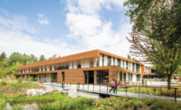
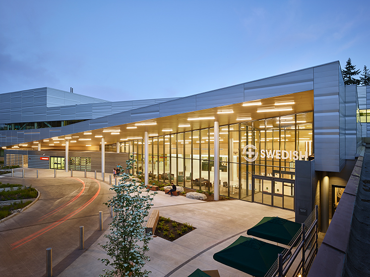
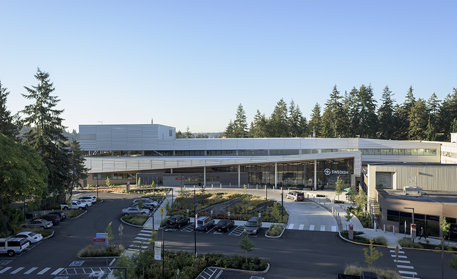
The architects called attention to the main doors by placing them beneath the highest point of the canted roof, which slopes down toward the fiber cement panel—clad emergency entry volume.
Photo © Benjamin Benschneider

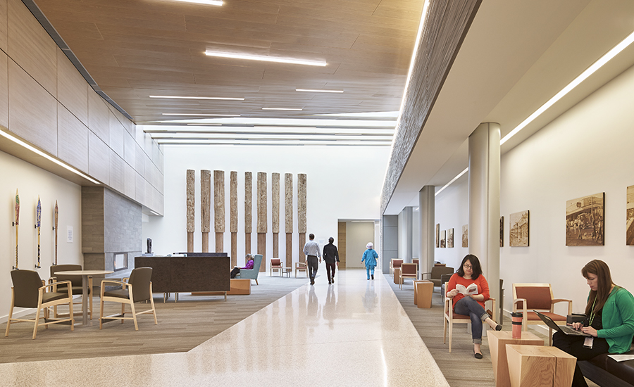
In the lobby (above), metal ceiling panels that imitate wood extend outside, beyond the glazed facade, maintaining continuity of materials while adhering to fire codes.
Photo © Benjamin Benschneider

The texture of the steel-panel cladding recalls glacial striations in the local landscape.
Photo © Sean Airhart/NBBJ

Art and sculptural elements adorn the lobby, including decorative painted paddles, from the Tulalip Tribe (left), reclaimed boom logs (center), and reclaimed wood panels (right) engraved with photos of historic Edmonds.
Photo © Benjamin Benschneider

Decorative paddles donated by the Tulalip Tribe.
Photo © Architectural Record

A fireplace in the skylit lobby give the space living room–vibes.
Photo © Benjamin Benschneider

The boom logs were turned smooth at the bottom, allowing them to be cleaned more easily.
Photo © Benjamin Benschneider

Photo © Architectural Record

Emergency entrance
Photo © Benjamin Benschneider

Exam rooms surround the care-team stations.
Photo © Benjamin Benschneider

Trees cleared from the site were repurposed as landscape features, suggesting canoes or shingles, which recall the city’s mill-town past.
Photo © Benjamin Benschneider

Main entrance at night
Photo © Benjamin Benschneider

Photo © Jay Dotson Photography

Image courtesy NBBJ

Image courtesy NBBJ


Architects & Firms
Less than three miles from the shore of Puget Sound, in the Seattle suburb of Edmonds, an angular silver building peeking out between the evergreens announces the campus of Swedish Edmonds medical center. Designed by NBBJ, the 77,000-square-foot building updates and expands the services offered at the community hospital while adding a much needed “front door” to the sprawling complex.
When Swedish Edmonds’s chief operating officer Sarah Zabel came to work for the hospital (which was then known as Stevens Hospital) in 2001, the first thing she heard from the medical staff was that they needed a new emergency department. It was housed in a 1970s building intended to serve 20,000 patients annually but was seeing more than twice that number.
Additional Content:
Jump to credits & specifications
“I remember the hospital as a bunch of outdated Brutalist buildings,” says project designer Brian Uyesugi, who lives just a few miles from the project. “The perception was that the care wasn’t good, even though the performance statistics were high,” explains NBBJ principal and project planner Janet Dugan (also an Edmonds local). The hospital became part of the Seattle-area Swedish health-care system, which, soon after, committed to building a new emergency department. In addition to providing this urgently required facility, the project would also create a portal to the campus that, with more than a dozen buildings constructed over the course of five decades, was a hodgepodge of architectural styles. “We envisioned it as a connector,” says Dugan of the new building (completed in July 2016), which was designed to be more welcoming and inspire confidence in the quality of care.
Effective emergency departments must be easy to navigate. So the architects focused on streamlining circulation throughout the new steel-frame building, to increase the speed with which patients are assessed and treated. They also aimed to create distinct arrival points: some for patients with emergencies and others for visitors and those receiving outpatient treatment. Their solution was to place the entrances strategically and provide explicit and implied wayfinding measures. A painted-steel-clad overhang and double-height, glazed facade function as a “front porch,” and boldly announce the main entrance. Standing outside next to a large water feature by the doors, one can see past the reception desk deep into a skylit lobby with 30-foot ceilings and an art-filled, living room–like waiting area, complete with a fireplace.
The front porch, which is tallest over the main entrance, pitches down toward the emergency-department doors, decreasing the scale of the building to prevent people without true emergencies from accidentally wandering in. This clearly marked entrance is smaller and situated closest to the imaging facilities for diagnosing time-sensitive conditions like strokes and heart attacks. According to Zabel, this design decision has directly contributed to significant improvements in Swedish Edmonds’s care statistics.
The new building houses 35 treatment rooms designed for different levels of emergency, from “vertical” rooms with specialized armchairs for people with minor emergencies to trauma rooms where doctors can perform surgery. The glass-walled treatment rooms encircle central clusters of staff workstations, which are low enough to give seated nurses direct lines of sight to patients. The new wing also includes a separate area with behavioral health rooms for individuals in crisis who might pose a danger to themselves or others. In the old emergency department, behavioral health (BH) rooms weren’t separated. “It was traumatic for general emergency patients to see and hear individuals in distress,” says Zabel.
Throughout the largely one-story facility, details of the design demonstrate a respect for patients’ well-being and the surrounding context. Shielded cove lighting keeps fixtures from shining directly into the eyes of those on gurneys, while the material palette refers to specific aspects of Edmonds’s history. For example, the architects relied heavily on wood in a nod to the former shingle-mill town’s industrial past. Nine boom logs in the lobby (long, straight trunks that were once fastened together, corralling felled trees as they floated downriver) form a sculptural, 18-foot-tall work of art. Perforated metal ceiling panels, which extend beyond the glazed facade to the soffit of the exterior canopy, match the color and look of wood veneer panels. In the gardens, the architects incorporated landscaping features such as shingles, made from trees that were cleared from the site during construction.
Other material choices, such as the grooved fiber cement panels, hark back to a more distant past, when advancing and retreating glaciers carved the earth, leaving behind the hilly, rocky landscape that characterizes the area. “We tried to find materials and products that would help describe that movement and sedimentation,” says Uyesugi. But even if the connection to the site’s geologic past isn’t obvious to the casual observer, NBBJ’s design for Swedish Edmonds respects its context and elevates the hospital’s physical presence to the same level as the quality of its care.
CreditsArchitect: NBBJ
Engineers KPFF (civil, structural); Stantec (electrical, telecom); Mazzetti (mechanical, plumbing)
Consultants Site Workshop (landscape); Stantec (acoustic); Mazzetti (energy modeling)
General contractor: Sellen Construction
|
SpecificationsGlazing Vitro Architectural Glass
Roofing Sika Sarnafil
Doors Kawneer North America
Ceilings USG
Paint Benjamin Moore
Wallcoverings Carnegie Fabrics
Solid surfacing Corian
Resilient flooring Johnsonite, Armstrong
Carpet Shaw Contract
Furniture Allsteel, Knoll, Steelcase
Upholstery Allsteel, Bernhardt, Maharam
Lighting Cooper, Bega
|


