Urban Hospice by Nord Architects Copenhagen
Copenhagen

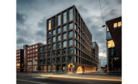
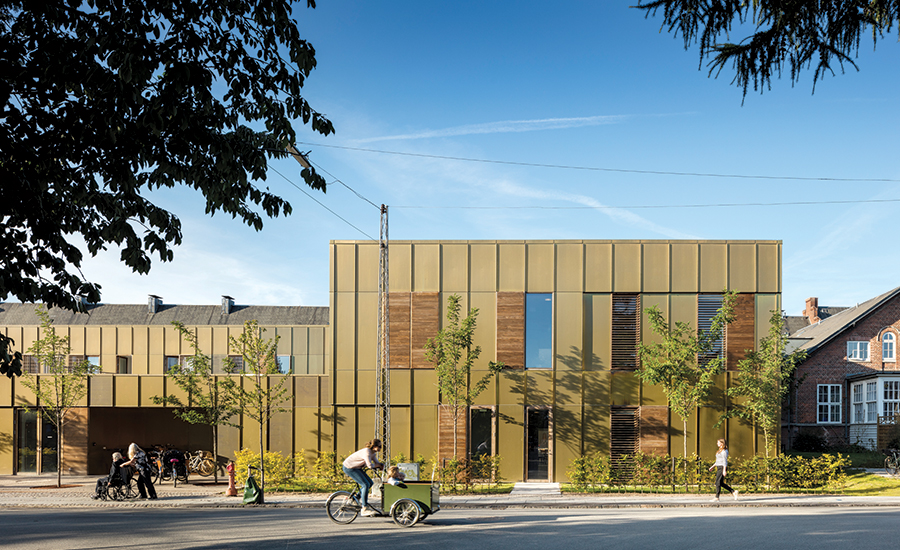
A bronze-zinc alloy that has weathered to a greenish gold clads the Urban Hospice in Copenhagen, which is part of a redevelopment for social and health-care facilities.
Photo © Adam Mørk

Courtyards are carved out of the block.
Photo © Adam Mørk

The hospice is nestled among historic buildings belonging to the Deaconess Foundation’s campus.
Photo © Adam Mørk

Kebony—a sustainable softwood treated with chemicals to give it properties of hardwood—is used for window frames and shutters on the exterior.
Photo © Adam Mørk

Each room has a convertible sofa for family stay-overs.
Photo © Adam Mørk

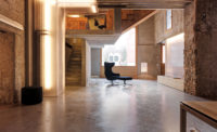
The public living areas open on to a central courtyard.
Photo © Adam Mørk

The architects provide smaller, more secluded areas where patients can come out from their rooms. Privacy is emphasized in the design of visiting areas as well with enclosed two-person seating.
Photo © Adam Mørk

Image courtesy NORD Architects Copenhagen

Image courtesy NORD Architects Copenhagen


Architects & Firms
As a building type, the hospice has programmatic peculiarities that require a special understanding on the part of its architects. The terminally ill patients in this palliative-care facility in Copenhagen survive on an average of just 19 days after admission, with many dying in the first week. While it is heavily staffed for expert round-the-clock care, the environment needs to be as domestic as it is clinical—a dignified, calm, even cheerful place for patients and their families.
It is normal in Denmark for hospices to be in the rural hinterlands, rather than the city. But as Morten Gregersen, partner of NORD Architects Copenhagen, says: “The idea is to be close to the relatives.”
Additional Content:
Jump to credits & specifications
To achieve that, the client, the Diakonissestiftelsen (Deaconess Foundation), part of a Lutheran pastoral-care movement dating back to the 1860s, included the facility in a redevelopment master plan for a 10-acre teaching-hospital complex in the affluent, low-rise district of Frederiksberg. There it replaces an earlier, smaller hospice.
NORD, a fairly young practice known for its community engagement, won the commission following an interview selection process. With the financial help of the A.P. Møller Foundation, it was able to design a new structure that has high-quality medical and related equipment as well as generous spaces, with premium finishes and fittings.
From the street, the 24,000-square-foot, $7 million Urban Hospice gives little away about its use. With its brass-zinc alloy cladding weathering to a greenish gold, set off by wood details, it could be a small office or even apartment building. NORD’s architecture is often more exuberant than this, but as Gregersen explains, the client did not want a landmark building that might attract sightseers. In this area of residential villas, it sits low—one and two stories plus a basement for services and storage, while behind it rise the neo-Gothic redbrick facades of the original teaching hospital. The site is tight, but NORD still wanted to provide secluded, landscaped open spaces where patients could come out into the light and fresh air—in their beds, if necessary—with space for family and staff. The firm accomplished this by introducing a series of curving courtyards into the otherwise rectilinear plan and by placing a roof terrace on the single-story section at the front.
Once inside the building, it becomes clear that the layout encourages a selfcontained community. On the ground level, staff quarters occupy the western side of the floor, with patient rooms on the east, and the largest courtyard between the two. The second floor is devoted completely to patients, including the roof terrace. Designed to accommodate a total of 16 residents, each room has a sofa that can convert to a bed for visiting family: there are also two separate guest rooms in the facility. Specific technical requirements can be met easily: electric hoists are integrated into the rooms to help staff move around those who are immobile; soundproofing solves acoustical needs, and even the thick doors have rubber seals. Windows throughout the building are triple-glazed for acoustical and thermal insulation, including the large curved ones around the courtyards (“an expensive detail,” says Gregersen). Surfaces are tough and washable. And though the rooms have operable windows for use when appropriate, each is air-conditioned in such a way that they can be easily refrigerated following a death by lowering the thermostat. There is no separate morgue: the bodies remain in place for 24 hours, so that families and friends can visit to pay their final respects.
Often, in hospices, there is a separate, out-of-sight service entrance for undertakers. Here you can encounter (as I did) a family group of all ages accompanying a casket as it is wheeled through the public areas of the building and out the front door to the hearse. This way of doing things is part of the brief: “Death and life share the same entrance,” says the hospice’s director, the straightforward and cheerful Helle Tingrupp. “It shouldn’t be hidden away.”
Tingrupp explains the building’s rationale: a place for healthy families as well as very sick people, and a place of often heavy physical work for the rotating staff of 50. There is a need for seclusion and grief, but also celebration–in fact, the building’s popularity is such that Tingrupp has to cope with more requests to visit from large family groups than she had anticipated. “The building is fantastic,” she concludes. And I have to agree: it is an uplifting place with a remarkably noninstitutional ambience. This is architecture that improves our experience of the inevitable.
CreditsArchitect: NORD Architects Copenhagen — Morten Gregersen, Johannes M. Pedersen, partners; Mia Baarup Tofte, Steffan Iwersen, Astrid Leth Gregersen, team
Engineers Rambøll Copenhagen (structural, m/e/p)
General contractor: Georg Berg
|
SpecificationsMetal panels Alumeco
Oak-and-Kebony Wood-and-Glass Windows Krone
Moisture barrier panels Fermacell
Acoustical ceiling Ecophone
|

