Museum of the American Revolution by Robert A.M. Stern Architects
Philadelphia

The new museum is the latest addition to the Independence Hall neighborhood in Philadelphia.
Photo © Peter Aaron

The spiral stair is the centerpiece of the interior, which has historic displays.
Photo © Peter Aaron

The spiral stair is the centerpiece of the interior, which has historic displays.
Photo © Peter Aaron

Image courtesy Robert A.M. Stern Architects


Architects & Firms
In the mid-20th century, Philadelphia witnessed the demolition of dozens of non-Colonial buildings, including two extraordinary Victorian ones by Frank Furness, in an effort to preserve the Independence Hall neighborhood’s 18th-century character. That approach to “preservation” was typical of the era, as the re-creation of Williamsburg, Virginia, attests, where hundreds of historic structures were destroyed to turn it into a Colonial theme park.
Nearly 70 years later, Philadelphia is still struggling with how to integrate new buildings into an urban fabric teeming with Founding Father–era gems, Greek Revival banks, and Federal rowhouses.
Within this context, who can blame Robert A.M. Stern Architects (RAMSA) for its homage to history in the design of the new $150 million Museum of the American Revolution?
“The building is meant to capture the spirit and context of the area, and capture a sense of the architectural environment that existed during the American Revolution,” says Robert Stern. “At the same time, it makes a statement that is suited to its 21st-century period.” Indeed, the central challenge of the project was to adapt Federal elegance to today’s tourism needs.
Sited on a bustling corner in the heart of Philadelphia’s tourism district, the 118,000-square-foot building fulfills Stern’s primary wish for the museum to be a good citizen. Its massing takes its cues from the neighboring historic buildings’ cornice lines, while Pennsylvania red brick, white trim, and keystone-accented arches dutifully reference the neighborhood’s aesthetic. Its dense, urban feel is enhanced by oversized retail-like windows and an outdoor café that reinforce the building’s connection to the street.
But unlike the reserved buildings of yore, this one features exaggerated blind arches and a voluptuous bronze-painted domed entrance that contribute to a sense of playfulness. “It’s very important that the building be friendly and dignified,” says Stern. The exterior conveys the message that interpreting history can be fun, and larger than life.
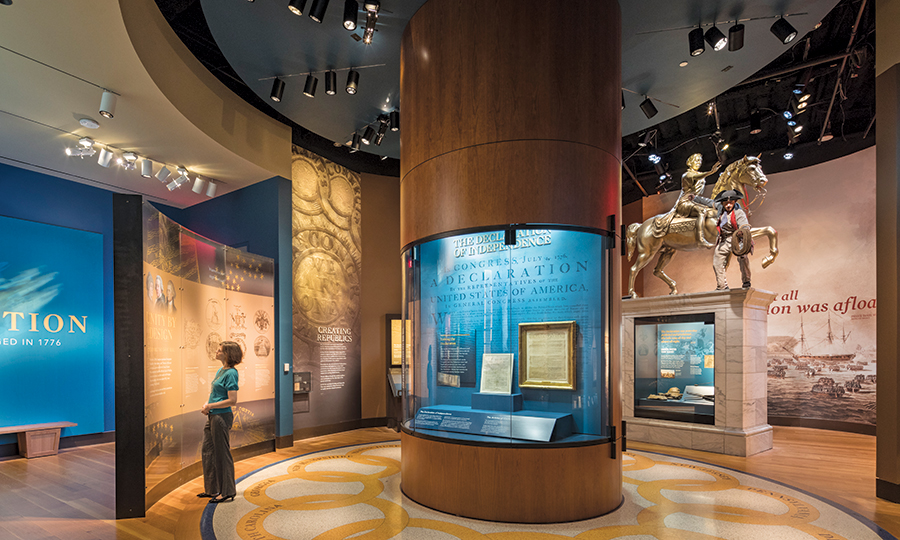
Inside, a more formal tone sets in. A terrazzo-tiled rotunda opens on to the design’s centerpiece, a two-story spiral staircase that winds up to a skylit atrium. These spaces, with cream-painted walls, evoke both the gentility and longevity of historic civic buildings and, with a center-hall floorplan, the hominess of a great residence. In a building that necessitated 32,000 square feet of windowless exhibition space for light-sensitive objects, such as George Washington’s war tent, this atrium offers the museum’s only natural light.
But despite the architecture’s best efforts to encourage visitors to inhabit the grand past, the often crass present is as quick to assert itself as the short walk from front entrance to gift shop. Getting this building built was a struggle that took longer than the Revolutionary War itself (which lasted eight years) and the museum seems to be at pains to acknowledge the funding that made it possible. From the museum’s abundance of donor nameplates (including one in honor of the architect himself, paid for by Comcast CEO Brian Roberts) to its several rentable events spaces, the building is no trust-fund baby. It needs to pull double duty both as a theatrical showcase for a history museum and as a revenue engine—and at times the financial priorities of a 21st-century cultural institution seem to have undermined more exciting design choices.
With the exception of the rotunda, the first floor is largely occupied by the uninventive gift shop, café, theater, and temporary-exhibit spaces. The outdoor plaza, designed by OLIN, and the main staircase could be contemplative respites but instead feel engineered to accommodate the reality of masses of tourists. On the exterior, details such as the cornices—bland strips instead of the delicately ornate moldings typical of historic buildings—hint that the architects were limited in how seriously to appropriate the past.
The building and museum try hard to have it all, and this may be the source of its problems. How American.

