When the 3-decade-old skin-care brand Aesop opens a standalone store, it frequently taps a local firm to design the space. As a result, no two shops are alike, yet all reflect the Australian brand’s ethos. “They want the DNA of each project to emerge” from the specific local condition, says Washington, D.C., architect David Jameson, whose namesake firm designed Aesop’s first store in the nation’s capital.
Additional Information:
Jump to credits & specifications
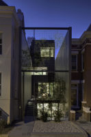
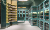
For Jameson, the context was a new 600-square-foot shell at the base of the Shay, a ground-up residential development in the city’s Northwest quadrant that opened in late 2015, filling two long-empty urban lots. As a result, the architect had more design breadth than usual: “We were able to control everything except the concrete floor and deck,” says Jameson. Taking inspiration from the site at the east end of U Street, a corridor with a deep musical history, once known as “Black Broadway,” the design team envisioned the space as an abstraction of that rich cultural past. Two bands of brass shelving line the walls; each band contains three levels. The 180-shelf units, some faceted and each about the size of a shoebox, hold the products but are not packed to the hilt. Instead, black tubes, bottles, and boxes (packaging is uniform across all product types) are placed in a variety of quantities and arrangements. Combined with the rhythmic, linear pattern of the shelving and creamy handmade paper that lines each shelf, the overall effect is of notes on a music staff.
The space narrows in width from front to back, where the sales counter sits, creating an increasingly intimate experience as one explores the product selection—a necessity, given the complete lack of signage and Aesop’s fondness for small packaging fonts. At the center is a large communal sink for testing products (one of the few programmatic requirements), nestled in a rectangular block of blackened-oak cabinetry that Jameson calls the store’s “Donald Judd moment.” Indeed, everything in the space, including the empty walls, which are covered in a tan, hand-rubbed plaster, contributes, like the sculptor’s work, to a sense of rich materiality and craft, in keeping with both Aesop’s brand and the general design aesthetic of Jameson’s firm, which primarily works on residential projects.
But just because the architects had latitude does not mean Aesop was hands-off. “They wanted samples of everything,” Jameson notes. Yet there was little pushback on the design, he says (except when it occasionally impinged on company requirements), adding enthusiastically that “whenever there was an opportunity to go even more minimal, they would spend the money.” (Jameson won’t disclose the construction budget, except to note that it was “significantly” more per square foot than the average District retail project.) “At every turn,” says Jameson, “I found them wanting to do the next, better thing.”
CreditsArchitect: David Jameson Architect Inc. Personnel in architect's firm who should receive special credit: David Jameson, FAIA
General contractor: Madden CCI, Mike Madden
Photographer: Paul Barbera Photography, Paul Barbera, http://www.paulbarbera.com/, barbera@me.com
|
SpecificationsDoors Entrances: Forever Glass- Glass door Metal doors: Forever Glass brass metal clad entry portal. Hardware Locksets: C.R. Laurence Blumcraft exterior door hardware Closers: C.R. Laurence concealed floor closer Pulls: C.R. Laurence Blumcraft exterior door hardware Interior Finishes Cabinetwork and custom woodwork: Andy Greene - Potomac Woodwork L.L.C. Wall coverings: American Clay Lomalina finish Special surfacing: Triton Metals brass metal shelving Resilient flooring: Existing Concrete Floor finished by Boatman & Magnani Inc Furnishings Tables: Andy Greene - Potomac Woodwork L.L.C. Lighting Interior ambient lighting: strip back-lighting behind brass metal shelving Tasklighting: Lucifer lighting SURFACE MOUNT ADJUSTABLE LED lights |


