Performance Capture Studio
Lorcan O’Herlihy and Stephen Kanner convert a pair of old aircraft hangars into a Performance Capture Studio by breaking down hierarchies.

Photo © Frank Oudeman

Photo © Nicolas O.S. Marques

Photo © Frank Oudeman

Photo © Nicolas O.S. Marques

Photo © Nicolas O.S. Marques

Photo © Frank Oudeman

Photo © Nicolas O.S. Marques

Photo © Nicolas O.S. Marques

Photo © Frank Oudeman

Image courtesy Lorcan O’Herlihy Architects (LOHA) / Kanner Architects (KA)

Image courtesy Lorcan O’Herlihy Architects (LOHA) / Kanner Architects (KA)

Image courtesy Lorcan O’Herlihy Architects (LOHA) / Kanner Architects (KA)

Image courtesy Lorcan O’Herlihy Architects (LOHA) / Kanner Architects (KA)

Image courtesy Lorcan O’Herlihy Architects (LOHA) / Kanner Architects (KA)


Architects & Firms
Lorcan O’Herlihy and Stephen Kanner refer to the checkerboard wall snaking through their Performance Capture Studio (PCS) north of San Francisco as a “strange loop,” a term used in film and other arts to describe something that breaks down the usual hierarchies of time or space and ends up where it started. Often self-referential, strange loops—like M.C. Escher’s famous drawing of two hands drawing each other or movies with story lines that return to the same moment again and again—can fascinate us by relatively simple means.
Due to the size of the PCS project—120,000 square feet in two former aircraft hangars—and the prominence of the client, ImageMovers Digital, the two architects, who run separate firms in Los Angeles, decided to work together. The scale also convinced them that they needed a simple device to orient visitors moving through the two giant buildings. “It’s easy to get lost in spaces this size,” states O’Herlihy. The architects also needed a way of controlling daylight for the hundreds of editors and animators working on computers to turn live-action performances into animation. “Seeing the images and color on their screens is critical to these people’s work, so we had to give each of them a way to control daylight,” explains Kanner.
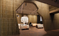
While O’Herlihy and Kanner had to protect computer screens from glare and light, they wanted to keep the interiors as open as possible and expose the hangars’ bow-truss structure. (The buildings sit on what had been Hamilton Air Base, which closed in 1976 and now provides restored tidal wetlands, and new housing and offices in the renovated hangars.) So the architects developed a flexible system of steel poles hung with powder-coated steel-plate “flags” that can display images of the films the studio is working on. The 11-by-17-inch flags act as a kind of pixelation for the images, which are printed on magnetized vinyl (the same material used for refrigerator magnets) and can easily be attached or detached. Some flags are clad with a corklike material made from recycled plastic, so artists can pin up their work for review. While some flags merge to form a solid surface, others spread apart and swivel so they create a porous boundary. Winding the flag wall along the main circulation route in each of the hangars, the architects established a strong navigational device—a strange loop that takes visitors back to the start and uses images of movies to refer to the work of the people employed in the building. “It’s easy to give people directions,” says O’Herlihy. “You just tell them to follow the flags.”
Directly behind the flag wall, the architects suspended a black-out curtain that is white on the flag side and gray on the other. Cut in 4-foot-wide sections, the curtain allows each worker to control the amount of daylight reaching his or her workstation. O’Herlihy and Kanner didn’t design the workstations but planned the work areas so they are as open as possible. While private offices line parts of the two buildings’ perimeter, the architects enclosed them in floor-to-ceiling glass so sunlight shines through them to the main circulation path and the areas with workstations.
Just as O’Herlihy and Kanner turned horizontal circulation into a design opportunity, they took advantage of stairwells to set off some visual sparks. Fabricated with 3⁄4-inch steel plates and rolled-steel railings, the stairs act as sculptural elements connecting each building’s two floors. And by surrounding each stair with curving wood-panel walls painted a different primary color, the architects provided a welcome contrast to the neutral-toned palette used in the work areas.
While the private offices and open work areas adhere to a no-nonsense aesthetic, a few shared spaces make bolder statements. A second-floor library, for example, sits within the curving embrace of open bookshelves made from the same system of steel poles used for the flag wall. And a stylish presentation room occupies the second floor of an old control tower attached to Hangar 7, the building where most animators and editors work. Hangar 9, on the other hand, houses many of the functionally important but architecturally less glamorous spaces, such as a data center, a theater, and the two-story black box where actors are hooked up to electronic nodes that capture their performances and turn them into animation. With a budget of just $200 a square foot, the architects could afford only a few big moves. So they set a “soft” loop in motion around a darker, more solid core, punched colorful holes in the floor plates, and exposed the archaeology of the existing buildings. As a result, they captured the energy and creativity of filmmaking for people whose job is to make films.
PeopleOwner: ImageMovers Digital Architect: KA Personnel in architect's firm who should receive special credit: Architect of record: Engineer(s): Mechanical/Electrical: ARC Engineering Consultant(s): Lighting: Horton Lees Brogden Lighting Design Acoustical: Veneklasen Assoc. Other: A/V: Snader and Assoc / RLS / Diversified Systems Furniture: Vangard Concept Offices General contractor: DPR Construction Inc. Photographer(s) Nicolas O.S. Marques (310) 451-5400 CAD system, project management, or other software used: |
ProductsSpecialty Areas: Stairs: Olson Steel Openings between floors: DPR Construction Inc. Structural system: wide flange and composite deck, steel stud and joist system Glazing: Doors: Sliding doors: C.R. Laurence Hardware: Hinges: Ives, Dorma Pulls: Schlage Cabinet hardware: Hafele Interior finishes: Cabinetwork and custom woodwork: Woodworking Specialties Wallcoverings: Corrugated Metal Special surfacing: Carpet: Interface Raised flooring: Haworth Furnishings: Reception furniture: Custom by Architect Custom Conf Rm Table: Moto Art Upholstery: Knoll Lighting: Downlights: Da-Sal Industries, Lightolier Task lighting: Finelite Controls: Trane (BAS System) Conveyance: Plumbing:
|


