Nishimura Restaurant
CL3 Architects brings Asian design traditions into the 21st century at Nishimura restaurant in Beijing.

Photo © Eddie Siu

Photo © Eddie Siu

Photo © Eddie Siu

Photo © Eddie Siu

Photo © Eddie Siu

Photo © Eddie Siu

Photo © Eddie Siu

Photo © Eddie Siu

Photo © Eddie Siu

Photo © Eddie Siu

Photo © Eddie Siu


Architects & Firms
In a place like Beijing, where anything goes, designers often bring in art installations or bold flower arrangements to add verve to upscale interiors. But in their design of Nishimura, a Japanese restaurant on the second floor of Beijing’s Shangri-La Hotel, the architects at CL3 had no use for add-ons. Using mostly wood, the Hong Kong–based firm turned architecture into sculpture, creating a place that blurs the line between design and art.
“We try to avoid just buying artwork at the end of a design and putting it everywhere,” says William Lim, managing director of CL3, which Shangri-La invited to redesign Nishimura as part of a larger project that included the renovation of the existing hotel and the addition of an adjacent 142-room tower. In Hong Kong, CL3 had designed two branches of Nadaman, a Japanese restaurant, in Shangri-La hotels, bringing in a consultant to contribute stark dry floral arrangements. “But here we didn’t work with another artist. Instead, we built art into our design,” explains Lim.
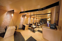
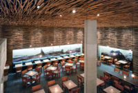
Entering the 5,400-square-foot restaurant, visitors check in with the maître d’ at an oak-colored travertine desk connected to a raised pool (made of the same travertine). Through a screen of dark elm slats, they see a sake bar and get an oblique view of a 26-foot-long partition assembled from 1,000 sheets of engineered plywood. As they approach the partition, which separates the bar from a dining area, guests encounter the restaurant’s coup de grâce: a pair of curvaceous openings dug into the 4-foot-thick wall. One cutout begins as a wide oval then narrows to a moon-shaped hole on the opposite side—as if a giant knot had been gracefully excised from an oversize chunk of lumber—while the other starts narrow and goes wide. The result gives patrons on both sides of the wall tantalizing, shifting views. Workers spent weeks laminating the precut sheets of plywood, then sanding and smoothing them with wax. Apart from its aesthetic attraction, the partition serves as a clever way of hiding two structural elements: a low beam and a large column.
Lim’s inspirations—Japanese gardens and the changing seasons—led him to plant dried cherry trees in beds of white pebbles in places such as the teppanyaki room and to use a limited range of wooden tones that signal a shift from cool to warm. The sun peeks into the restaurant through a skylight in one of the dining areas.
PeopleOwner: Architect: Personnel in architect's firm who should receive special credit: Design Director: Joey Wan – Design Director Project Designer: Jane Arnett – Senior Associate, Rain Ho – Senior Interior Designer Engineer(s): Consultant(s): Other: General contractor: Photographer(s): |
ProductsStructural system: Hardware: Interior finishes: Cabinetwork and custom woodwork: Wooden hemisphere feature in Private Room by general contractor (refer to image no. 100) Paneling: Plastic laminate: Special surfacing: White reconstituted marble in General Area and Cashier sourced by general contractor Light beige oak timber floor in General Area sourced by general contractor (Refer to image 072) Carpet: Screen : Furnishings: Upholstery: Lighting: Pendant Light in Booth Seat Area supplied by I.F. Lighting Limited (refer to image no. 102) Polyamide Pendant Light in Private Room supplied by Matisse Limited (refer to image no. 080) Plumbing:
|


