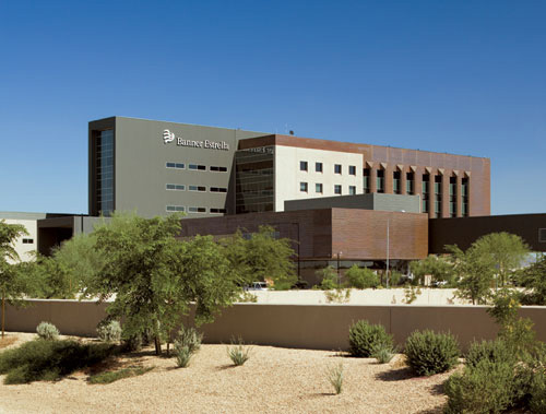
Banner Estrella Medical Center
NBBJ designs a technologically advanced hospital with room to expand, at the crossroads of several growing cities.

Photo © Jeff Goldberg/Esto

Photo © John Durant

Photo © Jeff Goldberg/Esto

Image courtesy NBBJ

Image courtesy NBBJ

Image courtesy NBBJ


Architects & Firms
Phoenix, Arizona
When officials at Banner Health asked designers from NBBJ’s Seattle office to create their new, 452,238-square-foot hospital in west Phoenix, they said they wanted the place to be “warm.” But NBBJ design principal Christian Carlson, AIA, disagreed with the term. “What does ‘warm’ mean in Phoenix?” he asks. “How about a cool white tent in the desert.” The folks at Banner were soon convinced, and the design team began their research. “It’s rare to build a hospital from the ground up,” says Carlson about the site—a 50-acre stretch of undeveloped desert that sits at the crossroads of two major freeways and is surrounded by several growing communities. “Our thought was, if we really got to do it right, what would we do?”
As well as a soothing, healing place for people in a vulnerable state, the client had several other mandates for this medical center, which was meant to serve as a template for future Banner hospitals. Because of the rapidly populating communities it served, Banner Estrella was to be built for fast-track growth, with an almost Lego-like plug-and-play design that would accommodate two additional towers and a total of 600 beds on its campus. Upon opening, the hospital would comprise a full-service, acute-care, 170-bed tower, medical office buildings, and an outpatient surgery center. Next, this hospital of the future needed to be technologically and architecturally advanced, and virtually paperless.
Simple tectonic forms make up the mass of the campus, which is structurally composed of only a few materials—tilt-up concrete, copper, glass curtain walls, and galvanized aluminum siding. Circulation and utilities are arranged along an interconnecting spine, where modular pieces can be added without moving the physical plant, the medical office buildings, or the lobby. Locating the central plant and loading dock 300 yards east of the main campus means that noisy coolant towers and emergency generators as well as supply trucks are away from patients.
Degrees of transparency are determined by the sun, with vertical “eyebrows” shading windows on the west side of the patient tower, and horizontal hoods shading windows on the south and north sides.
Inside the main lobby, the 35-foot-high space looks more like a hotel/spa than a hospital, with walls of concrete and cool white acoustic panels, Venetian plaster covering structural beams, and a mesquite wood staircase. A walk down the second-floor staff corridor reveals shadows dancing through skylights, and areas off the corridor that encourage spontaneous conversation among the staff—especially relevant, as this hospital is one of the first to eliminate departmental fiefdoms by efficiently combining surgery, radiology, and diagnostic areas.
|
People Owner Architect Partner in Charge: Partner in Charge of Interior Design: Design Principal: Lead Designer: Lead Interior Designer: Lead Medical Architect: Project Manager: Lead Technical Architect: Project Architect: Associate architect(s) Interior designer Engineer(s) Structural: Civil: Consultant(s) Lighting: Medical Equipment Planning: General contractor Photographer(s) Jeff Goldberg/Esto: Matt Milios/NBBJ CAD system, project management, or other software used |
Products Exterior cladding Concrete: EIFS, ACM, or other: Roofing Windows Glazing Doors Hardware Security devices: Interior finishes Paints and stains: Paneling: Carpet: Furnishings Patient room seating: Cafeteria Tables and Seating: Conference Tables: Files and Shelving: Lounge Seating: Patient Beds and Overbed Tables: Lighting Exterior: Conveyance Plumbing
|
|


