Umeda Hospital by Kengo Kuma and Associates
Hikari, Japan

The sloping roof reaches its low point at the north corner beside a converted London bus, used now as a play area for kids, helping to promote the hospital’s friendly image.
Photo © Daici Ano

Kuma’s first building for Umeda Hospital was a boxy concrete assemblage. The new addition features a five-story steel-clad structure fronted by a one-story wood-clad storefront that serves as the main entrance.
Photo © Daici Ano

Traditional taruki joists are visible on the underside of the 7-foot-deep eaves.
Photo © Daici Ano

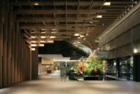
The walls and ceiling of the large first-floor gallery are clad in lapped cedar planks for a warm feel.
Photo © Daici Ano

A patient dining room features large windows with views into the kitchen and to the outside.
Photo © Daici Ano

Signs, fashioned like garments that can be removed, are made of white cotton cloth.
Photo © Daici Ano

Image courtesy Kengo Kuma and Associates

Image courtesy Kengo Kuma and Associates


Architects & Firms
A chunky concrete box fronted by an elegant wood-louvered addition, the Umeda Hospital brackets the extremes of Kengo Kuma’s architecture. While concrete and glass once characterized the Tokyo-based designer’s work, today wood, bamboo, and other natural materials are his signature. Separated by 17 years and exemplifying different modes of architectural expression, the base building and its new addition house a 34-bed maternity hospital plus an outpatient pediatrics clinic. Departing from the sterile coldness of generic health-care centers, the warmth of the reborn hospital welcomes patients both big and little.
Additional Content:
Jump to credits & specifications
Located alongside a four-lane thoroughfare in Hikari, a town of 54,000 at the southern tip of Honshu (Japan’s main island), the new construction is anchored to Kuma’s original building. Like many small medical facilities in Japan, the privately held Umeda Hospital bears the name of its owner and head doctor. A 14th-generation physician, Dr. Kaoru Umeda initially hired Kuma in 1996 to create a replacement for the hospital that had been constructed during his father’s tenure. When that facility was starting to show its age and needed rejuvenation, the client turned to Kuma once again and asked him to update his own building. In keeping with the hospital’s credo, the doctor wanted a distinctive structure that maximizes patient comfort but is friendly toward its neighbors too.
In response, Kuma excised the four-story front of the existing hospital and replaced it with a five-story L-shaped addition. The facility’s main entrance, it opens to a lobby-like gallery flanked by the pediatrics department on one side and obstetrics on the other. Occupying a single-story space alongside the heavily trafficked street, the children’s clinic consists of curtained exam and treatment areas plus a segregated section with direct street access for sick kids. The women’s department contains a variety of outpatient exam rooms at grade, two operating suites on the second floor, a day care center (a service available for children born at the hospital), patient dining and exercise rooms on the third, staff dining and meeting rooms on the fourth, and doctors’ rooms, such as on-call suites and offices, on the fifth. Hallways at either end of each level tie the new construction to the old. Left untouched, the earlier building is color-coded by floor and contains the delivery suites plus private rooms for each patient.
Concentrated in the addition, state-of-the-art treatment spaces are one benefit of the reconstruction. Another is the hospital’s fresh identity—it hardly looks the part of an institutional building type.
“We think the relationship between the hospital and the community should be much closer,” remarks Kuma. Defined by slender wood louvers and an extensive galvanized-steel roof, the addition’s exterior masks the original building behind it as it greets the street in front.
Jutting out from the steel cladding covering the addition’s upper floors, the roof’s swooping surface terminates in 7-foot-deep eaves that extend protectively over the sidewalk. Inspired by traditional Japanese architecture, the overhang is supported by delicate taruki joists, parallel steel bars visible on the eaves’ underside. Despite its overall size, the roof descends gracefully to its low point at the north corner, where it hovers at a residentially scaled 7 feet above the ground. Picking up the parallel lines of the roof and eaves, cedar louvers conceal the concrete portion of the addition’s street front while glass walls open its gallery to passersby.
The gallery’s arrangement of plush seating, small gift and sundry shops, and a sunken play area all improve the patient experience, yet Kuma’s material palette is largely responsible for the interior’s relaxed atmosphere. In another quote from history, yamatobari walls made of lapped cedar planks line the spacious room. “If the wall is flat, people cannot understand the thickness of the material,” explains Kuma. The rhythm of the walls is echoed in the louvered, canted ceiling as well as in the wood floor. In the treatment rooms, white walls predominate, but plywood accent pieces such as ¾-height partitions and built-in furniture mollify the antiseptic appearance of these areas.
Complementing Kuma’s interiors, signage created by the graphic designer Kenya Hara conveys a sense of both cleanliness and softness deemed appropriate for a facility catering to the well-being of mothers and children. A redo of Hara’s concept developed for the hospital’s first Kuma building, the first of many collaborations between the designers, the signs are made of white cotton cloth with red lettering—a play on the first aid color scheme. Acknowledging white’s tendency to show dirt, Hara fashioned the signs to be like garments that can be removed, washed, and put on again. While mitten-shaped markers identify individual rooms, two arm-like wood-and-cloth sign poles point the way to functions on either side of the gallery.
Despite Japan’s dropping birth rate and the consequent competition for patients, the Umeda Hospital routinely delivers 70 to 80 babies each month. Undoubtedly this volume of births reflects the appeal of the facility’s patient-centric approach; it is a testament to Kuma’s gentle building, which puts everyone at ease
CreditsArchitect: Kengo Kuma and Associates
Engineer: YSE
General contractor: Obayashi Corporation
Client: Dr. Kaoru Umeda
Size: 21,400 square feet
Completion date: March 2015
|
SpecificationsStructural system Steel Frame
Exterior cladding Metal/glass curtain wall: Galvanized Metal Roofing Wall / Eroof Wood: Thermo Cedar Louver/ Okazaki Mokuzai Curtain wall: ALC Panel
Roofing Built-up roofing: Galvanized Metal Roofing / Eroof Elastomeric: Elastomeric Tile Metal: Aluminum Coping
Windows Metal frame: Aluminum Window / YKK
Glazing Glass: Double Glazing
Doors Entrances: Stainless Frame Glazing Door / YKK Metal doors: Steel Doors /Sanwa Shutter Wood doors: Okazaki Mokuzai Sliding doors: Sanwa Shutter Fire-control doors, security grilles: Sanwa Shutter
Interior finishes Demountable partitions: Okazaki Mokuzai Cabinetwork and custom woodwork: - Carpet: TORI
Furnishings Office furniture: Okazaki Mokuzai Reception furniture: Okazaki Mokuzai
Lighting Interior ambient lighting: Panasonic Downlights: Panasonic Exterior: Panasonic
Conveyance Elevators/Escalators: Hitachi |

