Tate Modern Expansion by Herzog & de Meuron
London

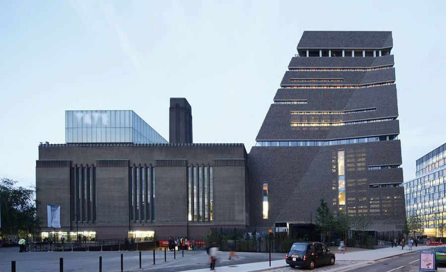
The Switch House, which adjoins the Tate Modern’s original Turbine Hall, rises 210 feet.
Photo © Iwan Baan

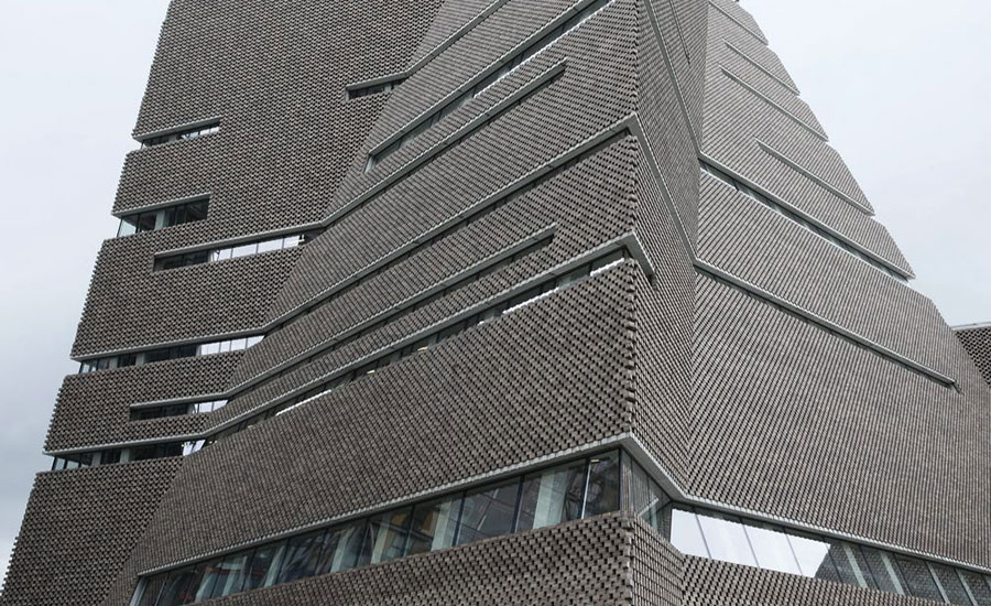
The brick-clad exterior of the Switch House.
Photo © Iwan Baan

The Turbine Hall (left) and the Switch House tower (right).
Photo © Iwan Baan

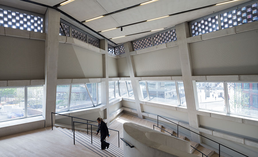
Landing at the top of the central circular staircase.
Photo © Iwan Baan

The staircase, which winds through the tower, is made of poured concrete.
Photo © Iwan Baan

The bottom of the staircase, on the lower level of the Switch House.
Photo © Iwan Baan

Each landing is framed by banisters, also made of poured concrete.
Photo © Iwan Baan

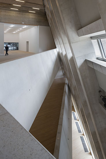
An upper-level landing, designed as a meeting place and overlook.
Photo © Iwan Baan

A gallery space on an upper level.
Photo © Iwan Baan

The rectilinear galleries are stacked, flanking the Turbine Hall.
Photo © Iwan Baan

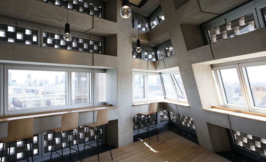
A café space with overlook views of London.
Photo © Iwan Baan

The architects, from Herzog & de Meuron.
Photo © Iwan Baan

The tower and surrounding garden, seen from the rear.
Photo © Iwan Baan

The Tate Modern seen from the Thames, with the Switch House tower in the rear.
Photo © Iwan Baan


Architects & Firms
Herzog & de Meuron’s extension to London’s Tate Modern completes a project that the architects outlined in 1995 when they won the competition to create an art museum out of a decommissioned power plant. And while the result is remarkably coherent, the new work is a sequel, not a repeat. The firm returned “as a team whose experience and way of thinking had grown immensely,” says Tate director Nicholas Serota, while the museum itself faced fresh challenges: how to show new art forms and build on its role as a public forum.
The first phase of the Tate Modern project, transforming two of the three parallel bar buildings of the former power plant, was completed in 2000. The Boiler House—facing the Thames—was converted into galleries, and the central Turbine Hall was emptied, inviting artists to create large-scale installations. The adjoining Switch House remained in use by the power company but was earmarked for the museum’s future extension. With industrial operations now confined to the eastern end of the structure, Herzog & de Meuron has replaced its western half with a stack of new galleries and constructed an adjoining 10-story tower over two retained subterranean oil tanks.
The tower’s truncated pyramidal form is a sensible response to programmatic considerations and was “strongly informed by the geometry of the tanks, as well as existing street lines and protected views,” says Jacques Herzog. “We don’t rely on intuition or the ability to make unusual shapes to make buildings; our approach is conceptually driven.” The tower’s square top is rotated relative to the square of its ground plan, twisting the form. To avoid “warped” or curved facades, a diagonal crease was scored across each of the four elevations, producing eight variously angled planes.
A perforated brick skin stretches over the precast concrete frame like a veil; allowing light to seep out at night but preventing views in by day, it has an enigmatic quality. The extension’s textured masonry reinterprets the material character of the host building but was a late alteration. The architects first proposed boxy forms stacked in a seemingly haphazard fashion within a glazed envelope, but “we really began to feel that we were caught in a trap,” says Herzog. Though the concept allowed a sense of freedom in design, its transparency would have imposed too many restrictions on gallery operations, so was revisited.
The tower stands alongside a terrace and two small parks that echo the plaza on the river side, suggesting parity in status between front and back. A new entrance allows visitors to come directly in, and another on the south side cuts a passage through the building to the river, effectively weaving its interior into the city’s public routes (museum entry is free).
The museum’s heart remains the Turbine Hall, into which a broad, gentle ramp descends from grade. If that vast space is the nave of Tate Modern’s cathedral, the galleries created for this second phase within the two underground Tanks are its chapter house. The cylindrical structures are among a range of unconventional rooms in the Switch House and serve the ambition “to explore the period after the 1960's, when art became active,” explains Tate Modern director Frances Morris. Its galleries were designed to enable audience interaction with sculpture and installations, and allow for the display of film, sound, and “live” art. Performance-based works take place among and alongside interactive and dynamic sculptures and installations such as David Medalla’s bubble fountains and those that have abandoned the plinth to occupy galleries in new ways, such as Carl Andre’s Bricks and Roni Horn’s weighty glass cube, Pink Tons.
The concrete Tanks “are literally and figuratively the foundation of the new building,” says Serota, who heads all four of Tate’s museums and initiated Tate Modern. They set the curatorial tone and introduce the material language and spatial idiosyncrasy developed in circulation spaces on the upper floors. In the Boiler House, the concourses proved unexpectedly popular as spaces for relaxation and reflection, so here they are given greater prominence. Rather than confining stairs to a core, the architects let them wander around the plan, inscribing a ribbon-like processional route through the building.
Beside the Tanks, a luxuriantly curvaceous stair winds up from the basement, transporting visitors to the second floor concourse in a jaw-dropping moment of revelation. Overhead, floors pull back from the inward-leaning concrete frame to create a slanted atrium that visually links the tower’s three gallery levels. Robust materials are elevated by refined detail; the sophistication of the chunky structure is revealed in its complex angles and neatly aligned joints, while the heavyweight brickwork that screens the windows has been laid to minute tolerances and invisibly pinned with steel dowels. Echoes of the power plant’s matter-of-fact construction are clear. “It’s a very ‘direct’ building,” notes Herzog & de Meuron partner Ascan Mergenthaler. “Not just in the use of materials, but also in that the windows can be opened; you feel that it’s not hermetic.”
Small antechambers separate each climate-controlled gallery from the naturally ventilated concourses, slowing the pace of visitors as they enter. The upper-floor exhibition spaces are variations on the white cube and come in a range of sizes appropriate to the display of diverse work. The largest–200 feet long, 18 feet high, and column-free– has two tall windows to the outside and another over- looking the Turbine Hall, and is “a dream for us,” says Morris. “The curatorial possibilities are endless.”
Above the galleries are five floors containing social, dining, and education spaces, as well as a showcase for projects by partner organizations, crowned by an observation deck in the form of a double-height glazed room with a wraparound loggia. Bathed in daylight, it is a joyous conclusion to the upward journey from subterranean darkness and offers panoramic views of central London. This perspective is otherwise available only from the luxury apartment buildings that now crowd around the museum, by architects including Rogers Stirk Harbour & Partners. The developers who arrived to capitalize on the prestige of the Tate’s art and architecture may have “destroyed innocence, in a way,” as Herzog suggests, but the extension to Tate Modern is a strong defense of the ideal of common ground. It is porous, generous, and, as Serota puts it, “civic, but not pompous.”
PeopleArchitect: Herzog & de Meuron — Jacques Herzog, Pierre de Meuron, Harry Gugger (until 2009), partners; Ascan Mergenthaler, partner in charge; John O'Mara (associate project director), Kwamina Monney (project manager), Ben Duckworth (associate), Christopher Zeller, team Engineers: Ramboll (structural, from 2008); Arup (2005-07) Consultants: Vogt Landschafts-architekten (landscape); AECOM (cost); Gardiner & Theobald (project managers); Uxus (retail); Cartildge Levene with Morag Myerscough (wayfiding and signage); Mott MacDonald (acoustics) General contractor: Mace Client: Tate Size: 254,000 square feet Cost: $368 million Completion date: June 2016
|
ProductsMetalwork Lee Warren, Steel Arts Metalwork, Watson Steel Structure, Bourne Group Concrete Loveld Facade brickwork Swift Brickwork Contractors Roofing Prater Glazing Seele Furniture Virtra, Jasper Morrison |


