The transformation of a century-old brick university facility into a combination hostel and hotel has injected new life into this aging, somber building and has launched it from seclusion into the public domain. The new Generator Amsterdam, on the edge of a park in the up-and-coming eastern part of town, reflects the spread of tourism beyond the historic center—a trend that has been encouraged by the city, which has been greatly restricting hotel permits since the fall of 2013.
The young Generator hospitality chain—run by an American and funded by an English private equity firm—works with its global partner, Toronto-based DesignAgency, on the adaptive reuse, in cosmopolitan cities, of buildings that it deems to have character. The Amsterdam outpost, which has 566 beds in 168 rooms, opened in March and will be followed this year by venues in Stockholm and Rome. The largest to date, with 916 beds, is in a 1985 office building in Paris (RECORD, May 2015); the first in the U.S. is scheduled to open next year, in Miami. Diverse as the branches are, they all apply a common formula: give guests what they really need–Wi-Fi, USB ports, fun and lively social spaces–and leave out the fussy or fusty elements, such as closets and table linen.
A hip design aesthetic is also an important part of the Generator approach. Clients are by and large young people, but business travelers are increasingly drawn to the fresh no-frills approach—and the prices. This new kind of lodging that mixes a hostel with a hotel—a “poshtel”—offers both bunk beds and regular one-, two-, and four-person rooms. Generator’s venues are increasingly popular for events too, and the company is making more space to accommodate them. “We want to appeal not just to visitors, but also to locals,” says Anwar Mekhayech, principal of DesignAgency.
Generator brought in the Amsterdam-based architecture and engineering firm IDEA Ontwerp (or IDEA Design) for the conversion of this V-shaped 1917 building, erected for the University of Amsterdam’s laboratory for health sciences. In 1983, the lab moved out to the university hospital, and squatters moved in. The design challenge was to adhere to restrictions for this landmarked building and preserve key elements while providing for contemporary use and applying the brand’s particular aesthetic, says Eric Priester of IDEA Ontwerp. This not only entailed maintaining spaces like the library and lecture hall (now a lounge), as well as period details like stained glass and terrazzo floors, but also meant keeping aspects of the original floor plan, such as the wide hallways on the ground floor.
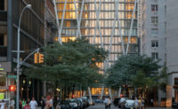
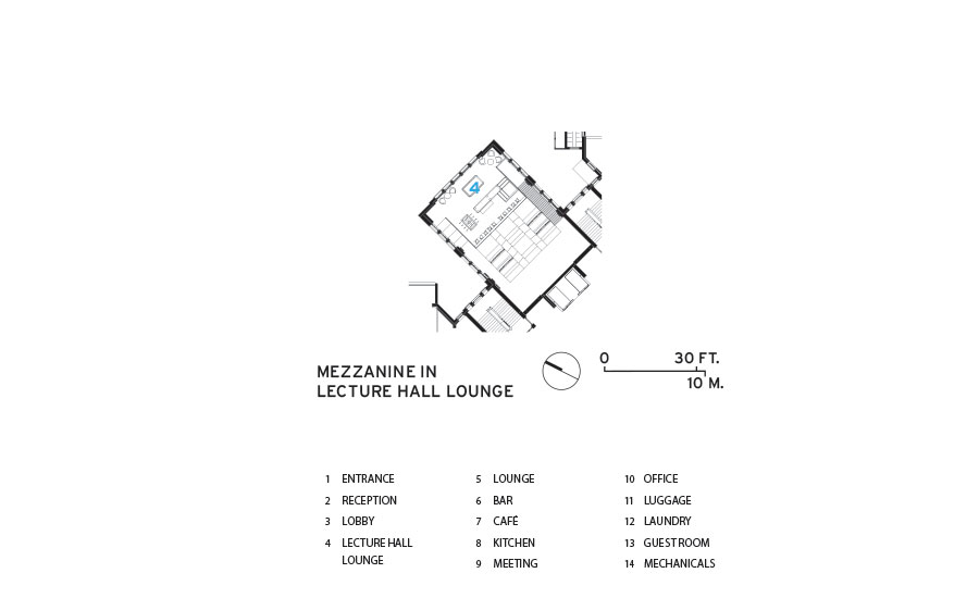
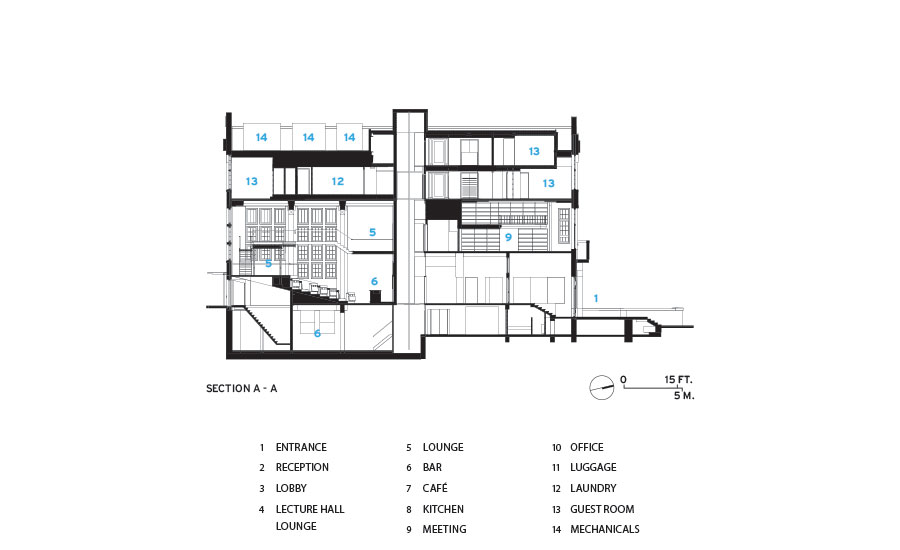
In spite of the landmark restrictions, a number of interventions were possible. In the old lecture hall the team inserted mezzanines at various levels, which provide intimate seating areas. Connected by stairs and a bridge, the mezzanines form a loop around the room, creating private zones while maintaining the graciousness of the original, soaring space. IDEA Ontwerp found new uses for existing elements too. For example, a shaft that formerly housed plumbing and exhaust was widened to hold a glass elevator, with graffiti-like art on the rear wall that you encounter as you zip up and down. The most dramatic change was replacing the top floor—a wood-framed level added in the 1950s—with two new guest room floors. These are enclosed within a diaphanous glass curtain wall that reflects the trees below and the clouds above and extends beyond the roofline, creating the illusion of disappearing into the sky. Priester says this bold addition gained landmarks commission approval in large part due to its non-historicist approach, as well as its visual lightness and ability to be reversed.
The north side of the hostel faces the Oosterpark, which serendipitously was renovated at the same time. In the basement-level breakfast room, guests now look out to the park through windows that had long been boarded up. Also on this level, old coal furnaces were removed from the boiler room to make space for a bar; under the tiled chute where the coal once came tumbling down now sits a comfy armchair.
Mekhayech says he loves the whimsy that characterizes so much Dutch design. That is why there are five different wallpapers by Studio Job, works by various Dutch artists commissioned through the local Brightside gallery, and furnishings by Amsterdam designers, like Blom & Blom’s lighting fixtures made from recycled lab bottles and beakers. The interior also contains playful references to Holland itself, with metal frames partitioning the café and restaurant that are a reminder of gabled Dutch houses; floor tiles nod to the springtime splash of color in the tulip fields.
With its surprising combination of old and new architecture, bursts of local art and design, and a clever hotel formula that attracts a wide-ranging crowd, Generator has brought a new kind of flair to Amsterdam’s flourishing tourism scene.
PeopleArchitect: IDEA Ontwerp — Pieter Koster, Hans Snoek, Eric Priester
DesignAgency
Van Rossum (structural); Michael Nijdam (m/e)
Deltavormgroep (landscape); Build2live (fire protection, acoustics)
Generator Hostels
70,000 square feet
withheld
March 2016
|
ProductsFinishes Studio Job, Flavor Paper
Flos, Moooi, Blom & Blom
Vitra, Bleu Nature, Miniforms, Piet Hein Eek, Tom Dixon |


