Speed Art Museum by wHY
Louisville, Kentucky

Speed Art Museum
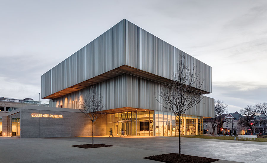
The boxy, aluminum-sheathed galleries of the second and third levels, slightly askew, sit atop the glass-clad ground-level spaces, which are accessed from a plaza open to a main boulevard in one direction and the nearby university campus in the other.
Photo © Rafael Gamo

Speed Art Museum
The aluminum and glass facade of the addition matches the champagne color of the original building’s limestone walls.
Photo © Rafael Gamo

Speed Art Museum
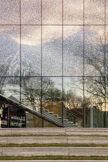
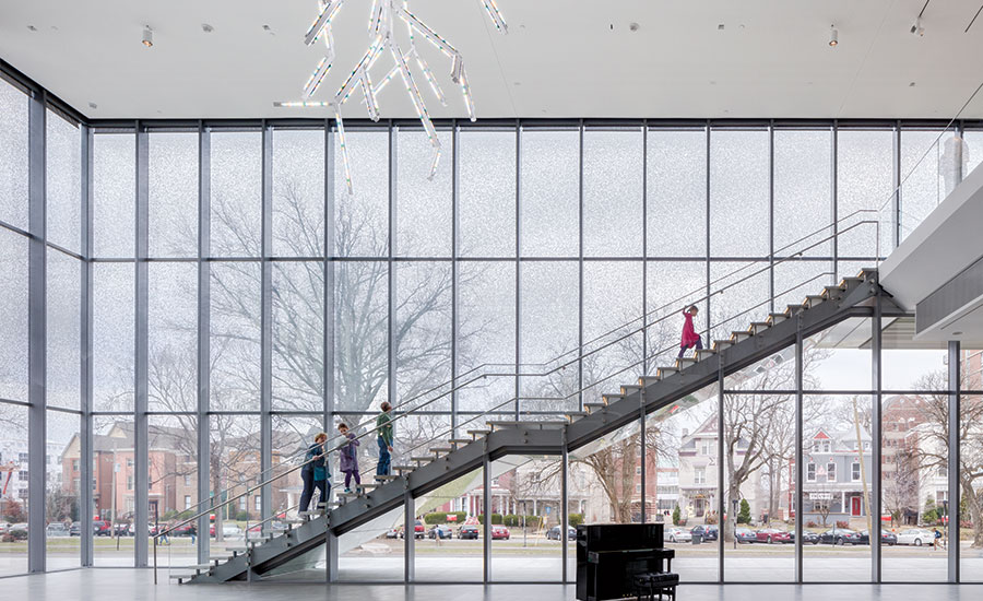
The insulated glazing units are fritted in a wavy pattern to give a sense of depth and provide additional light control to the lobby.
Photo © Rafael Gamo

Speed Art Museum
wHY developed the pattern for the folding aluminum panels of the addition’s facades by taking profiles of the classical moldings from the original building and combining them horizontally.
Image courtesy wHY Architecture

Speed Art Museum
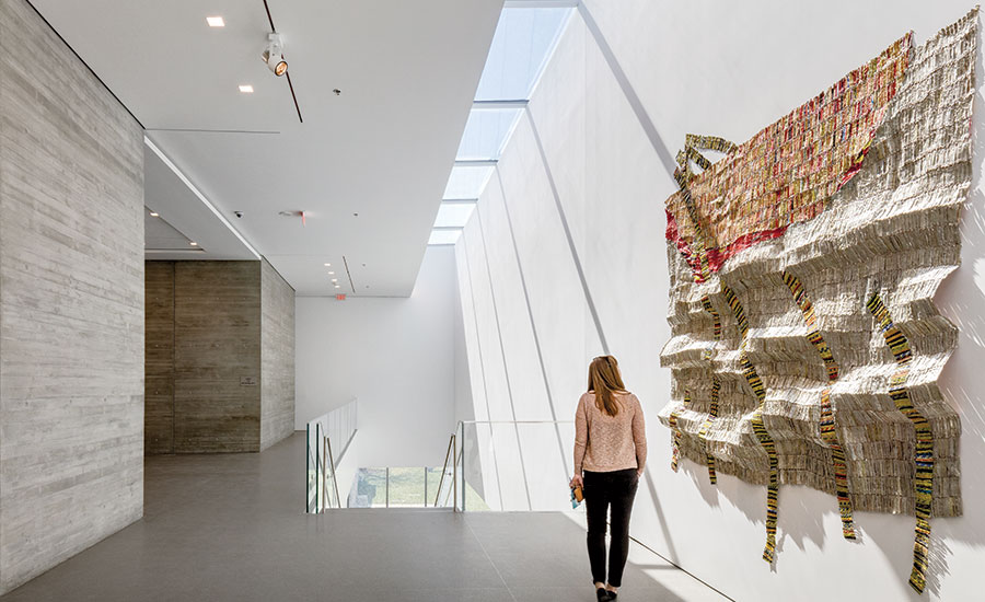
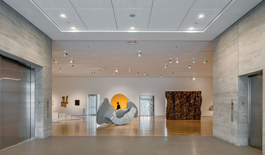
Contemporary galleries are vast open-plan volumes scaled for rotating exhibits of large pieces, and feature white oak floors and board-formed concrete walls at the elevator core.
Photo © Rafael Gamo

Speed Art Museum
Contemporary galleries are vast open-plan volumes scaled for rotating exhibits of large pieces, and feature white oak floors and board-formed concrete walls at the elevator core.
Photo © Rafael Gamo

Speed Art Museum
The axially planned ground floor, clad almost entirely in glass, reorients the institution to engage the city.
Photo © Rafael Gamo


Architects & Firms
According to architect Kulapat Yantrasast, “You can’t get a good answer if you don’t start with a good question.” The former protégé of Tadao Ando is founding partner and creative director of wHY, an interdisciplinary design studio based in Los Angeles and New York, whose ambitious expansion of the Speed Art Museum in Louisville opened in March. Yantrasast won the commission in 2009, after having completed a new building for the Grand Rapids Art Museum, in an international competition whose short list included Bernard Tschumi, Bjarke Ingels, and Jeanne Gang.
Hattie Bishop Speed, who believed in the power of art to change people’s lives, established the museum, Kentucky’s oldest and largest, in 1925 as a memorial to her industrialist husband, James Breckinridge Speed. Local architect Arthur Loomis designed its first home, which opened in 1927 next to the University of Louisville’s Belknap Campus, as an erudite if hermetic Beaux Arts monument, rendered in champagne-colored limestone. Additions followed in 1954, 1983, and 1995. The recent expansion encompasses approximately 80,000 square feet of renovation and 75,000 square feet of new construction.
Yantrasast’s first question was, “What would Mrs. Speed do?” It might seem unlikely that she would choose to nestle her discreet classical temple between two assertive modernist pavilions of glass, aluminum, and concrete. But Yantrasast thought otherwise: “I wanted to touch the life of the Speed with a vibrancy and variety that enhance its integrity and accessibility and bring it into the 21st century. Mrs. Speed would be very excited about it.”
The 62,500-square-foot, three-story North Pavilion, much of it bordered by shallow reflecting pools, is an instant landmark that nearly triples exhibition space and gives the museum a compelling new identity. Intended to appear freestanding and in asymmetrical counterpoint to the original museum, its massing spirals to reflect its vertical circulation. The first level is carved out below a substantial stair, while the second and third levels are articulated as cantilevered masses.
The free-flowing but axially planned ground floor, clad almost entirely in glass, reorients the institution to engage the city and the university equally. Accessed from a new plaza open to both, the entry hall places visitors on axis with the 1927 building. Positioned on a cross axis that links the campus to South Third Street, a major boulevard, are two imposing public spaces. Parallel to the street is the lobby, an ample atrium with the floating grand stair to the contemporary galleries above. Flanking the campus side is the auditorium, an expansive hall opening to a terrace via a hangar door that can lift the room’s exterior glass wall to make a giant awning.
The separate 12,500-square-foot, one-story South Pavilion, which abuts and partially conceals previous additions behind the Loomis building, provides more galleries and a 145-seat cinema while enclosing an outdoor sculpture garden. To further the goal of community engagement, the cinema— like the café in the North Pavilion—is accessible to the public without their visiting the museum.
Both pavilions share a spare but refined palette of materials. Vertically modulated curtain walls—predominantly of glass fritted in a pattern that becomes denser as it goes higher to control light—enclose the full height of the lobby and most ground-level spaces, which have floors of honed terrazzo. Irregularly corrugated panels of anodized aluminum clad the exterior walls of upper-level galleries, which have floors of white oak. Interior cores and the few entry-level exterior walls that aren’t glass are boardformed concrete. The warm gray color of both concrete and aluminum is keyed to the champagne color of the 1927 landmark’s limestone walls.
Seamless circulation provides serene passage from light to dark and from new to old. In the contemporary galleries—vast open-plan volumes scaled for rotating exhibits of large pieces—careful placement of interior walls facilitates smooth transitions between spaces and also modulates light levels from 80 foot candles in zones adjacent to the sunlit lobby down to 10 foot candles in areas that display works on paper. A glass bridge overlooking the education court—a second atrium newly excavated from a former basement— completes the axial procession from the bold, glassy transparency of the North Pavilion to the subtle limestone opacity of the original building.
“The bridge is very grand,” says museum director Ghislain d’Humières. “It provides a vista into 6,000 years of creativity.” Visitors come down from the bridge into the 1927 enfilade of classically configured galleries, anchored at their center by a hypostyle hall, which is linked by a new glass stair to a reorganized series of rooms that house permanent collections of European and American paintings above and Kentucky decorative arts below.
The Speed’s new transparency and accessibility mesh well with d’Humières’ vision for the future. “It’s exactly the tool we need,” he explains, “to create a hub of creativity, a place for every generation, where you can bring art from around the world into an open, welcoming environment.”
Contemporary museum design can run the risk of creating containers so audacious that they upstage their contents. At the Speed, Yantrasast’s characteristic modesty helped him avoid this pitfall. “The job of a museum architect,” he explains, “is that of matchmaker between two good friends— art and people. You set the best environment for the encounter, and then you leave the room.” At the Speed, the architect may have left the room, but his elegant legacy of light, connection, and spatial clarity remains.
The Creative Process
Kulapat Yantrasast
Kulapat Yantrasast describes wHY’s creative process at the Speed Museum as “acupuncture architecture.” “I came up with the notion,” he recalls, “when I was preparing for the design competition. I felt that museums are like old souls that have lived before us and will live long after us. So I think our efforts at rehabilitation and expansion should be like acupuncture and not like plastic surgery. This approach is about precise interventions at key spots in and around the museum in order to help rejuvenate and improve its flow and vitality as it gets bigger. There are so many museums that have become victims of their own enlargement by losing their clarity and vibrancy. I wanted to avoid that.” Another key aspect of wHY’s creative process is a contextual yet inventive attitude toward materials, linking new to old. A good example is the folded anodized aluminum paneling that clads the exteriors of the galleries. wHY developed the panels by taking profiles of the classical moldings that give human scale to the monumental 1927 building, combining them horizontally, and then abstracting the resulting pattern to create an irregular zigzag corrugation in plan. The panels evoke the original limestone in both their color and their play of light and shadow.
PeopleArchitect: wHY 473 W Broadway, New York, NY 646 682 9280 & 9520 Jefferson Blvd, Culver City, CA 310 839 5106
Personnel in architect's firm who should receive special credit: Kulapat Yantrasast, Principal, Partner in charge Andrija Stojic, Director, Project Architect Richard Stoner
Architect of record: K. Norman Berry Associates Architects
Interior designer: wHY
Engineers: Structure (Design): Thornton Tomasetti Structure (Record): Brown + Kubican MEP (Design): IBE Consulting Engineers MEP (Record): Kerr-Greulich Engineers Civil: Sabak, Wilson & Lingo
Consultants: Landscape: (Design) Reed Hilderbrand, (Record) Carman Lighting: Renfro Design Group Acoustical: Newson Brown Acoustics Curtain Wall: Thornton Tomasetti Waterproofing: Wiss Janey Elstner Food Service: JGL
General contractor: F.A. Wilhelm Construction
Photographer: Rafael Gamo
Renderer: wHY
Software: Auto CAD 2010 & Revit
Size: 75,000 square feet (new construction)
Cost: $50 million
Completion Date: March 2016 |
ProductsStructural system Steel frame Masonry: CIP Concrete Walls (F.A. Wilhelm) Metal Panels: McGrath Metal/glass curtain wall: Cristacurva & Kawneer EIFS, ACM, or other: STO Corporation Curtain wall: Cristacurva & Kawneer
Roofing Built-up roofing: TPO – Firestone Building products Elastomeric: Carlisle Coatings & Waterproofing Metal: Flashing and Sheet metal: Firestone Building products
Glazing Glass: Cristacurva Skylights: Kawneer
Doors Metal doors: Assa Abloy, Ceco doors, Poynter Sheet Metal Glass doors: Architectural Glass & Metal Hangar doors: Schweiss Doors
Hardware Locksets: ABH, Adams Rite, McKinney, National Guard, Rixson, Sargent, Schlage, Trimco Closers: Assa Abloy Exit devices: Tyco Simplex Grinnell Security devices: Tyco Simplex Grinnell
Interior finishes Acoustical ceilings: Armstrong, Crane, Hunter Douglas Suspension grid: Armstrong, Crane, Hunter Douglas Cabinetwork and custom woodwork: Solid Light Paints and stains: Benjamin Moore Solid surfacing: Corian Floor and wall tile: Rosa Mosaic & Tile, Louisville Stoneware Carpet: Mohawk, Shaw
Furnishings Reception furniture: Solid Light Chairs: Kartel, MTS Seating, Sandler Seating Tables: Herman Miller, Haworth Upholstery: Design Tex
Lighting Interior ambient lighting: HE Williams, Finelite, California Accent Lighting Downlights: Kurt Versen, Juno Task lighting: Igno Maurer Track Lighting: Edison Price
Conveyance Elevators/Escalators: Wright Elevator
|


