Ford Foundation: Innovation and Symbolism on 42nd Street
This article originally ran in the February 1968 issue of Architectural Record.

From Architectural Record, February 1968. Read a PDF of the original article here.
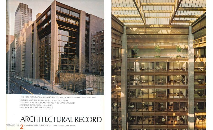
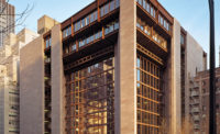
By enclosing a third of an acre garden in walls of glass twelve stories high, the architects of the Ford Foundation Building, Kevin Roche John Dinkeloo and Associates, have created a new kind of urban space that stands between the sealed environment of a modern office building and the increasingly harsh and uncontrolled urban landscape outside.
Original architectural ideas are rare and hard to come by; and, when they appear, they usually set off a train of related developments. While the Ford Foundation building is very much one of a kind, a special case, it is directly related to problems of the urban environment that architects and planners everywhere are trying to resolve.
When architects come to visit the Ford Foundation Building, however, they are going to get a surprise. While the basic concept of the building may seem simple enough in drawings and photographs, in actuality it is tremendously complex and paradoxical. The design, which might be expected to produce a sense of informality, openness and candor, is actually highly charged with a symbolic content that invests the most ordinary aspects of the building’s life with an almost ritualistic significance.
For example, a visitor does not simply drive up to the Ford Foundation, he approaches it by a carefully planned processional way, which turns the mundane requirements of a one-way street system into a ceremonial journey of surprise and discovery. Traffic regulations require that every car headed for the 43rd Street entrance to the Ford Foundation must first drive east on 41st Street, and turn left on to Tudor City Place, which crosses 42nd Street on a bridge, affording a highly interesting three-quarter view of the Foundation building. The building is not visible again until the car pulls into the entrance-way of the 43rd Street façade, a closed composition of granite and glass which affords no hint of the light and spacious garden court within.
This sequence, rather reminiscent of a slide lecture by Vincent Scully describing the approach to a Greek temple, is not an accident but conscious contrivance. In the same way, the Ford Foundation building itself is far more than office space for some 350 employees. It is a symbolic statement that seems to characterize the Foundation’s relation to the world around it, and the relationship of its employees to each other.
Kevin Roche says that he was certain from the beginning that he should not create a typical New York office building, which he calls just a multiplication of ground floor space. He also felt that the Foundation, which has grown very rapidly over the past 10 years, suffered from a lack of communication and needed to be housed in a building strongly expressive of relationship and the organization’s personality.
The site is an unusual one, near the United Nations Building, at the east end of 42nd Street, one of Manhattan’s most prominent cross-town streets. The plot selected by the Foundation is not prominent in itself, however; it is not large and does not occupy a corner. The most salient characteristic of the location is its proximity to Tudor City, a self-contained group of apartment houses dating from around 1930, whose frosting of Elizabethan detail gives the complex its name. Tudor City’s main level is more than a story above 42nd Street, and two parks at this upper level adjoin the Ford site’s eastern edge.
Although Roche knew all along that a courtyard of some kind would be an important part of his design, his initial concept was an L-shaped building with a stepped section that terraced down to meet the space of the Tudor City parks. The decision to reach out and enclose the courtyard space established the basic concept, and the rest of the building follows logically from it. The courtyard still steps up an entire story from 42nd to 43rd Street, and several of the lower floors of the buildings still step back to create terraces; but the interior volume becomes a single space, and pulls the whole building together in a very powerful way. The court becomes a park, which is open to the public and is a tremendously generous gift to the city, as is the care and restrain with which the building’s dimensions, proportions and colors have been related to its neighbors. The warm tones of the granite facing and the rust-surfaced steel harmonize particularly well with the red brick of Tudor City.
The offices are grouped around the court in such a way that it provides both a physical and visual transition between the office space and the world outside. The court serves as a giant return for the conditioned air supplied to the offices, and the offices and corridors that look out on the court have doors that can be opened and slid back. The court also provides a variety of outlook and a constant point of reference. Roche speaks of it as a “living room” for the whole Foundation that provides a sense of community for everyone who works there. The sense of community is certainly present, but the visitor is likely to find that “living room” is too domestic a term. In fact, the space is little short of awe-inspiring, and the sense of organization that is projected is one of ritual, hierarchy, and immense power.
It is difficult to say exactly why this rather unexpected effect should have occurred. One reason may be that, by enclosing the court, Roche has made the entire building essentially four-square; that is the building’s height, length, and width are very similar. The four-square building with an interior court is a traditional symbolic representation of the universe, and as such is an ancient symbol of power, used in religious buildings and palaces. The palace of the king of kings, the temple of the New Jerusalem, the house of the world, are the concepts this shape connotes.
Whatever the reason, the most ordinary aspects of the Foundation building seem charged with special significance. For example, it is very typical corporate symbolism for the top floor to be the executive floor; so typical, in fact, that one ceases to think of this arrangement as symbolic. But, in the Ford Foundation building, the president is visibly above everyone else; one can look up and see him from virtually every point in the building. Not only that, but directly above his head is the office of the Chairman of the Board, whose office is the only one adjoining the court that does not look out on it. The two offices seem to become the visible and invisible manifestations of a mysterious power.
The mysterious effect is heightened by the consistency of interior detailing. The whole building is essentially a collection of executive suites, as the non-executive work of the Foundation is contracted out, through the medium of grants. Each office is done in the same rich palette of subdued natural materials. To the outsider, all the offices appear identical, and the activity of the occupants thus completely unintelligible. The visitor senses, however, that, to the initiate, the fine gradation of office location and sizes has a definite meaning; so that, seeing all, he knows he is excluded.
A final symbolic note is struck by the fact that almost all the metal trim in the building is brass; that is, one knows it is brass, but actually one thinks of it as solid gold, the ancient perquisite of priests and kings. The pervasiveness of gold elevates everything to the status of cult object. Telephones, filing cabinets, typewriter stands, door trim, stair rails, all appear to be of solid gold. Most striking of all are three golden brass doors that lie at the end of a precipitous descent into the basement.
If the building has acquired a symbolic life of its own, however, it is because the Ford Foundation gave its architects the freedom—and the money—to make the design a work of art. And if the result has the effect of picking out and over-emphasizing certain aspects of the Foundation’s organizational character, it is because the design has a tremendous symbolic power that no one could have anticipated before it was built. It is, perhaps, the most important contribution of this building that it demonstrates that a space only modern technology makes possible can command an almost archaic significance.
The experience of the court is also an important one. The design of landscape architect, Dan Kiley, has made it a real garden, and not just a collection of potted plants. In a time of rapidly increasing urbanization, growing densities, and a more and more frenetic pace of life, a garden court of this kind becomes an oasis of tranquility and a point of balance in an uncertain world.
Thus, the design of the Ford Foundation Building, although unique, is also suggestive, and it will be interesting to see if it will have an influence on other buildings. One certainly hopes it will.


