Luminous Revivals
PG&E Mission Substation

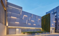
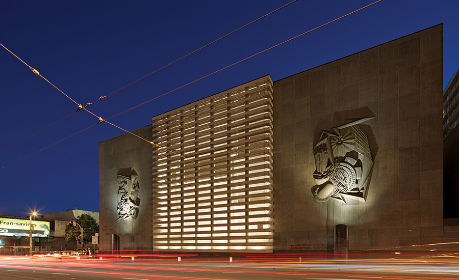
Illuminosa spotlighted Robert B. Howard’s Power and Light bas-reliefs and illuminated the partly resin-clad ventilation shaft from within.
Photo © Bruce Damonte

TEF Design repaired and replaced concrete panels on Mission Substation’s Hyde Street elevation.
Photo © Bruce Damonte

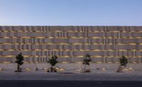
The facility’s Mission Street elevation is a modern composition of curved volumes framed by classical elements, to which newly installed bent-steel fins add a human scale and texture. Streetscape lighting by HLB complements Illuminosa’s treatment of this southeast face.
Photo © Bruce Damonte


San Francisco
Fortresslike power plants are usually perceived as an intrusion on the visual environment. But the San Francisco utility giant PG&E has long taken exception to that truism, as the developer of landmarks such as the Classical Revival– style Jessie Street Substation or Beaux-Arts Substation J, both of which are listed on the National Register. Now with design consultant Jonathan Manzo, the company has extended this legacy into the current century with sensitive improvements to many of its existing facilities.
The modernization of a series of substations, led by TEF Design, bridges PG&E’s historic cultural patronage and its present-day commitment to the urban landscape. The recent upgrades to the Mission Substation are the culmination of the utility’s new stewardship effort. Architect William Merchant originally completed this monumental container of electrical transformers in the Mid-Market district in 1948 and accented it with two striking bas-reliefs, Power and Light, by artist Robert B. Howard.
Anchoring a corner of Mission Street, the building comprises two public elevations. On its northeast face, the Power and Light reliefs are mounted atop cast-concrete panels and flank a projecting bay—formerly the ventilation shaft— which is wrapped in concrete bands. The substation’s southeast side, overlooking Mission Street, features nine inwardly curved alcoves framed by pilasters. A black granite base unifies the elevations, though on Mission Street this plinth is articulated as a series of planters whose bowed shapes alternate with the alcoves.
“The building’s original proportions are both strong and elegant,” says TEF associate principal Paul Cooper. “A lot of thought went into making it.” That thoughtfulness extended to the lighting. For example, Merchant embedded lamps within the planters, as well as two granite sidewalk pillars, to uplight the alcoves and sculptures.
Yet the Mission Substation’s architect did not foresee the neighborhood’s decline, which began in earnest with the 1960s-era construction of the BART subway system. Persistent homeless encampment in the substation planters ultimately prompted security improvements, and in late 2011 PG&E and Manzo invited TEF to join a project team that already included the Berkeley, California, lighting design studio Illuminosa.
The security upgrade needed to engage the cityscape in a positive way. “Scale, opacity, and rhythm of materials should strengthen the building without making viewers feel like their movement is being restricted,” says Cooper, who devised a fence of 1-inch-thick fins of steel, bent into sine-cosine shapes (curved at the top for bird control), to guard the Mission Street alcoves yet harmonize with their geometry. TEF and Illuminosa amplified the new barrier’s form by uplighting it with 3,500-Kelvin (K) linear LEDs at its base. Dimmable narrow- distribution LEDs flood the building’s alcoves in 4,000K light that terminates at the parapet for a slightly cooler, yet soaring backdrop. TEF partnered with the San Francisco office of Horton Lees Brogden (HLB) to balance Illuminosa’s work on the Mission Street facade. HLB illuminated adjacent trees and service-yard gates at approximately 3,000K.
Perpendicular to the building, on Hyde Street, Illuminosa placed a pair of 30-watt LEDs in each existing sidewalk pillar— one producing 2,700K light in a 14-degree beam spread, and the other washing 4,000K illumination over a 41-degree spread—to shine on the bas-reliefs. “The concept was to have a field of cooler color and a ‘punch’ of warmth,” says principal Alice Prussin. Meanwhile, LED floodlighting reflects off new stainless-steel mesh inside the ventilation shaft for a uniform glow. TEF installed translucent resin between the shaft’s three lowest bands to activate the pedestrian realm.
The revisions and additions to the Mission Substation have prevented loitering while also enhancing Merchant’s original vision more artistically than the previous metal-halide fixtures, which Prussin says had washed the bas-reliefs without focus and produced uneven bursts of light in the shaft. Besides participating in the revitalization of the Mid-Market area, the project offers further proof that utilitarian structures can, in fact, be civic amenities.
People
Architect: TEF Design Amy Eliot, principal in charge; Paul Cooper, associate principal; Kacper Biogosinski, architect; Nicholas May, designer
Lighting Designer: Illuminosa (facade) - Alice Prussin, principal; Horton Lees Brogden (streetscape) - Angela McDonald, senior principal
Engineers:Cushing Associates Consultants: Jonathan Manzo, Urbin (owner's representative) Acoustical: Charles M. Salter Associates General contractor: Paradigm Client: Pacific Gas and Electric Company
Capital partnership
Cost: $4.4 million Completion date: September 2013
|
Products
Exterior cladding
Lighting Detail
1A. East Facade - Hyde Street lighting concept Building shaft- To create an evenly glowing volume to highlight the building geometry and balance the façade composition. Type of metal mesh was selected to enhance the glow, translucent panels replace the previous solid panels at lower levels creating visual interest for pedestrians and preventing debris collecting in shaft. Carefully aimed 150-watt grazing uplights replaced previous 250-watt metal halide floodlights that created discernable scallops.
2A. East Facade - Hyde Street Lighting concept Reliefs: To create focus and bring emphasis to the iconic WPA era reliefs. The location of the sidewalk pillars dictated a grazing angle bringing a sense of depth and shadow. This is further augmented with the use of multiple accent lights of varying beam spreads at each location. The new lighting design uses 30-watt LED spotlights providing energy savings of more than 50%. Previous lighting used 175-watt metal halide floodlights providing only a general wash of light with no focus.
3A. South Facade - Mission Street Lighting wall alcove concept : To softly light alcove creating backdrop for dramatic lighting of fence element. Care was taken to control night sky light pollution and provide uplight at brow to accentuate building stature. 50-watt LED floodlights replace the previous 250-watt fixtures. Dimming control was specified for floodlights to allow for timed control.
4A. South Facade - Mission Street Sculptural Fence Lighting concept. Existing picket fence was replaced with custom designed and locally manufactured metal fence that provides security and aesthetic value to the substation and to the pedestrian experience. The integrated linear LED light channels located at the base of the new fence provide drama and activate the sense of movement across the length of the façade while emphasizing the sculptural geometry of the vertical fins. 4B. South Facade - Mission Streetscape lights. Uplights were added at the trees to balance the light from the fence and create a more secure environment. 4C. South Facade - Mission Street Gates. Lighting was added at the base of the gate fence to put light on the ground. This increased security and discouraged loitering. |

