Renovation, Restoration, Adaptation
Minsheng Contemporary Art Museum
Full Metal Jacket: An abandoned electronics factory is converted into a sprawling space for contemporary art.

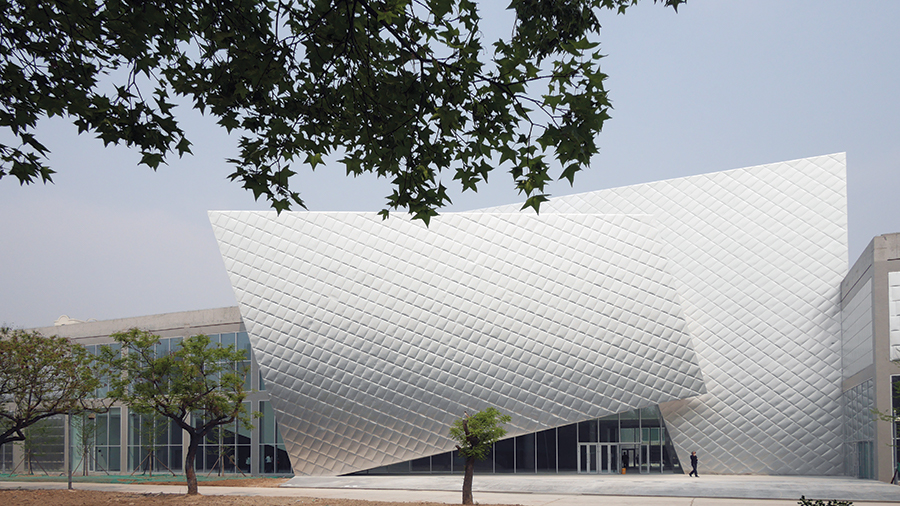
To break down the immense size of the 354,000-square-foot former factory building, Pei Zhu inserted an angled block that serves as the main entry and wrapped it in a delicate quilt of 2.3-foot squares made of almost paper-thin aluminum.
Photo © Fang Zhenning

To break down the immense size of the 354,000-square-foot former factory building, Pei Zhu inserted an angled block that serves as the main entry.
Photo © Fang Zhenning

A courtyard will be used for displaying art when the second phase is completed.
Photo © Qingzhu Image

A grand stair made of precast concrete leads to the second floor, rotates 45 degrees, and then rises to a third level.
Photo © Studio Pei-Zhu

A sophisticated play of shifting angles helps animate the main lobby.
Photo © Qingzhu Image

With skylights above, a bridge overlooking the main lobby is an excellent place to display art.
Photo © Cafa Art Info

The architects exposed the building’s original concrete beams in galleries, connecting the past to the present.
Photo © Studio Pei-Zhu

Image courtesy Studio Pei-Zhu

Image courtesy Studio Pei-Zhu

Image courtesy Studio Pei-Zhu


Architects & Firms
Beijing
At 985 feet long, an abandoned Panasonic television factory in Beijing offered tantalizing potential as a cultural space—and huge challenges. Set at the northern edge of Factory 798, the buzzing arts district that has developed in a cluster of mostly defunct industrial facilities during the past 20 years, the building was a logical site for China Minsheng Bank to create a museum to anchor its expanding presence in the contemporary art world. (The bank already had a museum in Shanghai, founded in 2008.) But converting the derelict leviathan in China’s capital, with its vast acreage of generic space, into a humanely scaled place for art would not be easy.
The bank started the process in 2011 by hiring Thomas Krens, the former director of the Solomon R. Guggenheim Foundation, to devise a programmatic strategy. Krens brought in Pei Zhu, the Beijing-based architect (Design Vanguard, December 2007) who had worked with him on a never-realized branch of the Guggenheim in the city and had also designed Pace Gallery’s outpost in the 798 art zone in 2009.
Much of Zhu’s work explores the notion of scale, playing with perceptions of size and orientation. For example, his Digital Beijing telecommunications center, built for the 2008 Olympics, looks like a giant computer chip, and his OCT Design Museum in Shenzhen takes the form of a three-story, metallic-skinned pebble. Both of those buildings obscure their size and present no obvious front or back. For the Minsheng commission, his task would be the opposite—making the 1979 building for the Japanese electronics giant more legible by breaking it into various parts and accenting its main entrances.
Prompted by Krens, Zhu approached the project as a chance to investigate the role of museums in the 21st century. “We kept talking about the art museum of the future,” says Zhu. “We felt it should emphasize activity rather than static galleries and should be flexible enough to accommodate different kinds of art—from painting to performance.”
Zhu’s strategy for taming the enormous building was to work through both subtraction and addition. To break down its expansive length both on the outside and inside, he carved out two full-height spaces for entrance lobbies, cutting concrete floor slabs and inserting new steel and concrete structural elements. Shiny metal boxes, tilted to attract attention, announce the two entries: the main one an angled cube projecting from the relentlessly horizontal old factory structure, and the secondary one topped by a canted light scoop that Zhu likens to a volcano. To clad the main entrance and parts of the elevation on either side of it, the architect used an inexpensive material—aluminum sheeting normally specified for air ducts. Working with the manufacturer, he reduced the thickness of the metal to 0.02 inches (0.5 millimeters), so it’s almost paper thin and has a fragile beauty set in tension with the toughness of the old building. Applied in 2.3-foot squares, the aluminum has the appearance of a quilted silk jacket of the kind often worn by people in northern China.
In the main entry cube, Zhu animated the space with a concrete stair that flares out as it rises to the second floor and then rotates 45 degrees as it goes to the third. Designed for sitting as well as climbing, the stair works as a social hub where people can hang out or watch performance art and presentations. Since the museum opened in May 2015, curators have sometimes borrowed the upper-level stair for art installations, says Zhu. Instead of poured concrete, the stairs are made from precast pieces, fabricated on-site.
Zhu removed the roof from a section of the north side of the building to carve out a long courtyard that can accommodate large works of art. Two overhead beams that slide along rails on the roof will help with the installation of heavy art pieces when the outdoor space is completed, later this year. To the west of the courtyard, the architect raised the steel-truss roof of the existing structure to create a “big box” that’s 45 feet high. Responding to the call for a variety of spatial experiences and the needs of different kinds of art, Zhu also designed a “medium box” and a “small box.” On the second floor, he laid out what he calls “perfect galleries” with 16-foot-high ceilings and dimensions that work for art such as painting and calligraphy.
Referring to the two lobbies, with their tall spaces that can be used in many different ways, Zhu says, “Creating ambiguous spaces is one of my signatures.” He points to Chinese artists who for centuries have painted landscapes with empty spaces that hint at the concept of infinity. Zhu hopes to recreate this effect in the museum.
Due to changes in the top ranks of Minsheng Bank, the project has moved along more slowly than expected. Work on the smaller lobby, some of the galleries, a black-box theater, and ancillary spaces for a café, an artist’s studio, and a VIP lounge—the second phase of construction— will start early in 2016. In the meantime, the museum has a rough-around-the-edges character that reinforces the muscular nature of certain elements, such as the sculptural concrete stair, but undermines others, including the more refined “perfect” galleries.
Built right after Deng Xiaoping began opening the Chinese economy to the rest of the world, the Panasonic factory was the first international joint venture with a non-Communist country. Now Zhu hopes the building can once again point China in a new direction as it looks beyond its industrial past and recycles its building stock, instead of always tearing down and starting over.
People
Architect Studio Pei-Zhu
Personnel in architect's firm who should receive special credit Design Principal: Zhu Pei
Engineers Shanghai construction design and research institute co., LTD;
Consultants Art Director and Museum Consultant: Thomas Krens/GCAM General contractor 7th Group Shanghai Construction Engineering Co., Ltd
Photographers Studio Pei-Zhu Client China Minsheng Banking Corp. Size 354,000 square feet Cost $6.1 million Completion date April 2015
|
Products
Structural system Steel frame structure at new atrium
Exterior cladding Metal panels/rainscreen: 0.5mm aluminum magnesium manganese panels Roofing Metal: 0.9mm aluminum self-locking panels Windows Metal frame: Aluminum mullions by King Glass Engineering Ltd
Glazing Glass: Low-E double glazed units
Doors Entrances: part of curtain wall by King Glass Engineering Ltd
Interior finishes Ceilings: Double layer of 9.5mm plasterboard Furnishings Reception furniture: Plywood carcass with white paint finish
Lighting Interior ambient lighting: Erco, Deco Conveyance Elevators/Escalators: Express Elevator
|


