Kansas City, Missouri
On a tidy parcel of land in Kansas City, Missouri, the Ewing Marion Kauffman School demonstrates an elegant sense of order and pragmatism while suggesting a forward-thinking attitude. In so doing, the building, designed by Perkins+Will, reflects the school’s vision of both discipline and flexibility—and creates a place of pride for a challenged student body.
The Ewing Marion Kauffman Foundation was established in the 1960s with the mission “to foster a society of economically independent individuals who are engaged citizens in their communities.” With a background in supporting education and entrepreneurial programs, the Kansas City–based organization founded its first charter school in 2011, housed in an interim facility for its first two years. Now, with its striking new 206,000-square-foot building, the school has room to grow. Currently, it serves 690 kids in fifth through ninth grade and will eventually run through 12th grade, expanding to 1,100. Students are admitted by a lottery system that gives priority to children living in the city’s six “highest need” zip codes.
The school’s philosophy has structure at its core. With a rigorous program designed to “create college graduates,” it has longer hours and a longer school year than the other local public schools. It also has double class periods and “maintains high academic and behavioral standards,” as noted on the school’s website. Between classes, the students, in their khaki-and-navy uniforms, move silently through the halls, in straight lines, with their arms pressed firmly to their sides.
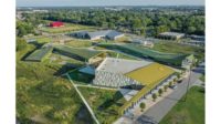
The 13-acre campus presented the architects with a challenge. A utility easement ran through the plot. And it contained two 1960s buildings that were formerly the headquarters for the Church of the Nazarene, which sits on an adjacent hilltop. Deeming one structure unfit for their needs, the team razed it but retained the second—a three-story limestone office building—for the middle school. “We treated it like a found object,” says design principal Bryan Schabel. But the building was too narrow to fit a double-loaded corridor, so the architects expanded it to the west. Distinguishing new from old, they clad the extension with a corrugated metal panel system that brings a spark to the volume’s more subdued limestone side. “It started out as a collage of different materials, which we continued on the other buildings,” says Schabel.
To traverse the easement, the team created an enclosed bridge, with a storefront window system, that connects the middle school to the core of the campus: a large volume housing the dynamic triple-height cafeteria and gymnasium. With a steel-framed roof and walls made of enormous structural precast-concrete panels dotted with porthole windows—which animate the interiors and soften the surfaces’ industrial quality—this building, with its long, broad ramp, helps adjust the floor-to-floor difference between the old and new construction. It also relates to the materiality of the existing structure and connects to the new steel-frame, corrugated-metal-clad high school volume. “Everything is off-the-shelf—it’s the whole idea of the building,” notes Ralph Johnson, design director for Perkins+Will, emphasizing the attention to the bottom line.
In the initial planning stages, Perkins+Will (with experience in education as far back as 1940, when they collaborated with Eero Saarinen on the Crow Island Elementary School) discussed a range of organizational concepts—for example, flexible classrooms that would open into each other. Of course, the scheme had to accommodate changing pedagogy. “The building was designed to be as adaptable as possible, to ensure it could always be utilized to serve the school’s mission, even if approaches to teaching change,” says Aaron North, vice president of education for the foundation.
In response to the school’s culture, the architects gravitated to a structured, more traditional scheme, “but one where we left some room for the school to create their own learning environments outside the classroom,” says principal in charge Steve Turckes. As children move through middle school into high school, the spaces loosen up, with more open, flexible areas—like the daylit cafeteria and a soaring atrium, with its bold yellow stadium seating— creating a subtle push-pull against the more strictly programmed classrooms. While classrooms and collaboration spaces in the middle school are accessed off the double-loaded corridor, the high school is a donut in plan, with commons rooms and a media center ringed by classrooms. Instructional spaces are devoid of teachers’ desks, to discourage “nesting” between periods. Instead, each grade has a dedicated teachers’ workroom to promote faculty collaboration.
Daylight floods the interiors, and though the surrounding neighborhood is known as troubled, views from the school frame the parklike setting of the campus, with patios and generous playing fields. Throughout the building are surprising moments, such as lounge-like study areas and quiet niches. At the top of the ramp leading from the cafeteria to the middle school is a pleasant balcony (looking down to the tables below), which has evolved to host morning meetings and end-of-day roundups. “We don’t always know specifically how these spaces will be used,” says Johnson. “It’s interesting to see how they become integrated into the curriculum.”
In its short history, Kauffman has achieved impressive boasting rights. The founding class is showing a 50-percentage-point gain on state tests after their first four years, and has surpassed statewide averages for reading and math. The school has an astonishing 97 percent attendance rate. Being in an inspired environment is surely a contributing factor. “The intentionality of this building is so important,” says Candace Potter, the school’s talent recruiter. “It’s wonderful to see how having a beautiful space affects the pride of the students.”
People
Architect: Perkins+Will Personnel in architect's firm who should receive special credit: Design Director: Ralph Johnson, FAIA, LEED AP Design Principal: Bryan Schabel, AIA, LEED AP Managing Principal: Steve Turckes, AIA, CEFP, LEED AP BD+C Project Manager: Christopher Hale, AIA, LEED AP Sr. Project Architect: Greg Tamborino, AIA, LEED AP BD+C Educational Planner: Aimee Eckmann, AIA, CEFP, LEED AP BD+C Project Team: Milena Kim, Crister Cantrell, Peter Frisbee, Leila Janssens
Associate Architect: MOMENTA
Interior Designer: Perkins+Will
Engineers: Shafer, Kline & Warren (civil); Walter P Moore (structural); Gibbens Drake Scott (m/e/p/fp)
Client: Ewing Marion Kauffman Foundation Size: 206,000 square feet Cost: withheld Completion date: August 2013 (middle school and shared buildings); June 2014 (high school) |
ProductsStructural system Steel frame, some precast walls
Exterior cladding Metal Panels: Centria Precast concrete: Coreslab Curtain wall: Kawneer
Roofing Firestone (fully adhered thermoplastic membrane)
Glazing Glass: PPG/Insulite
Interior finishes Acoustical ceilings: Certainteed Suspension grid: Chicago Metallic Paints and stains: Sherwin Williams Floor and wall tile: Daltile Resilient flooring: Armstrong, Azrock, Johnsonite Carpet: Interface, Shaw
Conveyance Elevators/Escalators: Schindler |


