On the far west end of a wall on the sixth floor of the new Whitney Museum of American Art hangs Frank Stella’s great and influential, black proto-Minimalist painting Die Fahne hoch! (1959). It’s raked with natural light streaming in from a giant window, making the work appear lighter on the left than on the right. Ordinarily, such an installation might cause an artist to go ballistic (though an oil painting can tolerate such indirect light) and sophisticated viewers to shake their heads in disapproval. But Whitney director Adam Weinberg says Stella approved the way the picture looks: as it might in a real person’s windowed home. The placement is subtly emblematic of the new Whitney’s enhanced spatial, visual, and social openness—a surprising humaneness, if you will, in such a gleaming new edifice.
For the opening of its new Renzo Piano building—with 50,000 square feet of indoor gallery space—the Whitney is trotting out 650 works by 400 artists in its holdings for an exhibition with a telling title from Robert Frost’s poem America Is Hard to See. In the old Marcel Breuer building on Madison Avenue—the third of four Whitney locations since its founding—what the public could see of the 22,000 works in the permanent collection was mostly confined to a measly 7,725 square feet on the fifth floor of what seems, in retrospect, a mausoleum-like edifice. So this show is less an exhibition than a reunion, in tuxes and ball gowns, where old Whitney favorites show up along with such pleasantly odd guests as a suite of gently satirical 1921 watercolors by Guy Pène du Bois, present only because the researching curators were serendipitously reminded of their existence.
The new Whitney has done a remarkable job of bringing coherence and experiential flow to its evolving definition of American art. (State-of-the-art LED lighting and some astutely chosen grays for some walls—off-the-shelf from Benjamin Moore!—help.) The exhibition is offered up in 23 “chapters,” each title deriving from a specific work within. The chapters run roughly chronologically upward from the ground floor. The Whitney’s earlier art looks better—more concentrated, richer—than its newer acquisitions. Ben Shahn’s The Passion of Sacco and Vanzetti (1931–32), Helen Lundeberg’s delicate “post-Surrealist” lithograph, Planets (1938), and Hugo Gellert’s astonishingly fresh propaganda prints, Fighting with All Our Might (1943), for instance, are free of the bombast that shows up in much of the more recent art installed on the floors above them.
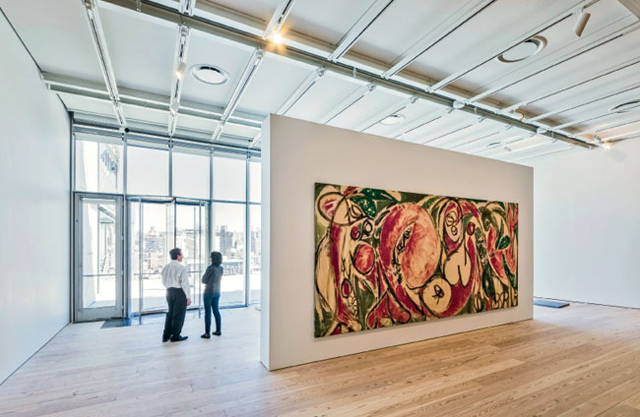
Some art closer to our time, however, does contain a few wonderful revelations. The largest and one of the best Lee Krasner paintings I’ve ever seen, The Seasons (1957), is given its own wall and steals the show from such big boys as Franz Kline and Barnett Newman. An untitled diagrammatic painting of a slave ship and cotton blossom, from 1969, by the under-known African-American artist Malcolm Bailey, who died in 2011, is powerful in the muted way it depicts its searing subject. The Whitney has included more women and minority artists not as a make-good, but simply because America is that much harder to see without their being more fully represented.
Piano’s new Whitney has an architectural openness that matches, if not surpasses, the museum’s curatorial stance. The 17½-foot ceilings, the same as in the old Whitney, feel more lofty; some are left “open” so works of art can be hung from the beams. Daylight floods into the building from east, west, and overhead on the top floor (from a refreshingly old-fashioned skylight system, with no tricky louvers or moving tilted panels). The art looks surprisingly de-institutionalized and fresh, as it might on a studio visit if the artist had swept the floors and repainted the walls. Yes, there are darker galleries in the new Whitney, but even those have a brightness and clarity. On the first floor, a dark-blue room contains work originally collected by the museum’s founder, Gertrude Vanderbilt Whitney (including some fine figure drawings by Edward Hopper done at the Studio Club, the precursor to the Whitney). The Whitney is leaving that gallery open to the public without an admission charge; visitors can descend from the High Line, walk in from the plaza, and go right to the art. Paying customers who get out on the Whitney’s expansive upstairs terraces will see the greatest 270-degree “waist-level views” (as Weinberg calls them) of Manhattan.
Those gritty city views could be a metaphor for the exhibition. “Hard to see” really means “hard to define,” or, as chief curator Donna De Salvo has described the task of mounting the exhibition, “the impossibility of offering a tidy picture of this country.” Many artists collected early on were immigrants; in recent years, the Whitney has struggled with a definition of what constitutes an “American” artist (its infamous Biennials include those who produce freshly baked art all over the world). One of the more startling works in the exhibition, for example, is a 6-foot-square collage, Air Mail Stickers (1962), by the Japanese artist Yayoi Kusama, who created it while living in New York but then returned to Japan and voluntarily committed herself to a mental hospital where she’s lived—and made art—ever since.
What “American” means for the Whitney is still a bit of a problem: is it a straitjacket or a key distinction in the increasingly global art world? The success of the new Whitney, beyond the box office, will depend on how well it navigates this tricky path. Placing a black Frank Stella in refreshing natural light is, one hopes, a small indication of the Museum’s adroitness.
Size: 220,000 square feet
Cost: $422 million
Completion Date: May 2015
Architect:
Renzo Piano Building Workshop, architects
in collaboration with Cooper Robertson (New York)


