Architects & Firms
Sydney is home to one of the most recognizable buildings in the world: Jørn Utzon’s Opera House. The shot of its shell-like nesting roofs, with the trussed arch of the Harbour Bridge rising beyond, is without question the image most associated with the city.
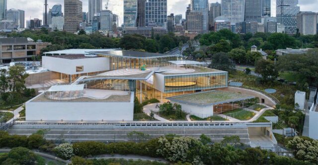
But now, half a century since the completion of Utzon’s building, Sydney has an architectural landmark with an entirely different character—the expansion of the Art Gallery of New South Wales designed by the Pritzker Prize–winning architects Kazuyo Sejima and Ryue Nishizawa, principals of Tokyo-based SANAA. Said to be the state’s largest cultural investment since the Opera House, the museum’s new stand-alone building seems barely there—at least when viewed from some angles from the west, at the edge of the Domain, the city’s expansive public park adjoining its Royal Botanic Garden. From these vantage points, it reads as a single-story glazed pavilion with an adjacent plaza sheltered under a wavy canopy of glass.

1
A plaza sheltered under an awning of corrugated glass and populated by a trio of 20-foot-tall figures by Francis Upritchard sits between the new and old museum buildings (1 & 2). Photo © Iwan Baan (1); Art © Francis Upritchard, photo © Art Gallery of New South Wales, Christopher Snee (2), click to enlarge.

2
The seemingly diminutive building, which opened in early December 2022, is the centerpiece of the Sydney Modern Project—a reimagining of the 151-year-old Art Gallery, known for its diverse collections of Australian and international art. The $236 million initiative, which includes $167 million from the New South Wales government, nearly doubles exhibition space and encompasses landscape, new public spaces, and a revitalization—by local firm Tonkin Zulaikha Greer Architects—of the institution’s existing building, which sits to the south, behind a neoclassical facade dating from the late 19th century.

The institution’s existing building sits to the south, behind a neoclassical sandstone facade. Photo © Iwan Baan
One begins to appreciate the scale of these ambitions when the expansion is viewed from its “back,” from Woolloomooloo, a neighborhood east of the Art Gallery, over one of the many small inlets extending from the harbor. From there, you realize that the SANAA project is not one pavilion but a series of interlocking volumes in glass and white Portuguese limestone, topped with overlapping roofs that appear to tumble down the steeply sloping site from the botanic gardens toward the water. The building is less playful than SANAA’s organically shaped and meandering “river” at Grace Farms, in New Canaan, Connecticut and less geometrically pure than the firm’s Kanazawa Museum of Contemporary art in Japan (2004), but no less appropriate to its site. Luke Johnson, a principal at Architectus, the Australian practice that served as executive architect, captures the ensemble’s essence, aptly and approvingly describing it as “scattered cards,” adding that its “looseness and casualness reflect a sense of place.”

3

4
The arrangement of pavilions creates a multistory atrium and clifflike vantage points for taking in views, people-watching, and catching glimpses of artwork (3 & 4). Art © Takashi Murakami/Kaikai Kiki, all rights reserved (3), photos © Iwan Baan (3 & 4)
The genius of this apparently random arrangement fully reveals itself inside. After entering from under the wavy glass canopy, a welcoming lobby gives way to a fluid multistory atrium that dynamically steps down with the topography. This interstitial space between the galleries affords dramatic clifflike perches where museumgoers can watch other visitors, take in views out to the surroundings, including vistas across Woolloomooloo Bay, and access the building’s many outdoor terraces—ideal in a city where daytime temperatures, even in winter, rarely drop below 60 degrees.

The building’s stepped form allows for many rooftop terraces. Photo © Iwan Baan
SANAA was selected in 2015 as the result of a multistage invited competition. The museum opted for that selection process, in part due to the difficulty of the location for the expansion, which was identified as part of a 2011 master plan, according to Michael Brand, the Art Gallery’s director, and onetime director of the J. Paul Getty Museum in Los Angeles. “It is an extraordinary site, but a complex one,” he says. Not only did the designers need to work with the steep terrain, they also had to contend with a 1950s freeway that sliced through the site. Though a land bridge was constructed over the heavily traveled artery several decades later, the platform’s limited bearing capacity meant that any solution had to touch down lightly. The presence of two subterranean WWII-era naval fuel bunkers offered similar challenges. “The expansion is partly on virgin ground, partly on the land bridge, and partly on the bunkers,” says Andrew Johnson, a principal at Arup, the project’s multidisciplinary engineering consultant.
With at least 50 percent of the expansion sitting on existing structures, and the differing subsurface conditions, the engineers relied on a variety of solutions, including steel braced frames and moment frames, with seismic separations between them, says Arup’s Johnson. Luckily, SANAA did not envision a museum of long, open spans. “They like columns,” he jokes, referring to Sejima’s and Nishizawa’s affinity for precise and attenuated structure. A regular and “reasonable” column grid, based on bays 29½ feet on a side, allows for the lightness of form, he explains. “It helps keep the elements small.”
Observers may wonder about the quantity of glazing and the potential for heat gain or damage to the art, but designers point out that much of the building is below ground and that the galleries are primarily conventional exhibition spaces, enclosed within the boxlike pavilions. They have drywall partitions and LED illumination, but with a few judiciously placed openings; large glazed planes are reserved for areas not intended for light-sensitive works. According to Paul Stoller, the director of the Sydney office of Atelier Ten, the project’s environmental-design consultant, much of the building’s total energy goes into maintaining the tight humidity range needed for art conservation rather than for space cooling. “And we recover a huge amount of that energy and reuse it within the HVAC system.”
Looking for a reprint of this article?
From high-res PDFs to custom plaques, order your copy today!
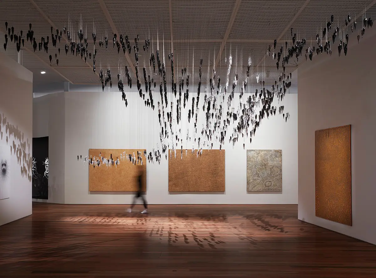
The gallery volumes are defined by the Portuguese limestone cladding; it continues from the building’s exterior into the atrium, becoming the surface against which some art is displayed, including a large-scale video installation by New Zealand Māori artist Lisa Reihana. The architects had investigated using the golden sandstone plentiful in the region and seen on many of Sydney’s historic structures, as well as the existing museum building’s templelike facade. Ultimately, they rejected it, deciding the material’s pronounced veining made it unsuitable as a backdrop for art. “The pattern is sometimes too big,” says Sejima. SANAA did, however, incorporate local soils into a rammed-earth wall that winds its way through the expansion and on which some artwork is hung. The 330-foot-long element, the first use of the material for the firm, includes subtle horizontal striations in warm tones that recall, but are less visually busy than, the native sandstone.

5
Within the atrium (5) and in other interstitial spaces between galleries (6), art is displayed on both the limestone and rammed-earth walls. Photos © Iwan Baan (5), © Art Gallery of New South Wales, Zan Wimberly (6)

6
The new building showcases the Art Gallery’s international contemporary collection, but gives pride of place to Aboriginal and Torres Strait Islander art. The work of Indigenous artists is displayed throughout the museum, and also in a dedicated space named Yiribana (“this way” in the Aboriginal language of Sydney) in a highly visible location, directly adjacent to the expansion’s entrance. Previously, in the historic building, the Yiribana gallery was in a basement.
Passersby may recognize this new commitment to Indigenous artists even without going inside. For instance, a glass-enclosed 115-foot-long “loggia” adjacent to the entry plaza displays some of the Yiribana gallery’s contents. And, starting in mid-2023, people will be able to traverse the plaza on their way down to Woolloomooloo, walking through a landscape by Indigenous artist Jonathan Jones. His piece, now being installed, will rely on an Aboriginal practice that uses fire to manage the land and ecosystems.

7
Most galleries are white-box spaces (7 & 8), except for one in a former WWII-era fuel tank (9). Photos © Art Gallery of New South Wales, Zan Wimberly (7 & 8), © Art Gallery of New South Wales, Jenni Carter (9)

8

9
One of the new building’s structures is not new at all. It is one of the two existing fuel bunkers now repurposed as a 24,000-square-foot gallery (the other serves as the loading dock). The vast exhibition space is reached by descending a pristine white spiral stair that contrasts with the gritty storage tank, whose walls are still stained with oil. The architects say that it just made sense to incorporate the bunker into the museum. “You can feel the history there,” says Nishizawa. Like the Turbine Hall at London’s Tate Modern, by Herzog & de Meuron, the space will house temporary, site-specific pieces. For the Tank’s inaugural commission, Argentinian artist Adrián Villar Rojas has interspersed monumental objects combining steel, resin, and organic materials among the forest of 125 existing concrete columns. The haunting installation is viewed in near darkness.

The End of Imagination by Adrián Villar Rojas is the Tank gallery’s inaugural commission. Art © Adrián Villar Rojas, photo © Jörg Bauman
It is fitting that the exhilarating Tank space is not at all legible on the exterior. Though the expansion is, of course, visually striking and architecturally refined, SANAA has prioritized experiential and spatial qualities over creating an easily comprehended sculptural object. The new building has an affable informality that suits the city’s culture and the museum’s wide-ranging collection; it is rooted in the landscape; and it stimulates the senses. And those qualities, rather than a singular expressive sculptural form, make it the perfect landmark for Sydney.
This article is an expanded version of one originally published on November 29, 2022.
Click plan to enlarge

Click drawings to enlarge

Credits
Architect:
SANAA — Kazuyo Sejima, Ryue Nishizawa, principals; Yumiko Yamada, partner; Asano Yagi, project architect; Soo Kim, Hiroaki Katagiri, Takayuki Hasegawa, Riccardo Cannata, Enrico Armellin, Misha Mikhail Nemkov, Ichio Matsuzawa, Hana Greer, designers
Executive Architect:
Architectus
Consultants:
Arup (structure, fire, hydraulics, lighting, security), Steensen Varming (m/e, vertical transport), Surface Design (facade), GGN, McGregor and Coxall (landscape), Atelier Ten, WSP (environmental design), SO (signage), Akin Atelier (shop design)
General Contractor:
Richard Crookes Construction
Client:
Art Gallery of New South Wales
Size:
183,000 square feet
Cost:
$236 million
Completion Date:
December 2022
Sources
Acoustical Ceilings:
Ecophon
Vertical Transport:
Liftronic
Energy Management:
Alerton
Photovoltaics:
LG


