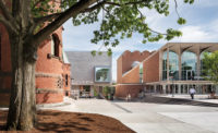
Queens Museum
The World of Tomorrow Today: A long-span-steel structure cloaked in modern-classical-style architecture has proved to be flexible for reinvention.


Architects & Firms
Since it was constructed for the 1939 world’s fair, the New York City Building in Flushing Meadows–Corona Park, now the Queens Museum, has played assorted unexpected roles. Its staid, modern-classical architecture, designed, ironically, to suit the “Building the World of Tomorrow” theme, has demonstrated a surprising agility in supporting a variety of programs. Planned to be the fair’s only structure to remain in permanent use, it was to become a recreation center for roller-skating and ice-skating. Yet it also served as temporary quarters for the United Nations General Assembly in the late 1940s—while the U.N.’s real home in Manhattan was being completed—and then as the New York City Pavilion for the 1964 New York World’s Fair. In 1972, the Queens Museum of Art moved into the north half, leaving only the ice-skating rink on the south.
The original architect, Aymar Embury II, known for his Colonial Revival country houses and later for metropolitan bridges, conceived the restrained monumentality of this colonnaded limestone hall for the city’s uber-boss of parks and roads, Robert Moses. The long-span steel trusses Embury employed for the roof allowed flexible-use, column-free spaces unusual at the time, notes Grimshaw’s partner in charge Mark Husser. “We wanted to make the most of Embury’s rigorous structural frame,” he says of Grimshaw’s design approach, “and emphasize the large open space.”
In the years before Grimshaw arrived on the scene, as the program changed, other architects left their mark—or tried to: architect Daniel Chait designed the ameboid setting for the Panorama in 1964; in a 1994 renovation, Rafael Viñoly Architects added glass ramps around the gigantic model and created a 30-foot-high aluminum-and-glass curtain wall for the east facade. By 2001, the city-owned museum had decided to take over the entire building, and held a competition. It was won by Los Angeles architect Eric Owen Moss, who proposed gutting the middle section of the structure and inserting a glass “drape” that bulged out from the east side (looking more like a giant wire bustle). In spite of Moss’s West Coast success in using brash, swashbuckling forms to make the once down-at-the-heels Culver City an architectural landmark of sorts, his proposal for Queens encountered increasing opposition and budget questions. By 2005, the museum’s executive director, Tom Finkelpearl, along with New York City’s Department of Design and Construction (DDC), began searching for another architect. The contract went to the New York office of the London architect Nicholas Grimshaw, and to Ammann & Whitney, an engineering and architecture firm. Perhaps it was a good omen: the latter was founded in 1946 by Othmar Ammann, who had worked with Embury on the Triborough Bridge (1926), connecting Manhattan, the Bronx, and Queens.
The architects decided to grab the attention of passersby on Grand Central Parkway by designing an elegant 200-by-27-foot screen wall of high-performance, ceramic-fritted glass —lit by LEDs at night—on the museum’s west facade. It is framed within Embury’s temple-like volume, with the entrance placed on an axis that cuts through the interior to the east. There, Viñoly’s 1994 curtain wall opens to the park and a head-on view of the Unisphere, the giant latticed steel landmark globe that flamboyantly symbolized the international aspirations of the 1964 fair.
Inside the building, Grimshaw installed a 55-by-40-foot skylight and suspended a 30-foot-tall glass lantern from the building’s steel trusses to give a sense of enclosure to a newly formed atrium gallery, which has replaced the ice-skating rink. The lantern’s glass fins, along with tensile-membrane ceiling and wall panels covering the roof trusses, help reflect and bounce light to the side galleries around the space. In these open galleries off the atrium, the architects employed fixed aluminum baffles on the ceilings to diffuse light. (Only two of the seven galleries are enclosed, one for video works, the other for the Neustadt Collection of Tiffany Glass.)
Grimshaw also made the Panorama more accessible from the central hub, moving the entrance from the exhibition’s north end to the main lobby. At the Panorama’s old entrance, the museum has created artists’ studios in former gallery spaces. A Grimshaw-designed spiral stair supported by a gangly tripod-like structure (intended to echo the base of the Unisphere) takes visitors up to a glass bridge on the mezzanine, where they encounter startlingly close-up views of the symbolic 1964 sculpture before moving on to other activities. Construction quality is rough, and elements of the punch list were left to be finished after the opening, while the second phase of the renovation is expected to be completed in 18 months.
The architectural team has not only reinforced the openness and flexibility of Embury’s long-span structure but exploited its Early Modern characteristics with current glass technology. The result dramatizes the sense of light and space inside and out without resorting to pumped-up architectural effects. In this manner, the makeover becomes a palimpsest—manifesting the contributions of Embury, Chait, and Viñoly—by quietly revealing traces of the building’s past architectural lives.
PeopleClient: Owner: Architect: Personnel in architect's firm who should receive special credit: Grimshaw Design Team: Ammann and Whitney Interior designer: Engineers: Consultant(s): Lighting: Audio / Visual / IT: Cost Consultants: Museum Programming: Food Service: Vertical Transportation: General contractor: Photographer(s): Size: 105,000 square feet Cost: $69 million Completion date: November 2013 |
ProductsExterior cladding Monolithic concrete floor polishing: Interior finishes Special interior finishes unique to this project: |


