Photo © Alexander Severin
Neither the tallest nor the flashiest among a new brood of high-rises reshaping downtown Brooklyn, 141 Willoughby takes advantage of its prominent full-block location to establish its credentials as an urban asset. Occupying a trapezoidal site greeting motorists and pedestrians as they cross the Manhattan Bridge, the 24-story office building steps down toward the East River and reinforces the street wall along Flatbush Avenue to show it’s a team player in the on-going process of creating a new, high-density civic realm for the area. A small park at the narrow tip of the property, previously the site of a three-story printing plant erected in 1919, adds to this effort with curving benches and three clusters of trees inviting pedestrians to pause and relax.
Just down Flatbush Avenue, SHoP’s Brooklyn Tower rises 1,066 feet (93 stories) and cuts a dark, neo-Gothic profile on the borough’s emergent skyline, while Studio Gang’s 11 Hoyt grabs attention with its scalloped facade and FXCollaborative’s 1 Willoughby Square takes honors as the borough’s tallest office building. Instead of trying to compete with these bigger and sexier rivals, 141 Willoughby takes a business-like approach to fitting into a rapidly evolving neighborhood and providing a workplace environment attractive to people returning to the office.

.webp)
Photos © Alexander Severin
Sculpted by zoning regulations and views in all directions, the steel-frame structure rises 150 feet to the top of its base then swivels part of its upper volume away from Flatbush Avenue to create a generous roof terrace on its 10th floor. Instead of placing its concrete core at the center of the building, the architects at Fogarty Finger shifted it to one side to provide uninterrupted office space on the wedge-shaped floors. On the exterior, they composed facades into bands with an increasing number of floors above a two-story podium—from one floor near the bottom to five at the top. The geometric progression defies traditional rules of tall-building design—which usually place progressively shorter elements at the top to emphasize verticality—but it works here to give the composition a visual heft that anchors the building to its site.

Photo © Alexander Severin
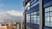
“Our sensibility is to do something simple, then give it layers,” says Harshad Pillai, the director at Fogarty Finger in charge of the project. Accordingly, the firm wrapped the building with floor-to-ceiling curtainwall, then highlighted the stacked composition with bands of bronze-hued aluminum between each group of floors and with vertical mullions that add subtle depth by catching sun and shadow.
As a speculative office development arriving in a difficult, post-Covid market, 141 Willoughby needed to offer a rich package of amenities to entice tenants. Visitors arrive at a 30-foot-high lobby on Willoughby Street featuring a twisting bronze stair that takes them to a pair of shared spaces on either side of the lobby. One is a library/lounge with sofas and bookshelves and the other is a larger bar/lounge with views out in two directions, as well as inward toward the lobby. On the 10th floor, tenants have access to additional amenities, such as a gym and a generous lounge adjacent to a roof terrace with a yoga pavilion, tables, chairs, and landscaping.
.webp)
Photo © David Mitchell
Pillai and his team designed the building for the Savanna Real Estate Fund with flexibility in mind. At its north tip, adjacent to the small triangular park, they created space on the lower floors that can accommodate a range of tenants—from retail to a healthcare provider. Below grade, they carved out a basement level that would work well for radiology and imaging equipment, should a healthcare company lease this part of the building. They also designed the elevator lobby so it could be accessed on Gold Street (in addition to Willoughby), if an anchor tenant wants its own entrance.


Photos © David Mitchell
On most spec office projects, the lead architect designs just the core and shell. But here, Fogarty Finger did the interiors of the common spaces as well. (SLCE served as executive architect on the project.) “Office culture has changed,” says Alexandra Cuber, director of the firm’s interiors studio. “Even before the pandemic, we were creating environments that borrow from the hospitality world as much as the corporate sphere.” So 141 Willoughby’s lobby has plants and comfortable places to sit and the amenities areas seem more like those in a hotel than an office building. Post-Covid, tenants are concerned about the physical and mental health of their employees. As a result, Fogarty Finger specified copper, which is anti-microbial, for the surface of the bar on the second floor and installed plants all around, including in the first-floor elevator lobby.

Photo © David Mitchell

Photo © David Mitchell
The project, though, faces a difficult commercial office market with a 22 percent vacancy rate in downtown Brooklyn in the third quarter of 2023, according to the Downtown Brooklyn Partnership. As of March 2024, no office or retail tenants had moved into the building. In the long run, the area’s emergence as a rival to parts of Manhattan will most probably help solve any leasing problem for 141 Willoughby. But the next year or two could be tough ones for the building.
.jpg?1711433253)


.jpg?height=200&t=1713468361&width=200)