Chicago's Museum of Contemporary Art Renovation Will Cater to a Wider Public

The MCA in Chicago will wrap up a redesign in June by the firms Johnston Marklee and Pedro y Juana.
Photo © Peter Mccullough / MCA Chicago

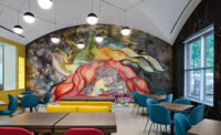
The renovation includes a new first-floor restaurant as well as a commons space on the second floor.
Photo © Tom Hancocks

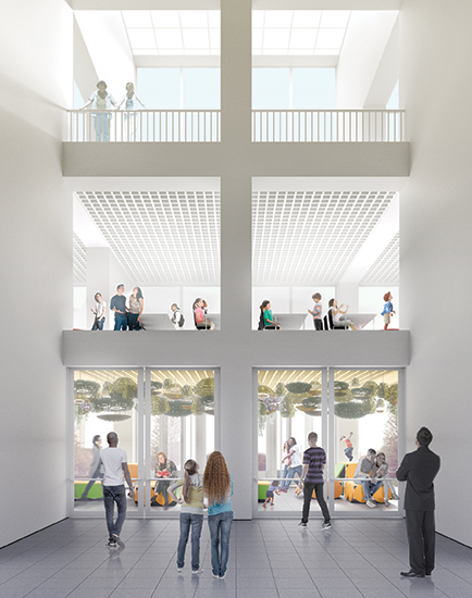
Mexico City–based firm Pedro y Juana devised a new flexible space for the MCA’s second floor. The design includes playful geometric fixtures as well as hanging plants.
Photo © Pedro Y Juana


A renovation of Chicago’s Museum of Contemporary Art (MCA) is intended to reintroduce the museum to a wider public, just when the project’s designers, the Los Angeles firm of Johnston Marklee, will be reintroducing themselves as artistic curators of the Chicago Architecture Biennial, set to open a few months after the renovation’s completion. Now under construction, the $16 million project will convert 12,000 square feet of interior space into free and publicly accessible cultural and social venues. It’s scheduled to be complete this June, in time for the museum’s 50th anniversary.
The renovation will reshuffle three programmatic elements of the building, designed by Josef Paul Kleihues in 1996. (The museum, when established in 1967, first occupied a space on East Ontario Street, four blocks south.) The plan will install a new groundfloor restaurant designed by Johnston Marklee and dominated by an immersive art installation by British painter Chris Ofili. On the second floor, the emerging Mexico City–based practice Pedro y Juana will create a flexible art and social space called “the commons.” Finally, the third floor will host new education and meeting spaces.
Throughout, Johnston Marklee’s plan aims to make more fluid connections between art, the museum, and the city with the intention of turning one of the city’s most formally imposing cultural buildings into a convivial and friendly place. “The entire renovation is meant to up-tick our welcome and hospitality factor,” says MCA director Madeleine Grynsztejn.
The second-floor commons area is most emblematic of the renovation’s approach. It aims to create a social “third space,” says Johnston Marklee principal Sharon Johnston— something between a white-box gallery and a hangout space, with programming such as workshops, performances, and artist-in-residence studios.
Grynsztejn first came across the work of Pedro y Juana at the 2015 Chicago Architecture Biennial and felt the MCA could use some- thing a bit like the designers’ Dear Randolph installation, a playful array of circular lamps connected via ropes and pulleys, begging passersby to fuss with them. She called it an “interactive way station,” believing that the commons could “communicate warmth and embrace.” Renderings of this space show a dense hanging-garden greenhouse of geometric forms and plantings. “We imagine the commons as an egalitarian space in constant motion,” said Pedro y Juana’s cofounder Ana Paula Ruiz Galindo in a statement.
Johnston Marklee’s design, meanwhile, picks up on cues from Kleihues’s original building, like the existing barrel-vaulted ceiling in the fourth-floor galleries, which they are echoing in the ceilings of the new restaurant. But an important part of Johnston Marklee’s responsibilities is coordinating programmatic shifts and creating a context in which fellow artists and designers can experiment. Johnston says it’s “like a chess game, where one person makes a move, and then somebody else makes a move in response.”
This focus on an enhanced public realm within the museum, Grynsztejn says, comes from a recent NEA study, which revealed that more than 70 percent of museum patrons are looking for a direct and engaged social experience, not so much a monastic journey through a temple of culture. In a presentation about the museum’s planned renovations, Grynsztejn called it transforming the museum from a “treasure box” to a “toolbox.”
And there’s certainly precedent for contemporary museums’ investing in large, flexible spaces, like MoMA PS1’s Young Architects Program summertime space or Herzog and de Meuron’s recent expansion of the Tate Modern, 40 percent of which, Grynsztejn says, is new social and cultural space.
But can these interior space improvements resolve problems of the museum’s public persona that are largely tied to its stark, severe exterior?
That’s a question raised by the museum’s initial critical reception and current assessments of its faults. In Blair Kamin’s 1996 review for the Chicago Tribune, he praised the interiors but knocked the building’s “fortress-like” perch on top of a steep staircase, its “brute monumentality” derived from Classical proportions, and a lack of recognizably humanscale detailing.
Chicago architect Stanley Tigerman has seen the building—which he calls a “missed opportunity” and “an embarrassment”— age over time. Though he praises both Grynsztejn and Johnston Marklee, he says “the problem is too large for a Band-Aid.”
But Johnston is confidant that a few thoughtful interventions will bring new life to the building. “Despite the heaviness and seeming rigidity of the [Kleihues] building’s archi- tecture,” Johnston says, the renovation will add “levity and lightness.”


