The Manetti Shrem Museum of Art by SO — IL & Bohlin Cywinski Jackson
Davis, California
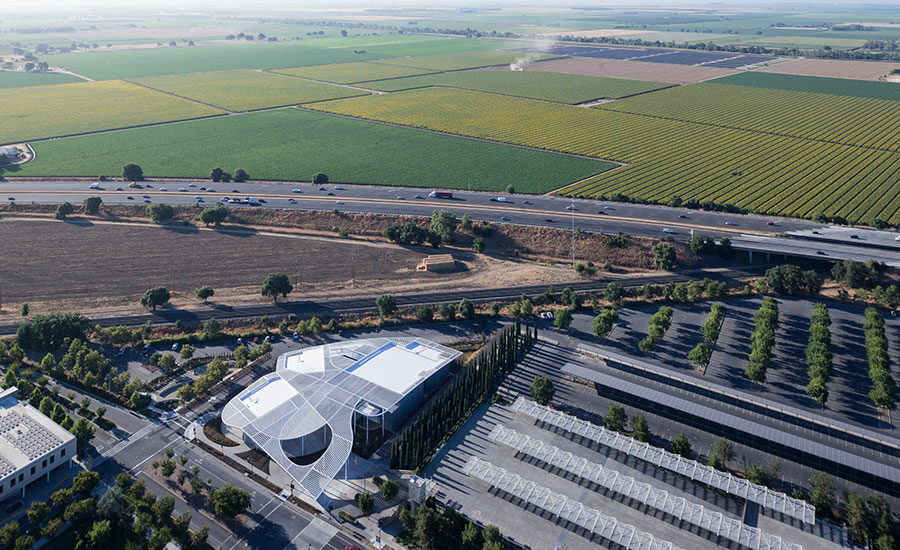
The form of the museum’s sensuous canopy was inspired by the nearby fields.
Photo © Iwan Baan
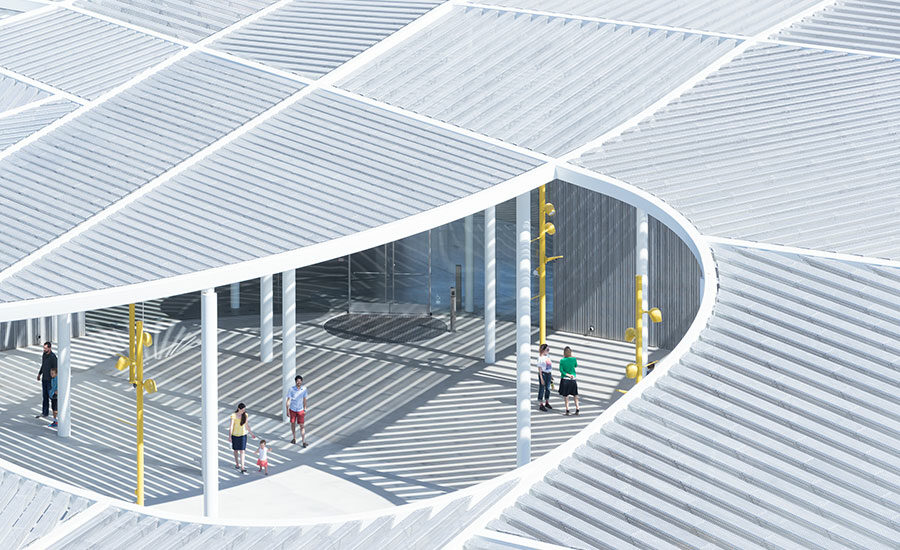
Supported by circular columns, the canopy covers a 50,000-square-foot area to create a generous entry plaza in front of the building.
Photo © Iwan Baan
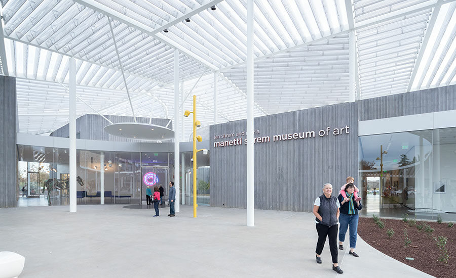
Above the main entrance, a large circular disc protects visitors from infrequent rain.
Photo © Iwan Baan
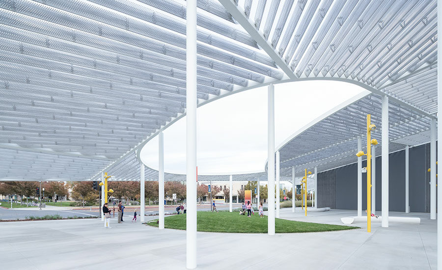
Photo © Iwan Baan
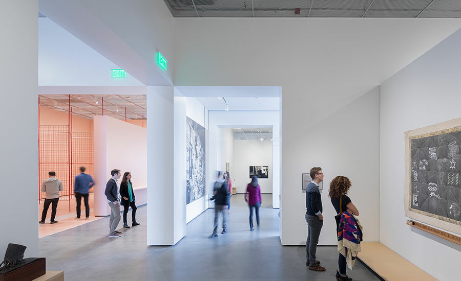
Photo © Iwan Baan
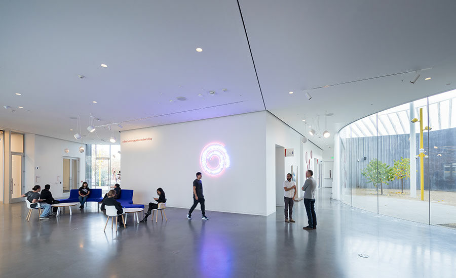
Polished concrete covers the floors of the galleries, lobby, and auxiliary spaces.
Photo © Iwan Baan
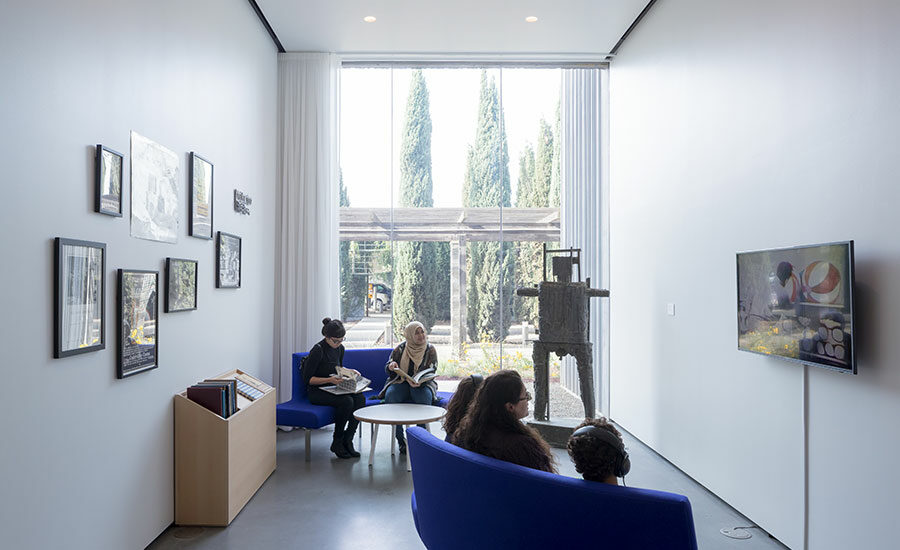
Polished concrete covers the floors of the galleries, lobby, and auxiliary spaces.
Photo © Iwan Baan
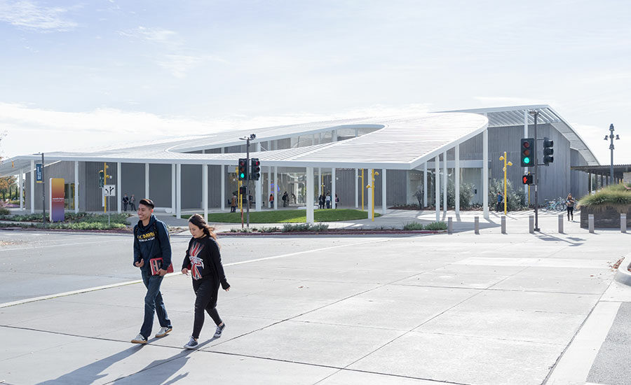
The arcing canopy dips as low as 12 feet at the front of the building.
Photo © Iwan Baan
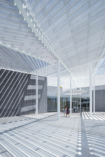
The canopy’s array of perforated triangular beams creates alluring silhouettes on the exterior wall of the building and floor of the entry plaza.
Photo © Iwan Baan
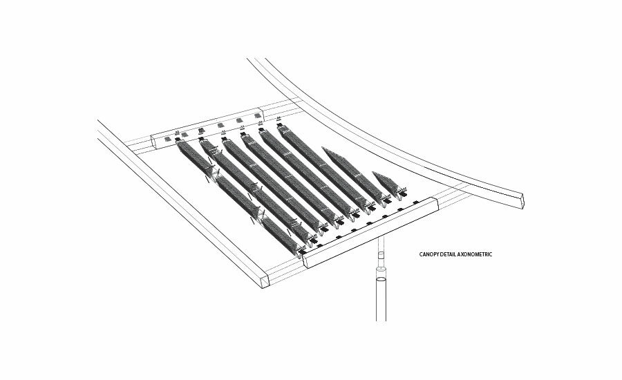
Image courtesy SO-IL & Bohlin Cywinski Jackson
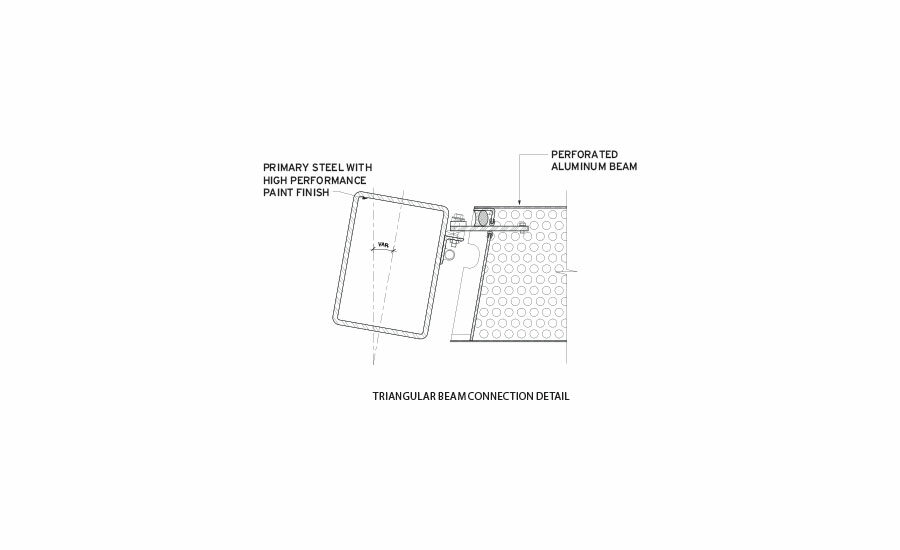
Image courtesy SO-IL & Bohlin Cywinski Jackson
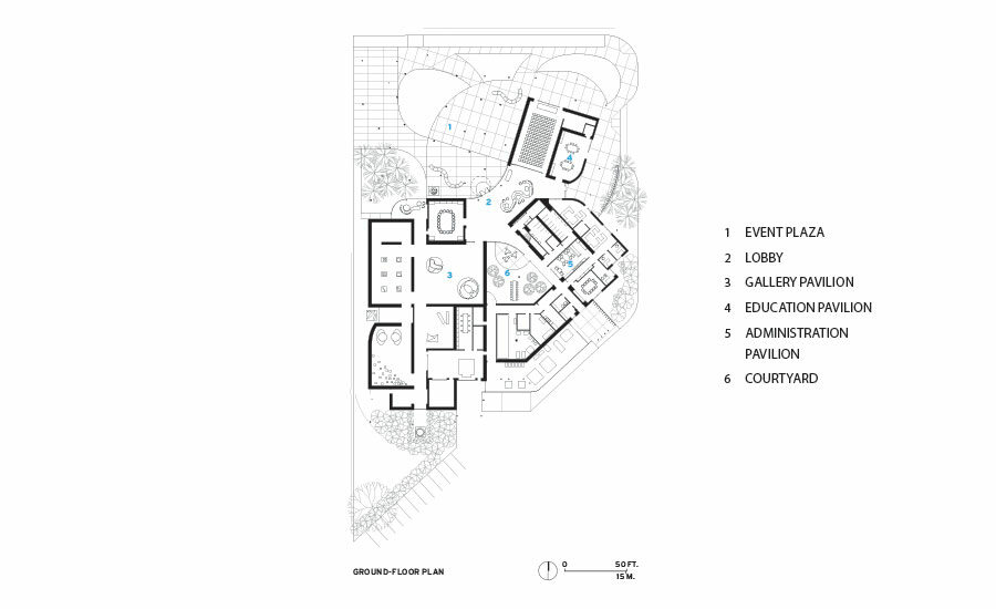
Image courtesy SO-IL & Bohlin Cywinski Jackson


Beginning in the early 1960s, the University of California at Davis became home to a thriving academic art scene, with influential figures Wayne Thiebaud, known for his colorful paintings of everyday objects, and Robert Arneson, father of the Funk movement, among its diverse faculty. In recent years, the university has sought to reignite the creative energy of that era. A 2013 competition for the school’s first purpose-built art museum—it previously exhibited work in a handful of galleries in existing buildings—called for a structure that would be a magnet on the sprawling campus. But the budget was extremely tight, and the client mandated a contractor-led design-build team.
Paired with contractor Whiting-Turner, architects SO — IL, based in New York, and the San Francisco office of Bohlin Cywinski Jackson (BCJ) offered an unconventional solution. Rather than create a presence with building height, as the other shortlisted entries did, they proposed a one-story structure—thereby saving money on elevators, egress stairs, and other associated costs—with a dramatic canopy reaching far beyond the building’s footprint. It was a very smart move.
The strategy won the competition for SO — IL and BCJ, but the design and detailing of that critical component had to be developed over the course of the next couple of years. “The canopy is essentially Pole Dance made solid,” says Florian Idenburg, founding partner of SO — IL with wife Jing Liu. Idenburg is referring to SO — IL’s 2010 installation at MoMA PS1 in Queens, New York, where a large net supported by a series of pivoting poles covered that museum’s courtyard—an exploration, according to the firm, of sensorially charged environments rather than finite forms.
At Davis, the inspiration for the canopy’s simple construction and sensuous design—reaching as high as 34 feet and dipping as low as 12 feet—came from the surrounding farmlands and their greenhouse structures. Coming into the Sacramento airport en route to Davis, the view from the plane over California’s Central Valley—with its patchwork of cultivated plots of land—is stunning. The architects beautifully recreated that tapestry in metal with the orthogonal sections of the canopy, interrupting it with sweeping curves, a reference to the Sacramento River that meanders across the fields.
Initial ideas for the canopy called for a steel frame and subframe connecting perforated sheets of aluminum. But the design team determined that it would be more cost-effective, and indeed more interesting, to give dimension to the aluminum and allow it to span the main frame, eliminating the need for the secondary steel.
The resulting triangular infill beams are dense in some sections and sparse in others, casting an array of intriguing shadow patterns onto the walls and ground beneath it. “We were able to dial it up or dial it down as we wanted,” explains Michael Ra, principal-in-charge at Front, the canopy and glazing consultants on the project. Idenburg and Ra have developed custom metal solutions together before, with the expanded aluminum mesh that clads the New Museum in New York, when Idenburg was with SANAA and on SO — IL’s Kukje Gallery in Seoul, which is draped in a blanket of stainless steel rings.
While the aluminum at the New Museum was anodized, a corrosion-resistant, marine-grade alloy was used for the beams at the Davis museum, allowing them to be left uncoated, exposing the natural material. The three-dimensional treatment of the aluminum, coupled with its raw metallic finish, gives the canopy a softness, according to Idenburg: “There is the hard box with a more delicate veil.”
The hard box, of course, is the building itself, which can’t help but take a back seat to the canopy. More like a pavilion, the highly transparent 30,000-square-foot container, whose roof follows the arc of the canopy, features three main areas—for galleries, offices, and classrooms—that pinwheel around a central lobby and interior courtyard. Its exterior walls feature elegantly corrugated precast concrete panels, some as high as 32 feet, and straight and curving glass, the biggest sheet of which is 10 feet by 14 feet.
Like SANAA’s Glass Pavilion at the Toledo Museum of Art, which Idenburg and Ra also worked on together, the glazing here is mullionless. Since it is taller than Toledo, it is also slightly thicker, with two lites of 0.59-inches apiece separated by a very clear interlayer. “Using a principle similar to a glass balustrade, we clamped the laminated panels at the bottom so they essentially cantilever off the ground,” explains Ra.
The 8,000 square feet of galleries feature polished-concrete floors, and ceilings of aluminum-mesh grilles, allowing views up to the sloping roof above. With works on paper comprising nearly three-quarters of the collection, the lighting within galleries, entirely LED, is controlled by occupancy sensors, turning off when galleries are empty. An off-site PV array satisfies some of the energy demand. The building is on track to achieve LEED Platinum and would be one of only a handful of museums in the U.S. to do so.
Whether approaching the campus from the freeway, or just walking around it, the $30 million new museum is a sight to behold. Architects often talk about constraints encouraging creativity. This is a real example of a tight budget leading to truly innovative design. More than that, SO — IL and BCJ have designed a building appropriate for the size and scope of UC Davis’s collection and audience, avoiding the costly mistake UC Berkeley made with its art museum and film archives, opened in January. It spent nearly four times as much on what was, primarily, a renovation of an existing building. At UC Davis, the university certainly got its money’s worth, and then some.
PeopleArchitect: SO — IL 320 Livingston street, 2nd Floor, Brooklyn, NY 11217/ 718 624 6666 / office@so-il.org
49 Geary Street, Suite 300, San Francisco, CA 94108/ 415 989 2100 / skrick@bcj.com Karl Backus, Partner in Charge
Engineers Rutherford + Chekene, structural
Consultants Lutsko Associates, Landscape
General contractor: The Whiting-Turner Company
Photographer: Iwan Baan, +31 (0)6 5463 0468 Photograph by Iwan Baan, courtesy of SO — IL and Bohlin Cywinski Jackson
|
ProductsStructural System Manufacturer of any structural components unique to this project: Olson Steel, braced frame building structure and canopy steel structure; HSI, entry rain disk. Exterior Cladding Metal panels: Reynobond Metal/glass curtain wall: Custom Stainless steel portals and laminated glass by Front Inc. Precast concrete: CTU Precast with custom-designed formliner Curtain wall: Oldcastle Other cladding unique to this project: Custom marine grade aluminum shading structure by Front Inc. Roofing Sika Sarnafil PVC roof Windows Metal frame: Oldcastle Glazing Glass: Laminated glass by Front Inc., IGU by Oldcastle Doors Entrances: Custom stainless steel portals by Front Inc. Special doors: Glazed Garage doors: C.H.I. Overhead Doors Hardware Locksets: Schlage Closers: Rixon Exit devices: Blumcraft Pulls: Ives Interior Finishes Acoustical ceilings: Armstrong Woodworks Suspension grid: Armstrong Carpet: Interface Special interior finishes unique to this project: Expanded metal mesh ceiling in Galleries, custom. Furnishings Office furniture: Steelcase Reception furniture: custom BCJ-designed Welcome Station(Northwood Design Partners) Fixed seating: MD3 Natural Forms exterior bench Chairs: Vitra Hal, Howe 40/4, Aalto 64 stool Tables: custom BCJ-designed conference, work and side tables (Northwood Design Partners) Upholstery: custom BCJ-designed sofa (Franciscan Interiors) Lighting Interior ambient lighting: Lobby: FLOS Aim. Offices: Litecontrol Mod 22 Downlights: Museum Fixtures: LSI LumeLex 2044 and 2047 Exterior: Selux Olivio Dimming system or other lighting controls: Lutron Conveyance Elevators/escalators: NA Energy Energy management or building automation system: Siemens |


