Record Interiors 2016
Repossi Place Vendôme by OMA
Jewel Box: A modern shop sets itself apart within a historic enclave of luxury boutiques.

The store’s upper level, where clients browse the jewelry collection at acrylic podiums, overlooks Paris’s famous Place Vendôme. The small space’s surfaces are completely clad in aluminum. LED strip lighting crisscrosses the ceiling.
Photo © Cyrille Weiner

Display windows make up one of the three faces of the kinetic billboard at street level.
Photo © Delfino Sisto Legnani and Marco Cappelletti

Variously rotated circular cases in galvanized copper display a range of jewelry on the upper level, while a standing aluminum display greets visitors on the ground floor.
Photo © Delfino Sisto Legnani and Marco Cappelletti

Variously rotated circular cases in galvanized copper display a range of jewelry on the upper level, while a standing aluminum display greets visitors on the ground floor.
Photo © Cyrille Weiner

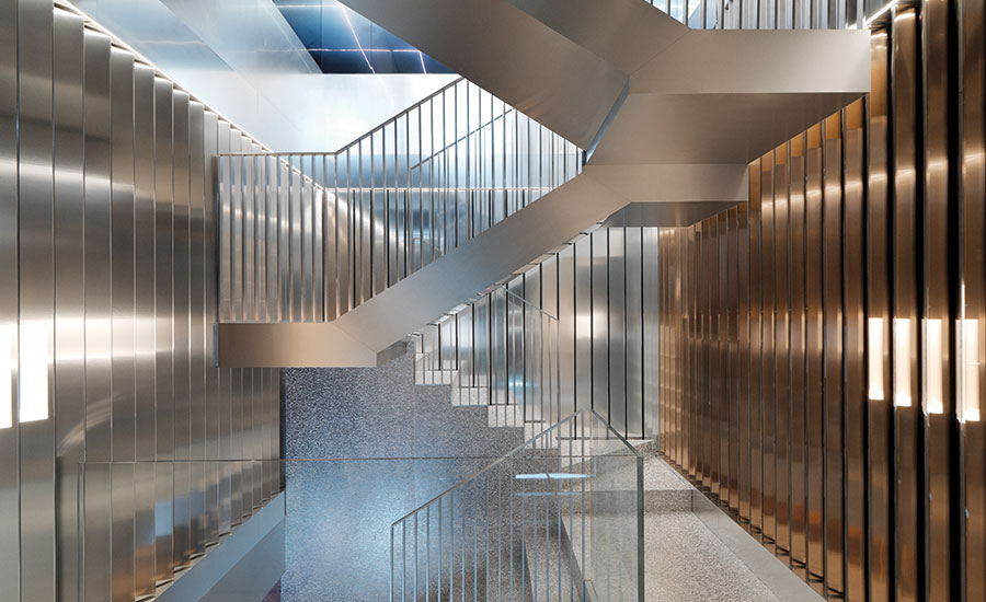
The staircase, sandwiched between the rotating billboard of the side walls, is a focal point. Its steps are formed from aluminum foam filled with resin that has the appearance of terrazzo.
Photo © Cyrille Weiner

A wall of thick, sliding resin cases separates the office from the salon-style space on the lower level, furnished with Donald Judd tables and chair.
Photo © Cyrille Weiner

The staircase, sandwiched between the rotating billboard of the side walls, is a focal point.
Photo © Cyrille Weiner

Image courtesy OMA

Image courtesy OMA

Image courtesy OMA


Architects & Firms
Although she’s scarcely 30 years of age, Gaia Repossi has been revamping her family’s century-old jewelry house, founded in Turin, since becoming creative director in 2007. Part of that transformation has included a complete overhaul of its flagship boutique on the Place Vendôme in Paris. In choosing a designer, the precocious scion immediately thought of Rem Koolhaas. “Many architects don’t consider retail a ground for intellectual reflection,” Repossi says. “But we need to question the place shopping has in society.”
Repossi was intrigued by the aesthetics of Koolhaas’s early work and his assailing of the typical shopping experience in the essay “Junkspace” (2001). For the design of her modern boutique, she worked with him and Ippolito Pestellini Laparelli, the youngest partner at Koolhaas’s firm, OMA.
Together, Repossi and her architects sought to create a space that would correspond to the needs of her diverse clientele—a few pieces cost under $1,000, while others have price tags that reach into seven figures—and that would reflect the contemporary bent of her unique jewelry. (Inspiration for her collections ranges from tribal tattoos to Le Corbusier’s architecture, as well as sculpture by Calder and Serra.)
“There are affinities between Repossi and OMA, mainly in the conception of projects,” says Pestellini Laparelli, “but jewelry brings the investigation of the small scale to an extreme.”
The small scale of this particular space—970 square feet, distributed over three levels—is somewhat unusual for the global firm, but OMA has completed similarly sized projects, including Le Dauphin restaurant (2010) and Maison Ullens boutique, also in Paris. While those projects, carried out by different associates in OMA’s office, made use of traditionally luxe materials like marble and onyx, Pestellini Laparelli chose to experiment with new materials, eschewing the finishes—wood, carpet, leather—typically associated with high-end jewelry showrooms. This was also an opportunity to execute a level of detail and craftsmanship for which the firm is not generally known. “Working on a small project is simply a shift of focus,” says Pestellini Laparelli. “But the amount of information you have to process is still vast. The very microscale is a universe as big as any large-scale project.”
The resulting surfaces and display elements—made from thick resins and acrylic and aluminum in various forms—reflect the color palette of Repossi’s distinctive baubles, from steely gray to subtle pink and rose gold.
The spectrum is on full display upon entry into the boutique’s compact ground level, its floor, unconventionally, concrete. There, the store’s signature feature—what OMA refers to as a billboard: automated walls that rotate to reveal three distinct faces—allows the ground floor to double as showroom and, quite literally, an extension of the street. “We designed the ground floor to be very flexible,” explains Pestellini Laparelli. “When the billboard is turned so that the jewels are hidden, the showroom can become a public space for receptions or speeches. It was a very interesting concept, since space is probably the most luxurious item you can get on Place Vendôme.”
When not showcasing jewelry, the other two faces of those triangular columns that rotate within the walls feature either a traditional mirror or a bronze-colored mirror that was developed in partnership with young Rotterdam-based designer Sabine Marcelis, using a film that is laminated into the glass. According to Pestellini Laparelli, “The colored mirrors don’t reflect reality exactly but add a layer of interpretation to the products, to the space.” (There are future plans to include a graphic element on one of the faces some of the time.)
Another arresting feature of the showroom is the staircase that connects the ground floor to the completely aluminum-panel-clad mezzanine above and the intimate, rose-hued lower floor, below grade. According to OMA, each level of the store corresponds to a certain category of customer described by the client—those who shop fast, slowly, and very slowly. Fast purchases of iconic pieces are made at street level. Upstairs, clients take more time to browse the collection. Downstairs, a classic salon-style space allows for one-on-one consultation for close inspection of desired pieces.
For the staircase, OMA turned to aluminum foam, a material it had originally experimented with when developing furniture for Knoll and then used extensively on interior and exterior walls at the Prada Foundation in Milan. Unlike Prada, however, here the air spaces within the foam treads, risers, and landings are filled with white resin to smooth the gaps and make it feasible as a walking surface. The effect, somewhat unintentional, are steps that appear to be made of terrazzo.
“We really wanted to create an experience,” explains Repossi. “I was not sure to what degree OMA would let me participate, but I was surprised by how much they enjoyed entering the client’s world.” While she admits to being less technologically inclined than her architect, she concedes that the automated walls of the ground floor invite people in. And any fear she may have had about the jewelry being able to shine within such a dynamic space have been put to rest since the store opened in July. “I’m very satisfied with how the pieces stand out,” she says. “It’s almost hypnotic.”
PeopleArchitect: OMA — Ippolito Pestellini Laparelli, partner in charge; Antonio Barone, Paul Cournet, Leonardos Katsaros, Francesca Lantieri, Kate Lee, Francesco Moncada, Silvia Sandor, team
Batiserf (structural); BET Louis Choulet (m/e/p)
970 square feet
withheld
July 2016
|
ProductsWall and mechanical displays: Goppion
Sice-Previt
Sabine Marcelis Studio |


