Los Angeles
The revitalization of Downtown Los Angeles remains a work in progress, with the area still a patchwork of commercial and residential towers, government and cultural facilities, light manufacturing, and parking lots. Lately, its momentum has turned to its eastern fringe, a once-industrial area now dubbed the Arts District.
Lodged between Downtown’s high-rise core and the Los Angeles River, the neighborhood started establishing a new identity in 2001 when the Southern California Institute of Architecture (SCI-Arc, where this author teaches) left its West L.A. home and reopened in a former Santa Fe Railroad freight depot. In June, the perpetually homeless Architecture and Design Museum (A+D) opened just south of SCI-Arc in a converted warehouse surrounded by hip restaurants, coffee bars, and lofts.
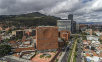
Imbued with this institutional credibility and growing market demand, the Arts District now enjoys the attention of the city’s real-estate developers, as demonstrated by the arrival of One Santa Fe, Michael Maltzan’s residential-commercial-retail colossus that is more than a quarter-mile long and, almost single-handedly, frames the neighborhood’s eastern edge. One Santa Fe, named for its street address, encompasses 510,000 square feet of space, spread over six levels containing 438 rental apartments (studios, one-bedrooms, two-bedrooms, and townhouses), as well as a ground floor with restaurants, offices, and shops surrounding that L.A. rarity—a public square.
“I think of the building’s context almost topographically,” says Maltzan, alluding to how the linear building slices its way through the four-acre site. “The first layer of the building relates to the open, accessible ground plane that connects retail and infrastructure. Then a stratum or belt line of parking on the north and apartments on the south takes the scale of the building up to that of the rest of the neighborhood,” he explains. The shops help animate a formerly lifeless street, while the architecture’s nod to multiple scales adds horizontal density without overwhelming the surrounding low-rise sprawl. The architect says the higher residential floors of the building offer “a whole other stratum for living on top of the city.”
Los Angeles urbanism has often been considered in linear terms (think Wilshire Boulevard). One Santa Fe deftly captures this essence, running parallel to SCI-Arc’s long building and responding to the series of railroad tracks on its eastern edge that separate the city from its contested river (currently being replanned by Frank Gehry). From a Downtown skyscraper, One Santa Fe appears as a superblock. But Maltzan undermines that impression up close with a series of design choices that reflect what he calls an “anticipatory urbanism”—the idea that L.A. is still in a state of becoming.
“One Santa Fe is a seam between the east and west sides of the city, a threshold that acts as a middle-ground landscape,” he says. “It doesn’t perform at the level of the city today, but it welcomes and insinuates an urbanism that will continue to develop as things like a future subway station or a bridge to the river get built.”
As an urban gesture, Maltzan cut out a large opening along Santa Fe Avenue and bridged the building’s two wings with a clear-span structure at the fourth floor, framing a view east and helping to define a parking lot for retail tenants and a wedge-shaped public space. The roof of the one-story retail plinth serves as an outdoor deck for amenities such as a pool, open-air movie theater, and yoga studio.
Bill McGregor, a partner with McGregor-Brown Company, one of the many developers involved in One Santa Fe, says the voids, while a significant budget item, were critical to the success of the project. “We didn’t want a building that had residential on top and then leftover ground-floor space for retail,” he says. “It was a passion of Michael’s, and of ours, that the clear span of the bridge create a grand doorway to make the retail space and pedestrian plaza work.”
In terms of finishes, the building relies on the contrast between a vibrant red-orange color, partly inspired by the district’s many brick buildings, and classic white for the basic stucco exterior of the residential units. An irregular grid of conventional windows along the residential layers adds a punch card–like rhythm, complemented by the steady punctuation of aluminum shading devices that break down the building’s long form. The apartment interiors, by other designers, are unremarkable except for the diversity of floor plans, including the two-story townhouses occupying the bridge section. About 20 percent of the dwelling units are affordable; the rest are market-rate. Structurally, the building follows standard L.A. residential construction methods—concrete base supporting timber framing—everywhere except for the steel in the bridge.
In recent projects like the nearby Star Apartments and now One Santa Fe, Michael Maltzan Architecture has shown it can create innovative solutions for starkly different populations—the formerly homeless at Star and mostly upscale professionals here—finding the sweet spot for extracting a vital architecture from the city’s otherwise humdrum multifamily residential design palette. Well beyond the tired clichés of indoor-outdoor living and insipid midcentury-modern riffs, Maltzan’s work explores the complicated history of L.A. while setting high expectations for a future in progress.
Size: 510,000 square feet
Cost: $165 million
Completion date: March 2015
People
Client/Developer/Owner:
Architect:
Personnel in architect's firm who should receive special credit:
Executive Architect
Interior designer:
Engineers:
Civil:
MEP:
Consultant(s):
Parking Design:
Code:
Telecom Systems:
General contractor:
Photographer(s): |
Products
Structural system
Exterior cladding Metal/glass curtain wall: Arcadia, McNichols Co. Precast concrete: Hanson Structural Precast Wood: Trex Moisture barrier: W.R. Grace & Co. Curtain wall: Arcadia Other cladding unique to this project: Greenscreen
Roofing
Windows
Doors Wood doors: ReliaBilt Sliding doors: Milgard Manufacturing, Inc. Fire-control doors, security grilles: The Cookson Co.
Hardware Closers: Cal Royal Exit devices: Von Duprin Pulls: Cal Royal Security devices: Sargent
Interior finishes Resilient flooring: Amtico by Mannington in all units Carpet: J+J Invision
Conveyance
Plumbing |


